The Transformation module is a tremendous addition in CSS3, it takes the way we manipulate elements on a website to the next level.
There are some experiments that really amaze me, however, we are not going to build something like a CSS-only icon that can somehow transform into an Autobot, as it may be overwhelming and not quite usable in real life as well.
Instead, this time, we will be stepping back and reviewing the basics of CSS3 2D Transformations to see how it works at a fundamental level.
Beginner’s Guide to CSS3 (Updated)
Since its announcement back in 2005, the development of Cascading Style Sheet (CSS) level 3, or better known… Read more
The Syntax
The CSS3 Transformations module basically allows us to transform an element to a certain extent such as translating, scaling, rotating and skewing.
The official syntax is transform:method(value). However, like any other CSS3 great additions that is still in the early stages, the current browsers still need the syntax version to run the transformations. So, the complete syntax would turn out like this:
transform: method(value); /* W3C Official Syntax */ -o-transform: method(value); /* Opera 10.5+ */ -ms-transform: method(value); /* Internet Explorer 9.0+ */ -moz-transform: method(value); /* Firefox 3.6+ */ -webkit-transform: method(value); /* Chrome / Safari 3.2+ */
Also, the method we are referring to above is the transform-functions, which could be replaced with one of the following: translate(), scale(), rotate() or skew().
The Value
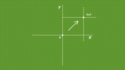
Most of the method’s value will correspond to the X-axis and Y-axis. If you remember the Cartesian coordinates system from your Math class in High School, the basic principle is quite similar, the X-axis represents the horizontal line and the Y-axis represents the vertical line.

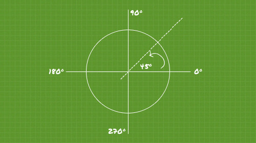
Except for rotations. The rotation will use the polar coordinates which is expressed in degrees that range from 0 to 360.

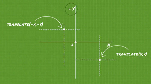
The values for all the methods can be both negative or positive. Just take a note though, as the web page is read sequentially from top to bottom which makes the Y-axis in the web work the opposite from the original principle of Cartesian coordinates. This means that when you add a negative value to Y-axis, it will move to the top instead.
Using the Transformations
Now, let’s see the following basic demonstration to see Transformation in action.
I – Translate
Don’t be clouded with the term translate, it will not translate foreign language. The translate here is actually a method for moving elements in some direction.
The method contains two values; X and Y. the X value as we pointed out above will take the element horizontally; to the left or to the right, while the Y value will takes it vertically to the bottom or to the top.

Now, let’s see some simple demonstrations below:
div { width: 100px; height: 100px; transform: translate(100px, 250px); }
The snippet above will move the element for 100px to the right and 250px to the bottom.
div { width: 100px; height: 100px; transform: translate(100px, 0); }
The snippet above will move the element just to the right for 100px, because we are zeroing the Y-axis. Then, if we want to move the element to the left, we only need to set the X-axis in negative, as follows:
div { width: 100px; height: 100px; transform: translate(-100px, 0); }
- “Translate” demo
Alternatively, we are able to move the element in a single direction with these individual methods; translateX() and translateY(), the difference is each of those methods accept only one value.
So, practically speaking, the transform: translate(-100px, 0) is also equal to transform: translateX(-100px).
II – Scale
The scale method allows us to enlarge or reduce the elements from its actual size. The scale’s value is the same as the translate method above, it also contains X and Y. The only difference is we do not specify the unit. Here is an example:
div { width: 100px; height: 100px; transform: scale(1.5); }
The above example will enlarge the div 1.5 or 150% of its actual size, and since we scale it equally for both the X and Y directions, we only need to declare it in one value. You can also declare it in this way transform: scale(1.5,1.5); if you want to go more detail, it will just do the same.

Furthermore, if we want to reduce the element we would specifically use a value from 0.999 to absolute 0, like the example below, which will reduce the size of the div for 50% or half:
div { width: 100px; height: 100px; transform: scale(0.5); }
But, be cautious, if you set the value to be absolute “0” the div will just disappear, so unless you have a valid reason to do so, I would not recommend doing it.
- “Scale” demo
III – Rotate
As we mentioned earlier in this post, the rotate method uses polar coordinates, so the value is stated in degrees. Here are two examples
The snippet below will rotate the div 30 degree clockwise.
div { width: 100px; height: 100px; transform: rotate(30deg); }

A negative value, as illustrated in the example below, will rotate the div in the opposite direction (counter-clockwise) at the same degree.
div { width: 100px; height: 100px; transform: rotate(-30deg); }
- “Rotate” demo
IV – Skew
The skew method enables us to create a sort of parallelogram. It also contains two values of the X and Y-axis. However, the value itself is stated in degree, instead of linear measurements like we use for the scale or the translate method. Here is an example:
div { width: 200px; height: 100px; transform: skew(30deg, 10deg); }
- “Skew” demo
V – Multiple method
The transform property is not limited to handle only one method, in fact we can include multiple methods in single declarations, like this:
div { width: 100px; height: 100px; transform: translateX(100px) rotate(45deg); }
The above snippet will move the element 100px to the right and at the same time it also rotates 45 degrees.
- “Multiple Method” demo.
Transform Origin
The transfrom-origin – as its name implies – is used to control the starting point of the transformation. If we do not explicitly declare this property with the following syntax transform-origin: X Y;, then the browser will take the default value which is 50% for the X and 50% for the Y.

Now, if we specify the transform-origin to 0 (X) 0 (Y) the transformation will start at the top-left.
Again, all the browsers still needs the prefix version to call this property. So, here is the complete version to ensure it works in most current browsers:
-webkit-transform-origin: X Y; -moz-transform-origin: X Y; -o-transform-origin: X Y; -ms-transform-origin: X Y; transform-origin: X Y;
- “Transform-origin” demo
Conclusion
We have come through all the four essential transformation methods; translate, scale, rotate and skew
However, as mentioned, this module is still in the early stage, so if you will apply these methods in your next website, make sure it degrades gracefully for incompatible browsers (I’m not referring to IE6 here).
Lastly, you can view all the demo or download the source from the following links.
- Demo
- Download Source
The post A Look Into: CSS3 2D Transformations appeared first on Hongkiat.