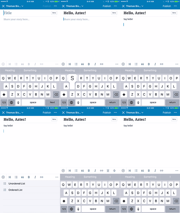
Now that so many of us carry around tiny pocket-size computers, more and more of our Internet time happens on phones and tablets — not just browsing, but creating. You’ve been asking for a better publishing experience in the WordPress app to make mobile publishing smoother. Today we’re introducing a new editor for iOS and Android, codenamed “Aztec.” It’s speedy and reliable, works with posts and pages, and is ready for beta testing!
What’s New?
At first glance, the Aztec editor might look like the old editor — which means you already know how to use it, with no learning curve.

What’s different, exactly? A lot:
- The overall user experience is smoother and snappier, with improved scrolling and faster image insertion.
- Spellcheck now works reliably.
- The addition of Undo and Redo tools means you can easily fix mistakes or move between different versions of your text when writing (and re-writing!).
- Dictation! Now, you can draft your thoughts without typing.
- Full support for accessibility technologies like iOS’ VoiceOver and Android’s TalkBack.
It’s not just better for people on phones: Tablet users will feel more at home, too. We designed Aztec with external keyboards in mind, making it feel almost like a word processor.
Interested in the full list of features and improvements? Here you go.
Side-by-Side Snappiness
We ran a copy and paste test on iOS with 500 paragraphs of text on an iPhone 6s. The pasted text appears instantaneously in the beta Aztec editor, while the current editor takes two minutes to render it:
Next, we edited an image-heavy post using WordPress for Android to see the scrolling speed improvement — there’s no contest. The current editor is on the left, the beta Aztec editor on the right:
Can I Try It?
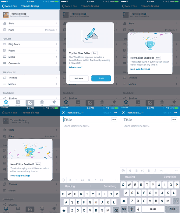
Please do! The Aztec editor is a beta version, which means we’re eager for your feedback so we can improve any weak spots before the official launch. When you install the latest WordPress update (8.0 for iOS, 7.8 for Android), you’ll see a pop-up window inviting you to try it out the first time you head to your site — tap “Try It” to activate the new editor. If you missed the popup, tap on Me and then App Settings to switch to the beta editor.

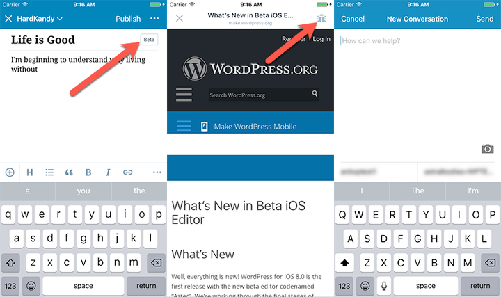
“Beta” means “not 100% ready for everyone;” there are a some things we’re still working on, and others we really want your opinions on. You can see what elements we’re focused on by tapping Me, then App Settings, and tapping the info circle button next to “Editor beta release notes & bug reporting.”
What’s Under the Hood?
The current editor uses a technology called a “web view” which got us 70% of the way to a great editor — but the last 30% of the experience was less than ideal. Aztec brings us closer to the 100% mark. It’s designed using technologies provided by Apple and Google, so it feels like part of the operating system: seamless.
(For more nitty-gritty: the iOS app uses TextKit and NSAttributedStrings, while the Android app uses android.text.Spannable. If you’re a developer — or are just curious — and want to know about the work going into Aztec, we’ve written about it on Make WordPress Mobile.)
All of the code is open-sourced and you can use it in your own application. Contributors are very welcome, and we look forward to any feedback on the project via GitHub or on Make WordPress Slack.
Feedback, Please!
You can give us feedback about the new editing experience in the editor window itself, so you can share your thoughts as they come to you. Tap on the Beta button in the post title area and then tap the Bug button in the navigation bar.

We’re standing by for your thoughts!
