They’re out! Like many of you, I look forward to these coming out each year. I don’t put much stock in surveys but they can be insightful and give a snapshot of the CSS zeitgeist. There are a few little nuggets in this year’s results that I find interesting. But before I get there, you’ll want to also check out what others have already written about it.
Oh, I guess that’s it — at least it’s the most formal write-up I’ve seen. There’s a little summary by Ahmad Shadeed at the end of the survey that generally rounds things up. I’ll drop in more links as I find ’em.
In no particular order…
Demographics
Josh has way more poignant thoughts on this than I do. He rightfully calls out discrepancies in gender pay and regional pay, where men are way more compensated than women (a nonsensical and frustratingly never-ending trend) and the United States boasts more $100,000 salaries than anywhere else. The countries with the highest salaries were also the most represented in survey responses, so perhaps the results are no surprise. We’re essentially looking at a snapshot of what it’s like to be a rich, white male developer in the West.
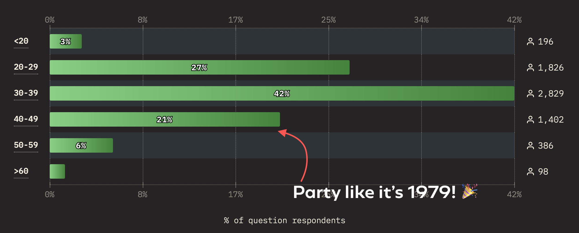
Besides pay, my eye caught the Age Group demographics. As an aging front-ender, I often wonder what we all do when we finally get to retirement age. I officially dropped from the most represented age group (30-39, 42%) a few years ago into the third most represented tier (40-49, 21%). Long gone are my days being with the cool kids (20-29, 27%).

And if the distribution is true to life, I’m riding fast into my sunset years and will be only slightly more represented than those getting into the profession. I don’t know if anyone else feels similarly anxious about aging in this industry — but if you’re one of the 484 folks who identify with the 50+ age group, I’d love to talk with you.
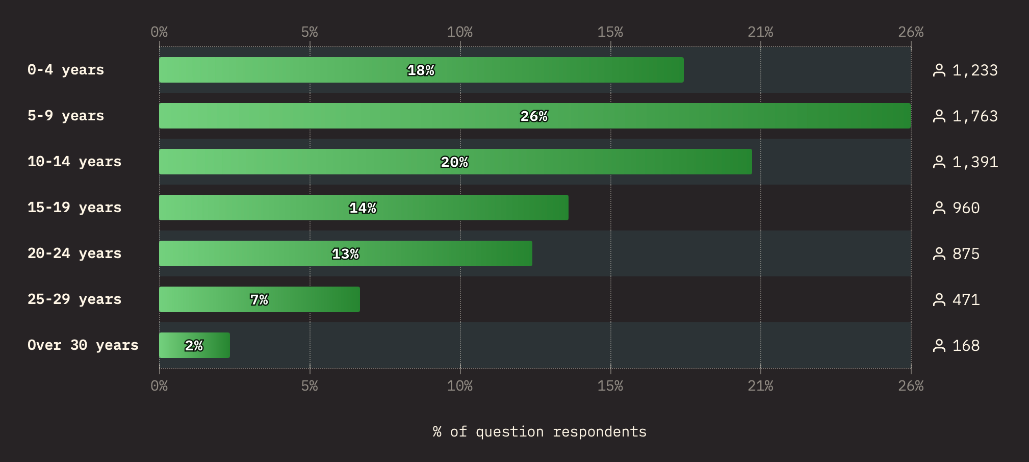
Before we plow ahead, I think it’s worth calling out how relatively “new” most people are to front-end development.

Wow! Forty-freaking-four percent of respondents have less than 10 years of experience. Yes, 10 years is a high threshold, but we’re still talking about a profession that popped up in recent memory.
For perspective, someone developing for 10 years came to the field around 2014. That’s just when we were getting Flexbox, and several years after the big bang of CSS 3 and HTML 5. That’s just under half of developers who never had to deal with the headaches of table layouts, clearfix hacks, image sprites, spacer images, and rasterized rounded corners. Ethan Marcotte’s seminal article on “Responsive Web Design” predates these folks by a whopping four years!
That’s just wild. And exciting. I’m a firm believer in the next generation of front-enders but always hope that they learn from our past mistakes and become masters at the basics.
Features
I’m not entirely sure what to make of this section. When there are so many CSS features, how do you determine which are most widely used? How do you pare it down to just 50 features? Like, are filter effects really the most widely used CSS feature? So many questions, but the results are always interesting nonetheless.
What I find most interesting are the underused features. For example, hanging-punctuation comes in dead last in usage (1.57%) but is the feature that most developers (52%) have on their reading list. (If you need some reading material on it, Chris initially published the Almanac entry for hanging-punctuation back in 2013.)
I also see Anchor Positioning at the end of the long tail with reported usage at 4.8%. That’ll go up for sure now that we have at least one supporting browser engine (Chromium) but also given all of the tutorials that have sprung up in the past few months. Yes, we’ve contributed to that noise… but it’s good noise! I think Juan published what might be the most thorough and thoughtful guide on the topic yet.
I’m excited to see Cascade Layers falling smack dab in the middle of the pack at a fairly robust 18.7%. Cascade Layers are super approachable and elegantly designed that I have trouble believing anybody these days when they say that the CSS Cascade is difficult to manage. And even though @scope is currently low on the list (4.8%, same as Anchor Positioning), I’d bet the crumpled gum wrapper in my pocket that the overall sentiment of working with the Cascade will improve dramatically. We’ll still see “CSS is Awesome” memes galore, but they’ll be more like old familiar dad jokes in good time.
(Aside: Did you see the proposed designs for a new CSS logo? You can vote on them as of yesterday, but earlier versions played off the “CSS is Awesome” mean quite beautifully.)
Interestingly enough, viewport units come in at Number 11 with 44.2% usage… which lands them at Number 2 for most experience that developers have with CSS layout. Does that suggest that layout features are less widely used than CSS filters? Again, so many questions.
Frameworks
How many of you were surprised that Tailwind blew past Bootstrap as Top Dog framework in CSS Land? Nobody, right?
More interesting to me is that “No CSS framework” clocks in at Number 13 out of 21 list frameworks. Sure, its 46 votes are dwarfed by the 138 for Material UI at Number 10… but the fact that we’re seeing “no framework” as a ranking option at all would have been unimaginable just three years ago.
The same goes for CSS pre/post-processing. Sass (67%) and PostCSS (38%) are the power players, but “None” comes in third at 19%, ahead of Less, Stylus, and Lightning CSS.
It’s a real testament to the great work the CSSWG is doing to make CSS better every day. We don’t thank the CSSWG enough — thank you, team! Y’all are heroes around these parts.
CSS Usage
Josh already has a good take on the fact that only 67% of folks say they test their work on mobile phones. It should be at least tied with the 99% who test on desktops, right? Right?! Who knows, maybe some responses consider things like “Responsive Design Mode” desktop features to be the equivalent of testing on real mobile devices. I find it hard to believe that only 67% of us test mobile.
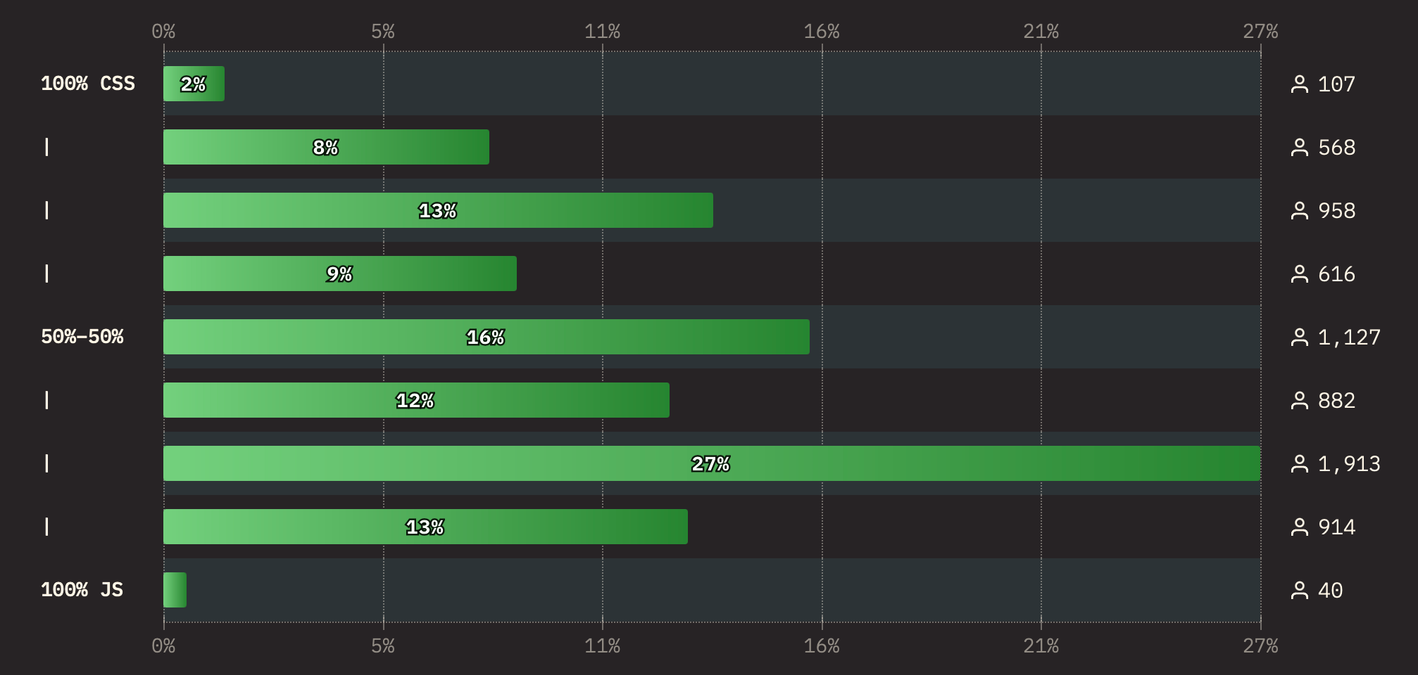
Oh, and The Great Divide is still alive and well if the results are true and 53% write more JavsScript than CSS in their day-to-day.

Missing CSS Features
This is always a fun topic to ponder. Some of the most-wanted CSS features have been lurking around 10+ years. But let’s look at the top three form this year’s survey:
- Mixins
- Conditional Logic
- Masonry
We’re in luck team! There’s movement on all three of those fronts:
Resources
This is where I get to toot our own horn a bit because CSS-Tricks continues to place first among y’all when it comes to the blogs you follow for CSS happenings.

I’m also stoked to see Smashing Magazine right there as well. It was fifth in 2023 and I’d like to think that rise is due to me joining the team last year. Correlation implies causation, amirite?
But look at Kevin Powell and Josh in the Top 10. That’s just awesome. It speaks volumes about their teaching talents and the hard work they put into “helping people fall in love with CSS” as Kevin might say it. I was able to help Kevin with a couple of his videos last year (here’s one) and can tell you the guy cares a heckuva lot about making CSS approachable and fun.
Honestly, the rankings are not what we live for. Now that I’ve been given a second wind to work on CSS-Tricks, all I want is to publish things that are valuable to your everyday work as front-enders. That’s traditionally happened as a stream of daily articles but is shifting to more tutorials and resources, whether it’s guides (we’ve published four new ones this year), taking notes on interesting developments, spotlighting good work with links, or expanding the ol’ Almanac to account for things like functions, at-rules, and pseudos (we have lots of work to do).
My 2024 Pick
No one asked my opinion but I’ll say it anyway: Personal blogging. I’m seeing more of us in the front-end community getting back behind the keyboards of their personal websites and I’ve never been subscribed to more RSS feeds than I am today. Some started blogging as a “worry stone” during the 2020 lockdown. Some abandoned socials when Twitter X imploded. Some got way into the IndieWeb. Webrings and guestbooks are even gaining new life. Sure, it can be tough keeping up, but what a good problem to have! Let’s make RSS king once and for all.
That’s a wrap!
Seriously, a huge thanks to Sacha Greif and the entire Devographics team for the commitment to putting this survey together every year. It’s always fun. And the visualizations are always to die for.