When visitors ‘land’ on your website, the landing page UX design goes a long way in establishing your credibility and winning their trust.
Landing pages are the face of your business to your potential customers and that’s why it’s important to optimize these pages well to get a good conversion rate.
What's more, they can even contribute to ranking your website on Google.
And how do you optimize your landing page UX design? The myriads of tips and hacks you found online may overwhelm you.
To get you started on solid grounds, here are the 6 proven landing page UX design best practices I would strongly recommend.
Let’s explore and understand.
Expert Tips for Effective Landing Page UX Design
Here are 6 expert tips to supercharge your landing page UX design.
1. Optimize Landing Page Speed
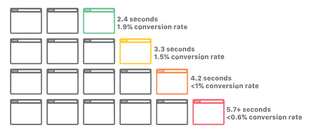
By now, we clearly understand that website loading speed can make or break its success. As shown in the image below, the conversion rate of a website drops with a delay of every second in the page loading speed.

In other words, if you want an effective landing page UX design, page speed is one of the first components you should address and you can use any of the leading tools for web designers to create efficient website pages.
Landing pages that load quickly on desktop and mobile devices will contribute greatly to lead generation too if you employ the right tools for it.
The Must-Have UI/UX Design Book for 2023. Check it now!
2. Reduce Text and Invest in Storytelling
Your visitors are not fond of text-loaded landing pages. They are looking for easy-to-find and valuable information on your landing page. Thus, the best practice for landing page UX design is to adopt storytelling.
I am not stressing so much about the narrative form but the way you communicate information on the page in a crisp manner. You may begin by identifying a problem or pain point, talking about the challenges it leads to, and positioning your product or services to solve the problem for your prospects.
For instance, let’s take business expense management as a problem. On your landing page, you can talk about its consequences and use client stories to show how your tool can help control business spending more effectively.
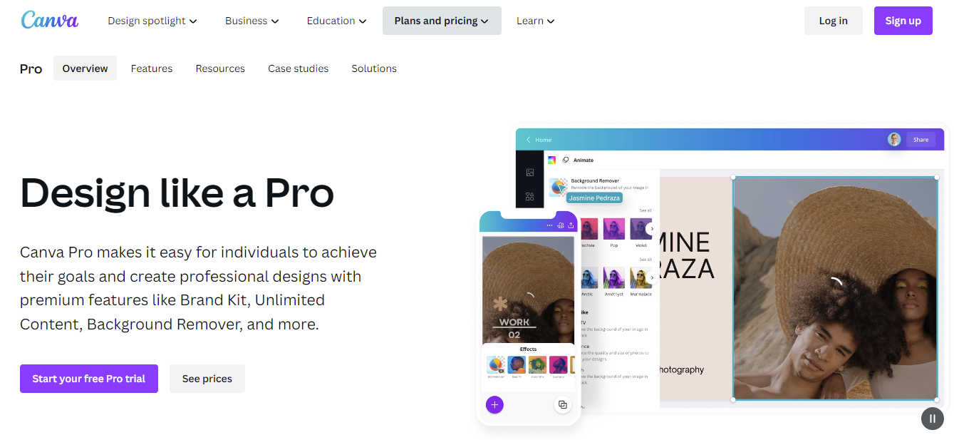
Canva designed their pro version landing page by adding more storytelling elements that help them to decrease the bounce rate.

3. Have Strong CTAs
If you want your visitors to get into action, your landing page must have a strong and convincing CTA. A survey conducted by HubSpot states that smart CTAs have far greater conversion rates than default CTAs.

You can ditch the regular CTAs like ‘signup’ and opt for more specific and personalized ones like ‘Try it for free’ or ‘Talk to sales team’.
What’s more?
You should include multiple CTAs on your landing page to ensure greater conversion. Remember, the CTAs should be relevant to your business and must occupy prominent spots on your landing page.
Here is an example, Google IndexCheckr add multiple CTAs for their index checker landing page that help them to get more conversion.

4. Build Authority with Testimonials
One of the best practices to make your landing pages convincing is to add testimonials and ratings.
See how Attrock showcases client testimonials to stamp their authority and prove to the prospects that they are the best choice.

Testimonials are not only great social proof but can also be used to address user objections. In the example above, see how the content specifically talks about how Ahrefs has helped the client in backlink building. It might be the one thing a prospect may need to see before converting.
5. Enrich with Videos
A majority of users prefer videos and images over plain text, be it in ads, social media content, or landing pages. As a result, inserting a single explainer video or image on your landing page can greatly boost your conversion rate.
Landing page videos can deliver quality information, address user fears, and prove your credibility in a fun and engaging way.
By embedding contextual videos in your landing page UX design, you can emotionally connect with the visitors and also convince them to take action.
For instance, if you’re selling an online course, you can put up a short video from the course on the landing page to give visitors a sneak peek.
6. Analyze User Behavior
To improve your landing page UX design, it is necessary to understand customer behavior on your website.
How much is the dwell time? What are the users focusing on? How about the bounce rate? Are they clicking on non-clickable elements? How is the response to CTAs?
When you analyze the data for a long list of such questions, you will be able to identify gaps in your design or issues that need to be fixed.
This will help you work toward making your landing page UX design more efficient.
Conclusions – How to Create Better UX Design to Boost Conversion
It is clear that landing pages with outstanding UX designs will go a long way in creating trust, building brand reputation, and converting leads.
Go ahead and work on the tips shared above and these web design tips to create stunning landing pages that will compel your visitors to explore more and move up the sales funnel.