Trust is hard to build yet necessary for any great website. If you can’t generate trust with your readers then why would they come back to your site?
Whether you run a blog, a SaaS product, or a client agency, it’s not easy to develop trust. Usually, it just takes time to build a rapport with your audience. Still, there are some design techniques you can use to increase the likelihood of building trust.
In this guide, I’ll cover some basic tips you can follow to add elements of trust to your website and build a stronger connection with new visitors.
Read Also: How Simple Trust-Building Practices Can Make Your Business Grow
Trust in design
Trust creates an environment where users want to engage with your website. It also gets users in a state of mind to consume and act upon your content.
This is why many of Google’s first page results lead to powerful .com domains and large authority sites, rather than lesser-known Blogspot blogs.
However, your domain is only one part of branding, so don’t assume a great domain is all you need. There are many factors that can sway a website into a trusted authority, but perhaps most important is content quality and user experience.
If you don’t deliver great content you’ll never build trust with users. This is just a given. But, if you have pretty great content and a solid branding you’ll have a much easier time selling trust with these design techniques.
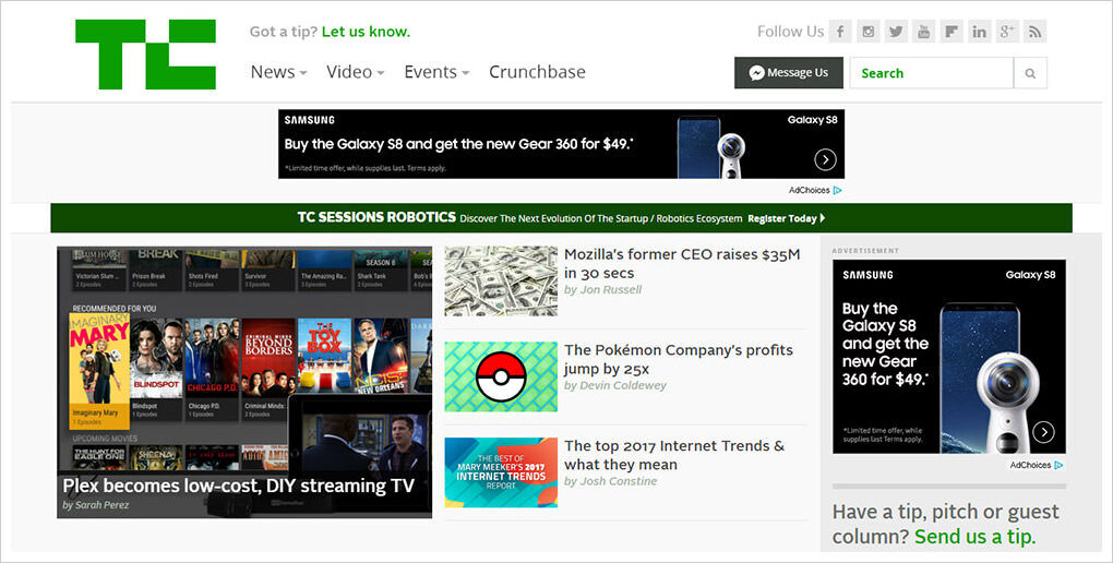
TechCrunch is a great example of something that was just a blog and over the years has scaled into a massive authority website. Their newest design reflects more of an online magazine, which builds a lot more trust in readers.

I encourage you to look around and study other websites in your niche. Study their color choices, typography, layout styles. See what works and what best conveys a sense of authority to the visitor.
Showcase client brands
One clear way to show you mean business is through other trusted third party brands. For instance, adding logos to your page tells the user that your company is trusted by other large companies—always a good sign.
This might be considered gaudy but it’s also a great way to convey trust right off the bat. If your homepage sells a service/application you’ll want to let visitors know that other big companies are happily using your product.
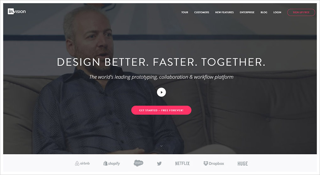
InVision has this on their homepage and it works very well. Almost everyone recognizes these brand logos at a glance. Twitter, Airbnb, Netflix, Dropbox, all very large companies relying on the InVision prototyping tool.

Notice these logos don’t need to be large or flashy. Most of the time they blend into the layout with a somewhat faded color scheme. This is perfect to draw some attention, without being too noticeable or obnoxious.
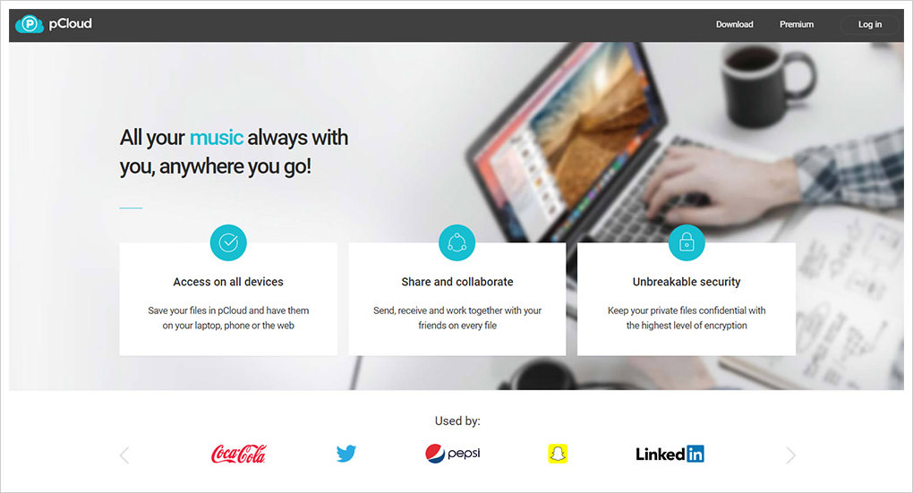
If you have a lot of brand logos you might even add a custom carousel rotator. You can see an example on the pCloud homepage. You’ll notice a small section labeled “used by” with two arrows to switch between corporate logos. These represent teams within the companies who use the pCloud security features.
People who don’t know about pCloud have no reason to trust this site. But, after seeing that Uber, Nike, Ikea, BMW, and Adobe all use this product, it may be worth testing them out.

User testimonials
People usually trust other people’s opinions. This is why testimonials are like a fast-acting glue to build trust with visitors quickly, even at a glance.
You can do testimonials however you want, such as direct quotes, video recordings, user ratings or something else entirely. The goal is just to have other people vouching for your service to build immediate trust.
Read Also: Get More Clients: How To Harness The Power of Testimonials
Spot Daycare does this with each individual daycare center. Each location includes a five-star rating feature, embedded alongside the main image which links out to Yelp reviews.
Because these reviews are from Yelp, they’re generally trustworthy. Anything that comes from a third-party looks like a genuine endorsement and it helps build trust with reluctant customers.

You still need to add these testimonials to the page without being obnoxious. I find the homepage is the best place to grab attention and you can nestle these testimonial widgets anywhere.
The Jazz HR homepage is really interesting because it uses client logos, along with user testimonials. When you’re looking at a glance, this immediately builds trust because there are so many reputable people clearly using this service. How could all of them be wrong?.
You’ll also see how each testimonial has a pithy header with 2-5 words, followed by an actual quote. This is another solid design technique to grab attention with shorter writing.

If you like this idea you could even try combining the client logos and the testimonials together, into one widget. Desk has this on their homepage and it’s a brilliant example of how far you can take this trend.
Just remember that people trust other people, so get testimonials that feel realistic and offer value to potential clients/customers.

Consistent brand design
If readers can grow familiar with your branding they’ll be far more likely to trust your website. A great brand makes your site feel more like a company. The information is then assumed far more trustworthy and you’ll get a lot of repeat visitors.
Take, for example, the design of AdEspresso. Most of their layout borrows colors and ideas from Facebook’s branding because the site is a direct Facebook advertising partner.
By keeping with this same branding across the whole site, it builds trust quickly. This design keeps you engaged and reading to see what the site actually offers.

Even if you’ve never heard of the AdEspresso brand in your life their site oozes a consistent theme and it all feels very trustworthy. The illustrations, the brand logos, the colors, everything.
You can also design your own branding with similar page elements such as icons and vector illustrations.
For instance, Skurt uses engaging graphics on their homepage to visualize the essence of their car booking business. These smart illustrations can work well to guide visitors through the features of the site.

Find whatever branding ideas work best for your site and try them out. Run split tests for different ideas to see which ones perform better than others.
There is no foolproof method of branding, so it’s mostly trial and error, with lots of user testing.
Professional UX work
The idea of “professional UX” may seem a little vague but it’s a crucial aspect of building trust. Your website should work just like all the other “trusted” websites online. This is why so many designers study other websites and restyle their layouts based on existing ones.
Search Google for websites similar to your own. What features do they have in common? How do they handle different page elements? Specifically, make note of these points:
- Navigation
- Header https://assets.hongkiat.com/uploads/designing-for-trust-add-elements-to-layouts/photos
- Heading/paragraph type
- CTA buttons
- Columns, grids, whitespace
By applying great UX, you can increase engagement and build more trust just by making a site that functions properly.
One great example is the TechTarget site that pops up for a lot of definitions when researching tech terms in Google. I don’t know much about the domain or the brand itself. However, their website design is exquisite and it breeds trust right from the first pageload.
This makes it seem far more like an authority with great content. It’s not just the typography or the colors or the branding. It’s the entire composition and how it all works together to create a trustworthy user experience.

Don’t try to reinvent the wheel with UX design. Instead, just follow whatever seems to work for others and put your own spin on it. Search the web and find well-designed websites. Make note of the features you like and why they work.
Over time, you’ll pick up some great design trends and you’ll learn how to replicate them properly.
Here are some galleries you can browse for design inspiration:
- One Page Love
- Landing Page Ninja
- CSS Winner
- Web Design Inspiration
Read Also: 5 Things Your Brand Must Have Besides A Logo
The post Designing For Trust: How to Add Elements of Trust to Your Layouts appeared first on Hongkiat.