The Web & design team at Canonical run two-week iterations building and maintaining all of the Canonical websites and product web interfaces. Here are some of the highlights of our completed work from this iteration.
Meet the team

Hey! My name is João and I’m a Senior Web Engineer on the Web Team.
Since I’ve joined Canonical about 3 years ago I’ve had the opportunity of contributing to a lot of different projects. Those include, maintaining our websites, working with other teams across the company to build dashboards that ship as part of our products, improving continuous integration pipelines and creating tools to improve development and QA experience on the team’s projects.
When I’m not doing any of the above, I would ideally be found traveling, trying out food, playing some tennis/padel or binge watching sports.
Web
The Web team develops and maintains most of Canonical’s sites like ubuntu.com, canonical.com and more.
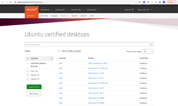
We made some UX improvements to https://ubuntu.com/certified. We have drastically reduced the number of filters on the search results page, now users can see the number of selected filters and the results have been separated into 5 views for each category: Desktops, Laptops, SoCs, Devices and Servers.

In this iteration some of the Web squad were working on a maintenance sprint where we tackled some of the tasks we don’t normally get time to work on. Firstly, we added sitemaps to some of our smaller sites such as microk8s.io and charmed-kubeflow.io to improve SEO.
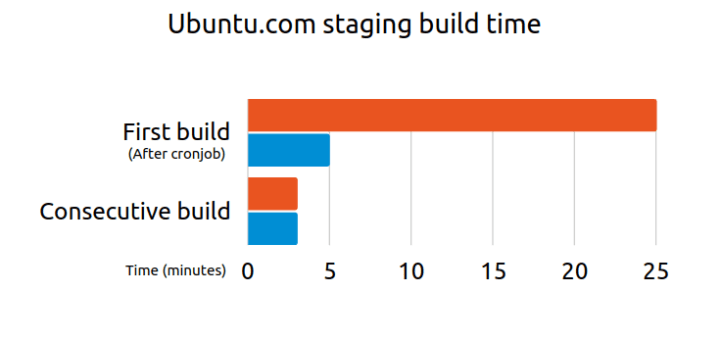
We improved the deployment times for our projects, thanks to keeping the docker cache for longer periods of time without wasting too much storage on it and using –production for npm:

We also worked on improving the way Ubuntu download mirrors are handled on our website, so we can test it better to avoid problems with broken mirrors in the future, especially around new Ubuntu releases.
We explored some ideas about how to improve the navigation on ubuntu.com. This included changing the information architecture, having clearer calls to action within the menu, using a ‘scent of information’ approach to navigation and having a standard pattern for navigation on topics.
Brand
The Brand team develop our design strategy and create the look and feel for the company across many touch-points, from web, documents, exhibitions, logos and video.
Tent cards
To support our participation at ROS CON JP, we were asked to create some Tent cards to be used at our booth because of the lack of physical brochures due to Covid-19 restrictions. The QR codes lead delegates through to the relevant content on ubuntu.com


Taipei office
We created the signage and booth graphics for our soon to be opened office in Taipei.


Accessible icon colours
We investigated the colours used in our warning icons and created a number of accessible versions that will be taken by the visual team and implemented into Vanilla in the coming iterations.


WSL logo presence
Further to our previous work, we created some rules and parameters around the use of our logos on Microsoft. We created a colour differentiation that users can follow to indicate which version of Ubuntu they have installed. The journey from search to install to UI is now much clearer.


Apps
The Apps team develops the UI for the MAAS project and the JAAS dashboard for the Juju project.
LXD authentication wrap up
This 2 weeks iteration, we’ve discovered another use case that LXD authentication plays a significant role in terms of security. This new use case involves creating a LXD machine as a power controller.

This image above is the form for when a user adds a machine. The process of adding machines allows you to add more than one type of machine at a time. Therefore, we don’t want to prevent people from adding machines at this stage. So we will bypass the authentication process but will provide an error in the machine listing page to inform users that it requires an additional step to get LXD to trust the certificate that is generated by MAAS.

When a user adds a LXD machine by allowing MAAS to generate a certificate as the authentication method, we will inform our users that there is some authentication error for that machine.

The machine summary will also show the error message and guide our users to fix this issue in the configuration tab.
In the configuration tab below, users will find all the relevant information about that LXD machine, the project it is associated with as well as the certificate and the private key. In order to get this MAAS generated certificate trusted by LXD, a user has 2 options. The first option is the most recommended option and more secure, which is to add the trust config using the LXD CLI. This step requires the user to download the certificate into the local machine and specify the file path in the LXD CLI. The second option is a less secure option, which is to use a trust password, generated via LXD CLI and add that password to MAAS. This will be an alternative way to establish the handshake between LXD and MAAS.

After finalising this use case, we have also worked on the final visual design for our UI. Once this gets implemented in MAAS UI, the authentication process between LXD and MAAS will be more secure. Stay tuned, for the next stable release!
Vanilla
The Vanilla team designs and maintains the design system and Vanilla framework library. They ensure a consistent style throughout web assets.
With the 2.34.0 release, several new patterns will be available:
Password toggle
This pattern gives users a simple way to check the password they’ve entered, should they wish to do so.

New tabs variant
We created a third variant of the tabs pattern, which is a lot more low profile, and designed to resemble Vanilla’s standard button pattern.
List icons update
A smaller addition, though one that has been repeatedly asked for, is the introduction of a list item with a cross icon, to contrast the existing ticked list item. This update also changes the default colour of the ticked list item from orange to green.

Preparations for Vanilla 3.0
We started preparations to release a new major version of Vanilla later this year. The first part of this work was removing the use of node-sass to build our SASS stylesheets and move to the currently recommended Dart implementation. This allowed us to clean up some incompatibilities between the two, and make Vanilla more future-proof for improvements in the SASS language.
Marketplace
The Marketplace team works closely with the Store team to develop and maintain the Snap Store site and the upcoming Charmhub site.

We have been working on the user experience of a Stared developer with agreed specifications.
We are ready to work on visual finishes.
We’ve been working on some back end maintenance and enjoyed some holiday! ?
With ? from Canonical web team.
Follow us on Instagram and on Twitter