The people who use the web are not a homogeneous mass but rather a huge group with incredibly high diversity. Many of them are not native English, or highly educated city dwellers with excellent health conditions. When we design for the public we need to pay attention to this fact; otherwise, we miss out on many potential users, as well as a great possibility to boost the search engine rankings of a site.
Universality and inclusivity are in the focus of the Accessibility web standards that are one of W3C’s web design related standards. The final goal of the Web Accessiblity Initiative (WAI) is to design a web that works “for all people, whatever their hardware, software, language, culture, location, or physical or mental ability”.
When we think about accessibility the most important thing we need to understand is that a user doesn’t need to have full loss of a sense or an ability to be in need for accessibility support. People who have problems such as partial sight loss, or mild hearing impairment also have acessibility needs.
Now let’s see who are the main groups, how they use the web and how the careful designer can improve their user experience.
Visual Impairments
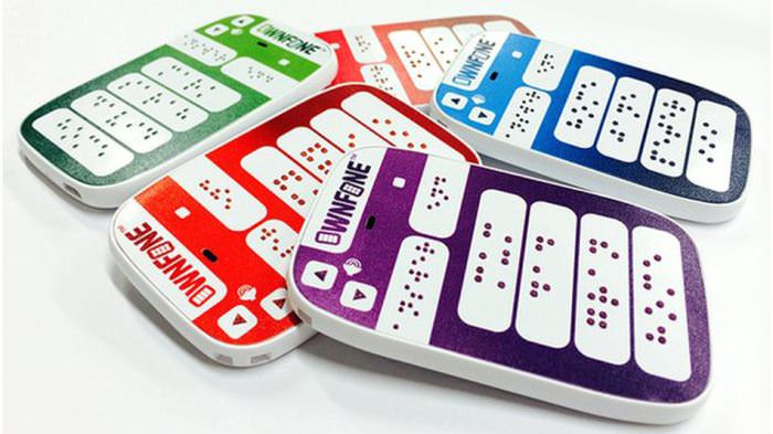
People in this group can have mild or moderate vision impairments in one or both eyes, colour blindness, low vision, blindness or deaf-blindness
In many cases there is a need to change the presentation of the web content to adapt it to their needs. They require the ability to resize text size and images, and to customize fonts, colours, and spacing to increase readability. It’s also a good idea to ensure that people who can’t see the mouse-pointer can navigate through the content using only their keyboards.
Many visually disabled people use screen readers that only work properly if the frontend is semantically coded, otherwise their special assistive softwares can’t identify the structure of the web page and users would hardly be able to make sense of the content.
We need to provide these pages with proper descriptions for hyperlinks, icons, images, and other media types with the help of explanatory alt and title HTML attributes. The rule of thumb here is to make an equivalent text alternative available for each non-textual element.

It’s also important not to stop users from configuring their own browser settings, so if it’s possible, specify everything in relative units (ems, rems, or percentages) instead of exact sizes.
In fact, the bots of Google and other search engines can also be thought of as visually disabled agents, and keep in mind that everything that is good for visually impaired humans also pleases the bots thereby improving the SEO ranking of a site.
Auditory Disabilities
Web users who suffer from hearing impairments of different grades can’t always understand speech, especially when there is a background noise. The most frequent use case here is video content, that needs to be made accessible by adding visual assistance to the audio part.
According to the Media Access Group of the WGBH Radio “an estimated 24 million Americans have enough of a hearing loss that they cannot fully understand the meaning of a television program”.
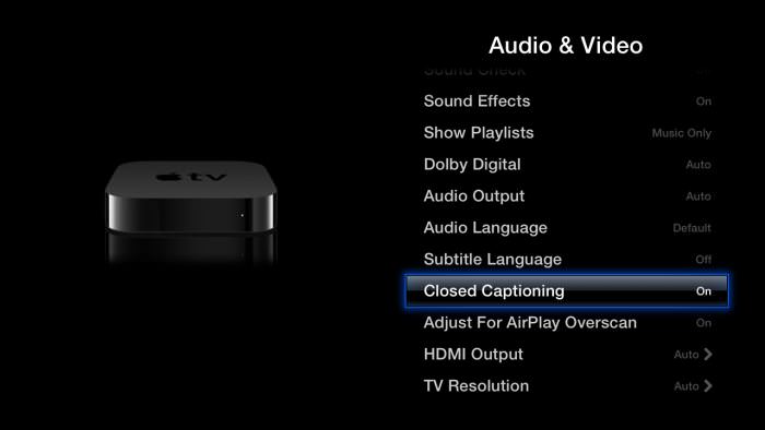
Using closed captioning in which background noises such as music or explosions are also captioned can help them a lot. Providing options for captions and transcripts can also significantly improve the experience of people who are not native speakers of the recorded language.
We also need to be careful when designing web and mobile apps. If users have to rely solely on interactions using voice, people with auditory disabilities or those without proper audio hardware or software will be excluded from the usage.
App designers also need to pay attention to always adding options to stop, pause, or adjust the volume. Apple TV is an excellent example of a device designed with the deaf and hard of hearing in mind, as it provides them with a nice user interface to customize subtitles and captions to their individual needs.

Cognitive and Neurological Disabilities
Disorders related to the brain or the peripheral nervous system impact how people move, see, hear and understand things. There are many people who need to process information slower than others, so we need to provide them with clearly structured content that facilitates orientation.
It can also help if we offer different ways of navigation: not only one huge dropdown menu, but also tag clouds, search option, breadcrumbs, and other smart and easy-to-understand solutions.
Enhancing the content with visual cues is crucial when we want to enable people with cognitive and neurological disabilities to understand the information we want to convey to them. Images, graphs, illustrations, and smart typography such as avoiding long paragraphs can do a lot for them.
Reducing the number of distractions like flashing or blinking ads and annoying popups can keep many of them on our sites, just think about those with ADHD (attention deficit hyperactivity disorder) or autism.
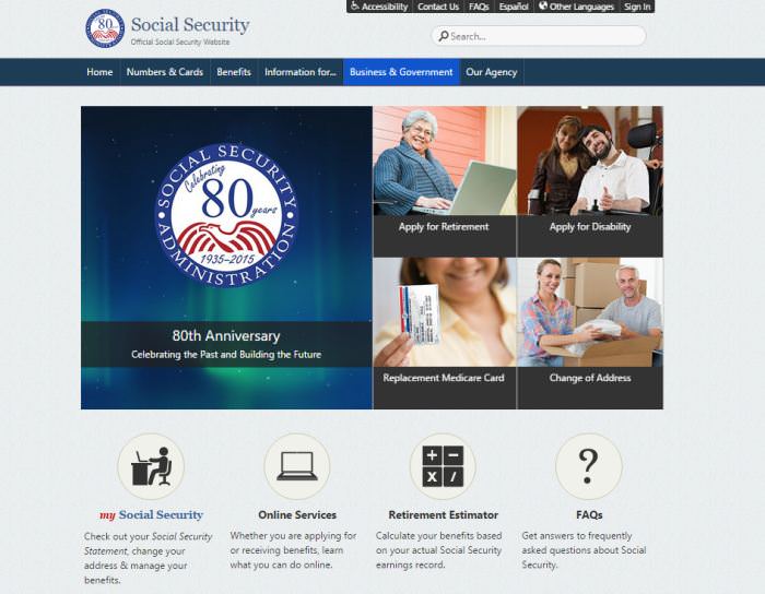
If you want to see an example of carefully designed, logically structured content with accessible navigation and descriptive visual cues, take a look at the U.S. government’s Social Security Administration site.

Physical Disabilities
Physically disabled people can have motor disorders, limitations of sensations or muscular control, joint problems, missing limbs, and can face many other physical impediments.
Probably the most important thing related to them is always providing full keyboard support, and giving enough time for them to complete tasks such as filling online forms, replying to questions or editing their previous content in comment sections.
Offering keyboard shortcuts, especially on touch-enabled devices can be godsend for this group.
Physically disabled people can face with difficulties when clicking small areas, so we always need to make sure that we design large enough, clickable areas like buttons.
It’s also important to keep in mind that many of them use assistive hardware or software. They can access the content with the help of an on-screen keyboard navigated through with a trackball, or they can use voice recognition or eye-tracking softwares.
Because of this, just like in the previous cases, it’s crucial to build logical, coherent navigation and a well-structured site without too many distractions.

Conclusion
Creating web experiences for disabled people is an excellent design practice. If we build a site that takes the needs of the sensory impaired into consideration, we design a product that is logical, well-structured and easy-to-use. This is not only good for the disabled, but for every single user, as they have the same need for an intuitive and customizable website that is easy to understand.
If we give users a choice about how they want to consume the online content, and carefully think about all the possibilities they might interact with our site, we increase the overall user experience of our design in a significant way.
Now Read: 10 Assistive Tech for People With Disabilities

The post Designing For People With Accessibility Needs appeared first on Hongkiat.