Whether you’re promoting or reviewing a product, service, website, course — or anything on WordPress, testimonials can be a key ingredient to help generate buzz.
A firsthand account of something is a great selling point on why a person should use it.
To really make them stand out, consider using creative testimonials that are memorable!
There are so many ways you can be creative with testimonials on a website nowadays, thanks to plugins. So, there’s no need to rely on antiquated full-page layouts of testimonial after testimonial, inconsistently written or designed.
Plus, there’s also the minimalism factor to think about. How efficient or attractive is it to dedicate a full page to testimonials?
There are many great examples of companies displaying testimonials on their websites in fun, new, and exciting ways.
In this article, we’ll take a look at 11 examples to handle testimonial pages, banners, and callouts in creatively different ways.
Hopefully, you’ll get a great idea of what may work best for your WordPress site to help build trust with potential users.
11 Creative Testimonial Examples You’ll Want to Implement
Social proof is a must these days. If you want visitors to trust you, then you need to give them solid proof of it. There’s no better way to do that than by showing them what others have to say.
If the rave reviews are starting to roll in about your business and you want a cool way to add them to your site, then check out these testimonial examples for inspiration.
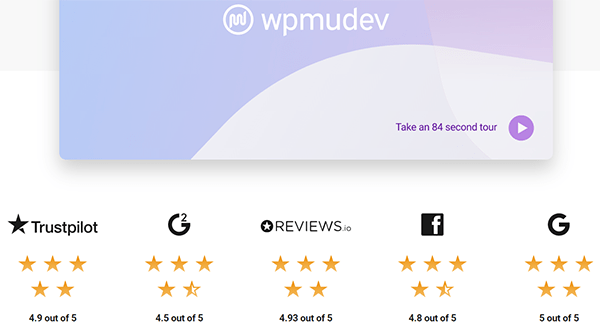
1. Show Your Overall Ratings From Different Trusted Sources

Showcasing your overall ratings from different trusted review sites like Trustpilot, Reviews.io, G2, Google, Facebook, Yelp, Sitejabber, etc. will instantly boost your credibility.
You can pack even more social proof punch by backing this up with client testimonials sourced from those sites.
Knock’em out with a one-two combination of ratings and testimonials on your site.
On a similar vein…
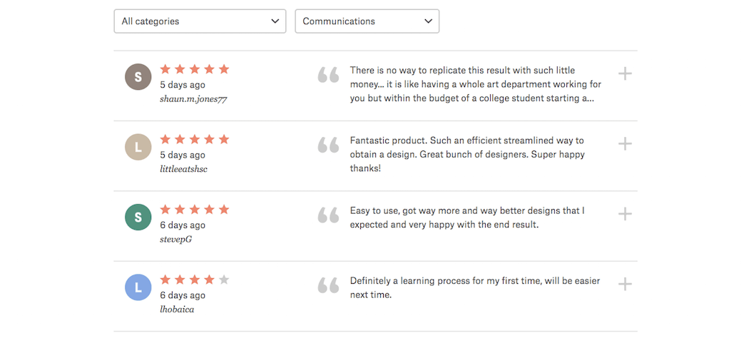
2. Testimonials with Ratings

Who’s to say that a service can’t be rated the same way a product can?
99Designs happens to have a volume of clients and a particular service that works really well with this format. This makes it much easier for companies or individuals interested in using 99Designs’ services to find out what other people think much more quickly than if they were to take the time to read through dozens of testimonials.
3. Testimonials with a Face to the Name

If you scroll down a bit on the home page of the Fusebox website, you’ll run into plenty of testimonials you can scroll through.
Fusebox has included photos of each customer and a testimonial that encapsulates the excitement of why they love Fusebox. It’s a great way to show real people that love the product. Putting a face to a positive experience is a win.
4. Testimonials on Instagram

Blue Apron had taken a smart approach in how they display customer testimonials by currently posting regular testimonials on their social media. Seeing how other customers would love to see what others have been able to cook up using Blue Apron’s services, they’ve compiled customer testimonials and snapshots of the resulting meals from Instagram.
You can use a plugin, such as Social Feed Gallery to help if you’d like to incorporate testimonials on your WordPress site directly from Instagram.
5. Optional Testimonial Highlight Reel

While each of the customer testimonials on ChowNow’s website is video testimonials, they’ve also gone through and pulled out the strongest quotes from each.
So, if prospective customers want a “highlight reel” of what others are saying, all they have to do is scan through the snippets on the page. It’s similar to the service ChowNow provides to its customers: it’s a quick and very convenient approach.
6. Simple and Straight-to-the-Point Scroller

Fourlane’s scrolling testimonials are straightforward in execution but well done all the same. The scroller appears in the middle of the home page, but it doesn’t get lost in the shuffle since it automatically slides.
7. Video Background Testimonial

Now, here is an interesting way to add a video background to your website. Because the Marie Forleo B-School is a video-based training program, it makes sense that they’d rely heavily on video throughout their site.
In the case of their testimonials, they’ve put a video background of the testimonial reel on the B-School page with a quote laid on top. You can then click through to watch the video that compiles all their stories and testimonials into one place.
8. Celebrity Testimonial

Marucci Sports website includes a testimonial from David Ortiz, or “Big Papi” as Red Sox fans know him.
There are other ballplayers throughout the rest of the site, that include video testimonials and articles about why they love Marucci Sports. The only difference is that the text in this one is a celebrity endorsement.
9. Original, Yet Modern Design

Phocas’ page of customer testimonials is beautifully designed. There’s the modern masonry layout, the great use of their brand color throughout, and the strategic use of bolded text to call out important snippets from each testimonial.
10. Clean, Consistent Layout

The Zapier home page includes a short section dedicated to customer testimonials. It’s clean, clear, and consistently designed to make readers think, “Why not stop and read this?”
You can also tell that each quote was carefully trimmed down to really get to the core of each customer’s benefits from the service.
11. Case Study Testimonial Callouts

It’s clear that Zendesk has gone to great lengths to create a comprehensive set of case studies from clients, big and small. It’s actually quite a testament to the quality of their product that they’ve worked with so many well-known brands and helped each of them succeed in their goals.
That said, visitors probably won’t take the time to click through every single one of the dozens of case studies that appear here. What they can do instead is look at the big-name testimonial callouts that are thrown into the mix.
Putting Testimonials to the Test
While each of the examples above paints a variety of creative scenarios worth exploring for your site, they wouldn’t be worth looking at if they didn’t have high-quality testimonials to show off in the first place. So, keep in mind the following tips when you go about gathering testimonials for your freelance business and putting them to the test:
- There are a variety of ways to get customer testimonials. You can ask for them (by email or survey), listen for them (in calls or correspondence with your clients), or look for them (on social media or review sites).
- Keep the testimonials short—ideally, no more than four or five sentences.
- Make sure the testimonials are direct. Sharing someone’s “Well done!” praise is nice but doesn’t really let others know what specifically you did or what the results were that merited such feedback.
- Include statistics when possible (like if your client reported a 10% lift in traffic after a rebrand).
- Make them authentic. In other words, feel free to clean up the quote for readability and make it sound like the testimonial came from an actual person (because it did).
- Include as many descriptors about the client giving the testimonial as possible; at the very least, a name, title, and company. Photos of the client or logos of their company are even better.
- Consider grouping testimonials based on the service or product they describe. Then place them on related pages.
We’re no longer in a position where we can rely on word-of-mouth marketing to grow our client bases organically.
With everyone flocking to the Internet to see what other people have said about your company, it’d be wise to work on collecting testimonials yourself and publishing them to your WordPress site. This way, prospective customers won’t have to wander around on Google, Yelp, or social media to find out more about your services or merchandise.
Also, consider adding reviews for your site with the help of a theme or plugin. Plus, you can make sure it goes flawlessly to add reviews the right way to your WordPress site.
Source: wpmudev.com