
Whether you’re looking to build your first website or are planning to revamp your existing domain, you likely want greater traffic, better leads, and more sales. Fortunately, this is a popular enough goal that there are some brilliant ideas floating around about how to increase conversions for your website. Simple design, clean navigation, effective use of color, optimized landing pages, crisp product descriptions and SEO, and page loading speed are all areas you can fine-tune – and you just might notice a boost in your profits.
Keep It Simple

Image: Landing page optimization checklist by Acquire Convert
Every suggestion in this checklist hinges on this principle: understand users’ intent, and give it to them immediately. In this sense, everything on your page should be purposeful and simple. This starts with understanding your customers: what are their values and pain points? How are your services a solution for those issues? What do you do differently that makes your services better than anyone else’s? Working with this user profile, keep your page simple in the following ways:
- Build a cohesive, clear value proposition. Starting with your brand image, infuse your purpose with unified landing pages, keywords, and product descriptions. Never give patrons room to get lost or confused about the services you provide or how they’re the best possible solution for your clientele.
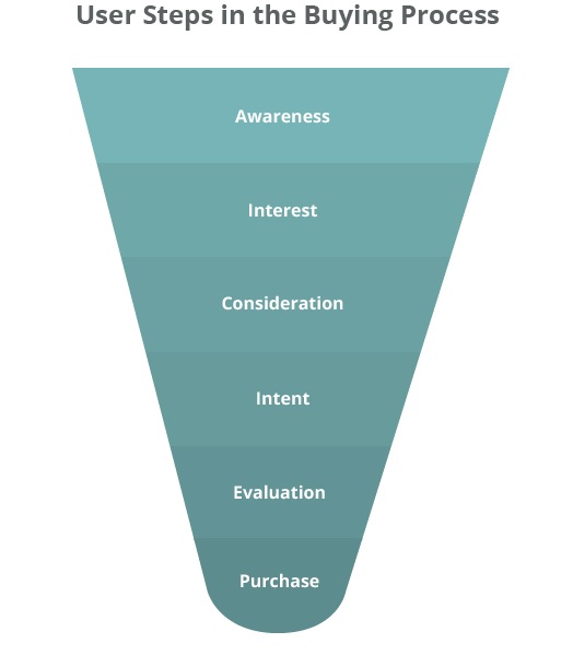
- Move your customers through the pipeline seamlessly. Every piece of your site design should move clients forward. The moment they need to know information or contact your business, they should find it. Don’t give them a chance to abandon their orders by keeping your pages simple and helpful.
Simple does not necessarily mean basic; rather, it means connecting users with what they want without putting anything unnecessary in their paths. This ensures they progress smoothly through your site and stay as undistracted as possible up through the checkout process.
Easy Navigation
Start by designing an easy-to-navigate page. Make sure content is easily understandable, avoid walls of text, and give readers the information they need immediately. Effective navigation can be accomplished with intentional and consistent color choices, such as a specific color for checkout buttons and an uncluttered menu. Shoppers should never spend more than a few seconds looking for tabs like FAQs, Contact Us, or Subscribe/Unsubscribe pages. If users are left in confusion for even a second, you risk them leaving your page for a competitor’s.
A World of Color

Image: The Logo Company
Restaurants use color to work up their consumer’s appetites; sports teams use color to get into their opponent’s heads; and websites use color to drive conversions. Color is a persuasive force, and it’s important to use it to your advantage. Certain hues can equate to political or social ideas, target different genders and age groups, and more. Again, the key is being deliberate; don’t just throw out a color because it looks nice. Understand the psychology of color, and use it to add cohesion between your brand, its products and services, and your website.
For example, put some contrast on your buttons to encourage a click (i.e., don’t use a green button on page where green is already a dominant color). If you’re targeting an older demographic, use muted, predictable colors rather than bright neons. This kind of coding reinforces what the client already knows or is searching for about your product, and it reduces the time he or she may spend looking for more information or where to go next.
Landing Pages with a Purpose
Getting a shopper to go from a search engine to a landing page is difficult enough. Now keep them by focusing on the action you want the user to perform. If the landing page is for a product, make sure the description is understandable and easy to read, and triple check that purchasing information and options are easy to find and use. Errors here can dramatically affect a company’s conversion rate.
Avoid jargon, start with the information the user clicked to find, and if you’re investing in paid traffic, make sure it gets to a specific product page. As much as possible, understand user intent, and direct them to the exact landing pages they’re looking for.
Functional Product Descriptions, Keywords and SEO
Keywords and product descriptions are only successful if you understand the customer. With knowledge of your patrons in hand, tailor product descriptions and keywords to your pages. When a customer clicks through on your site, he or she will be connected directly to a well-designed page clearly featuring the item or keyword he or she was searching for. Streamline this process. Make the information readily apparent and easily understood, and move your customers closer to a successful checkout.
Fast Page Loading
Online shoppers aren’t the patient type. At any point in the conversion process, a page-load delay greater than a few seconds will send them packing. Simple design pays off here, as well. Keep the checkout process lean by defaulting on the cheapest shipping options, this will increase traffic and sales, making it easier for returning shoppers to click through.
Pages that load quickly also have better SEO.
Analyze and Improve
With these best practices in place, your website is poised for more traffic and a better conversion rate. The “last” step is to see how effective these changes are, and if something’s not stacking up, revise until it works. Use tools like Google Analytics to see where clients are coming from, assess your bounce rate, and track your time to convert. These areas can point to problems where clients are getting hung up and turning around, or areas you can smooth out to keep buyers from abandoning their shopping carts. With this information in hand, greater sales simply amount to improving your site bit by bit.
The post Sluggish Sales? 7 Things that May Drive Traffic to Your Website first appeared on Web Design & Digital Marketing Tips.