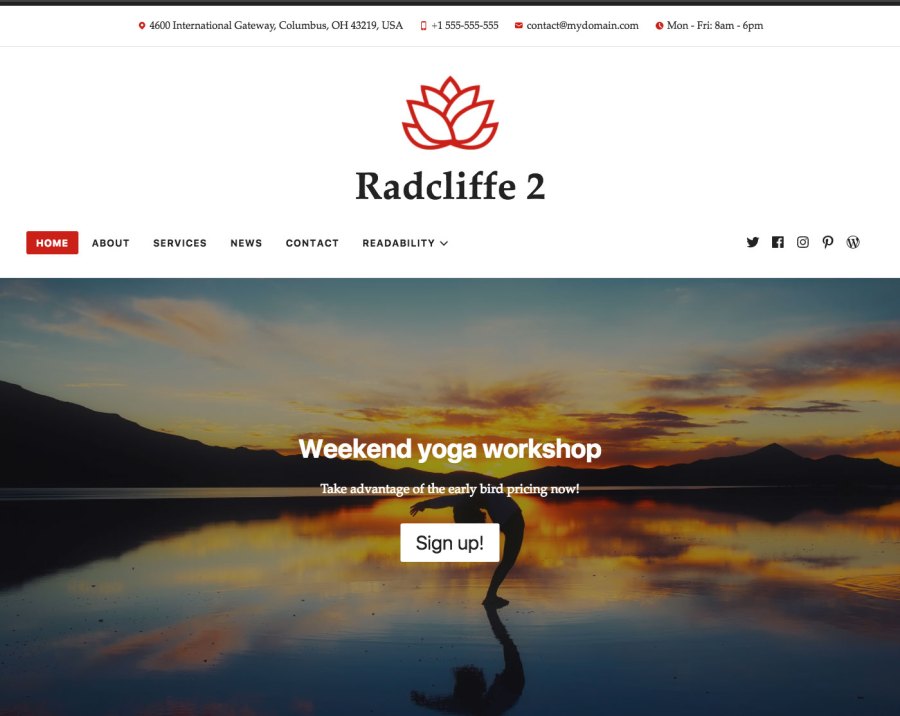
Today we’re happy to introduce Radcliffe 2, a refreshed version of a tried-and-true WordPress theme. We’ve optimized it for speed, and added new features specifically with small-business websites in mind.

Radcliffe 2 was a collaborative effort by several members of WordPress.com’s Theme Team. We wanted to update the popular theme for a more mobile-centric landscape, and to add new features that our small-business customers need.
Some specific design considerations for mobile include:
Standard fonts: Radcliffe 2 uses system fonts — fonts that are already available on computers and mobile devices — rather than loading its own custom fonts. This reduces page-load time, since sites no longer have to load special font files, and benefits people browsing your site on mobile devices. Like with other WordPress.com themes, the fonts can be changed using the Customizer.
No sidebar: For a more consistent experience between desktop and mobile screens, Radcliffe 2 has a single-column, no-sidebar layout. This helps sites retain the same look and feel, regardless of the device used to load it.
We’ve tailored Radcliffe 2’s other major features for small-business sites:
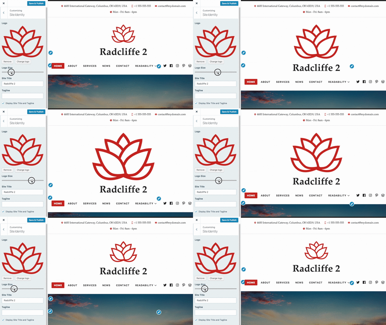
Logo Resizer: For a perfect fit, increase or decrease the size of your logo.

Style Packs: Looking for a different feel for your site? Style Packs allow you to customize your design to match your brand in seconds. Check out Modern Bauhaus, Vintage Paper, or the Upbeat Pop Style Pack options! Each pack includes unique colors and fonts that create a cohesive style.


Contact Information: This is an easy way to display your phone number, email address, physical address, and hours of operation in your website’s header or footer. Mobile visitors can simply tap on your number to directly call your business’s phone.
Featured Prompt: Create an eye-catching area with text, a linked button, and a background image to draw visitors to a specific area of your site.
You can learn more about Radcliffe 2 by reading the Theme Showcase documentation, checking out the demo, or trying it out on your own site!

The original Radcliffe was released almost four years ago by Anders Norén, a prolific and talented themer.
Chatting with Anders about his theme, it’s clear we can credit Radcliffe’s bold images and typography to its predecessors. “Radcliffe was my fourth free WordPress theme,” says Anders. “The previous three, Lingonberry, Hemingway, and Wilson, are all pretty traditional blog themes with a thin content column and (in the case of Hemingway and Wilson) a sidebar with widgets. I wanted to do something a bit different with Radcliffe. Something that used the full width of the screen for people who want their images to take up more space.”

The original Radcliffe theme.
The result was a theme that balanced eye-catching featured images with a deft treatment of the written word.
Anders’s passion for creating free WordPress themes, originally a hobby, led to his career in web design. He notes that while technology and WordPress have changed, some things haven’t.
“The basic tenets of what makes a WordPress theme — and a website — great are still pretty much the same. Accessibility, a good layout, thought-through typography, smart functionality, and a couple of small, user-experience enhancing flourishes here and there.”
His design process has evolved too, but the core purpose of why he creates remains. “I start in whatever end I have in my head and pull on that thread to see how long it goes,” he says. “If the single view comes first, I try to get a feel for how the archive view would fit together with it, and vice versa. The rest grows from there. It’s not a very structured approach, I’ll admit. And that’s the best part about releasing themes for free. The only requirement I’ve set for myself is that I have fun doing it.”