The appropriate use of color in web design could be the difference between drawing visitors in and inadvertently shooing them away. Studies done on color psychology show a correlation between color and mood, giving some shades a unique power over others. Designers can use this information to create brand recognition and bring attention to certain elements of a page. These design strategies can thus increase conversions if used appropriately.
The Basics of Color Psychology
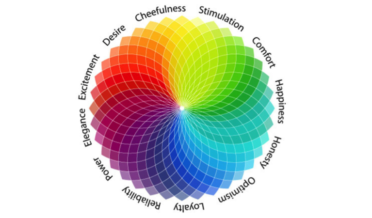
The human brain associates color with different emotions that can manipulate the way decisions are made. A study done at the University of Winnipeg shows that 62 to 90 percent of product judgments are based solely on color. Another study from Color Research and Application shows that colors can help differentiate a brand from its competition.
These statistics demonstrate how companies can harness the power of color to enhance statements and increase brand recognition. Although color associations do depend somewhat on personal experiences, there are some ubiquitous affiliations with different shades.
The Meaning of Different Colors in Design
Color associations can help web designers determine what shades they will use in their palates. Certain colors may create feelings that companies do not want associated with their brands, and overuse of brighter shades can ward off visitors. Conversely, choosing the right colors could boost engagement and make for a memorable look.
Red
The color red evokes feelings of excitement and alertness. It activates energy to encourage participation and draw attention. It can be associated with danger, such as a red stop light, emergency exit, or warning sign. Red is also used to promote fiery passion and feelings of lust or desire. Using red can make a bold statement, but overuse can look tacky.
Orange
A slight step away from the intensity of red, orange grabs attention and promotes vibrancy with an added touch of warmth. Tasteful use of orange accents fosters friendliness and cheer. Many tech companies use orange, as do companies with products geared toward children.
Yellow
Like a bright burst of sunshine, yellow arouses happiness and optimism. Yellow has the warmth of red and orange without the extreme boldness. Yellow can be hard on the eyes, so it is best used as an accent. Lighter shades are good for children’s products, and richer gold-like or mustard shades can add a retro feel.
Green
Bridging the gap between the warm colors and the cool colors, green stimulates peacefulness and relaxation. Green is the color most closely associated with nature, and therefore is good to use for eco-tourism, health products, or environmentally friendly companies. Lighter shades of green bring up thoughts of growth and youthfulness, while darker shades are linked to money and sophistication. Highly saturated greens can create a futuristic feel, and subdued olive tones are affiliated with the military.
Blue
For a soothing, calming effect, blue is the way to go. Blue also encourages trustworthiness, security, and dependability, which is why pharmaceutical companies, insurance agencies, and banks tend to incorporate blue in their logos. You should not use blue to promote food, however. It is suggested that, evolutionarily, the human brain associates blue with poison and therefore suppresses appetites.
Purple
If you are going for opulence and luxury, incorporating purple into your logo or website design is ideal. Traditionally, purple is affiliated with royalty and wisdom. Purple is a combination of the soothing powers of blue and the vibrant energy of red, making it a stimulating color for creative thought and problem-solving. Certain aspects of spirituality can be associated with purple, making it a good choice for yoga, meditation, and femininity.
Pink
For many years, pink was associated with young girls and playful romance, making it a natural choice for businesses with a female target market. Although pink makes an item easily identifiable as a product for women, many women do not actually prefer pink to other colors. Magentas and hot pinks are common in candy coatings and cake icing, so pink can bring up sensations of sweetness.
Black
When combined with sleek contours and high-quality materials, black elicits glamor and exclusivity. Black is timeless and versatile. It makes for a great contrast against practically any other color. Certain color combinations, such as black and red or black and green, can make for a gothic, wicked feeling.
White
White is the absence of color. Simplicity, minimalism, and balance can be promoted when an abundance of white is used in a design. Using white space as a design feature is popular in modern websites and helps keep text looking neat.
Using Color to Increase Conversions

If you are creating a new website or considering a website redesign, you should use the theories of color psychology when picking colors. You can employ this insight into the inner workings of the human mind to promote desired feelings and guide users to certain actions, which can help increase conversion rates.
Match Color Associations with Brand Personality
Knowing what feelings most people associate with particular colors is a useful tool when developing a brand. Consider the primary emotions that you want to elicit when people hear your brand name.
Should consumers feel excited about what you have to offer? Is instilling loyalty and competence more important to you? Would you rather evoke a sense of luxury and sophistication? Ask yourself these questions to pinpoint what personality you want to convey before landing on a color palate. If site visitors can vibe with the feeling of your site’s colors, they are likely to continue on and engage with the site’s features.
Create Your Own Color Associations for Information-Heavy Sites
Users tend to abandon sites that are difficult to navigate. If your site is dense with information, try organizing the information into logical categories and giving each category a color association. Maybe you have several different product lines to highlight or programs to introduce or explain. Much like a binder with colored tabs, utilizing color psychology to differentiate between pages can create a more organized, user-friendly design to keep visitors interested.
Use Contrast to Increase Readability
Most people will not read the full text of a page at first glance, but they are especially unlikely to read text that is not adequately contrasted with its background. Typically, you should stray away from lighter colors for text for this reason.
Yellows and pastels are hard to distinguish and will not jump out at the reader. The classic white background with black text is ideal for lengthy copy as this is the strongest contrast. Call-to-action buttons or navigation bars may have more-vibrant colors to guide the users’ eyes. Consider outlining the letters with a color that starkly contrasts with the background to make the words pop out. The more readable a page is, the more likely it is for a visitor to take the time to sift through it.
Add Bold Details to Draw Attention
You can use a combination of color psychology and design elements to pull in site visitors and lead them to a desired action. Call-to-action buttons are a prime example of this. Using a design element such as rule of thirds with a color that creates a sense of urgency such as red or orange can draw attention right to the button. Highly contrasted leading lines can have the effect of guiding a user’s sight right to a point on the page. Think about not only what the colors say, but also how their interactions with the design influence user decisions.
Color psychology is not a full-proof method of branding, but basic color associations have been proven to work time and time again. Choose a color that is right for your brand to attract your target audience and make a memorable statement. Appropriate use of chosen colors against other colors and design elements can encourage interactions and boost conversion rates.
The post The Right Mindset: Capitalize on Color to Increase Conversions first appeared on Web Design & Digital Marketing Tips.

