With the introduction of the Block editor, the WordPress.com Classic Editor was set for retirement at the beginning of June. We pushed that back a bit to make time for more changes that ease the transition to the Block editor — and now it’s time!
The WordPress editor empowers you to create pages and posts by layering multiple blocks on top of each other. It’s versatile, intuitive, and boasts exciting new features, including:
- Over 100 content blocks available for publishing.
- A growing collection of block patterns.
- Dozens of beautiful built-in page templates.
- Styles you can customize directly within the editor.
If you’d rather stick with the Classic editor experience — the one you used before we introduced the WordPress.com editor a few years ago — no worries. With the new and improved Classic block, you have the best of both editors: the flexibility and stability of the Block editor, and the Classic editor interface you know.
From August 11 on all WordPress.com accounts will start to switch from Classic editor to the new Block editor. It will happen in phases, and you’ll get an email to let you know to expect the change.
Here’s what you need to know if you’re a fan of the Classic editor experience.
Why the change?
There are exciting new features in the pipeline that require the new WordPress editor. It’s not technically possible to retrofit them into the older, Classic editor, and we want to make sure everyone can take advantage of them as they become available. With all WordPress.com users publishing with the Block editor, all WordPress.com users always have the latest and greatest.
Can I create simple blog posts the way I always have?
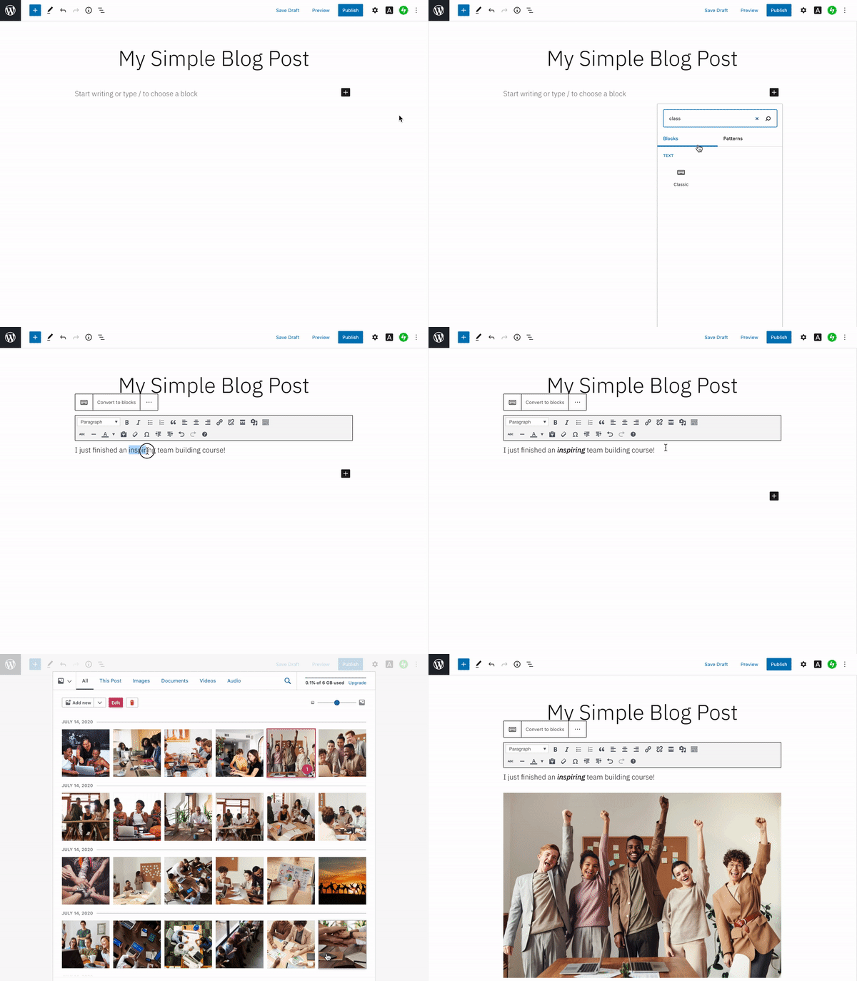
Yes, with the Classic block! It provides an editing experience that mimics the Classic editor — the same options and tools, in the same spot.

To use it, add a Classic block to your post or page, then add and edit both text and media right inside it.
Also ….
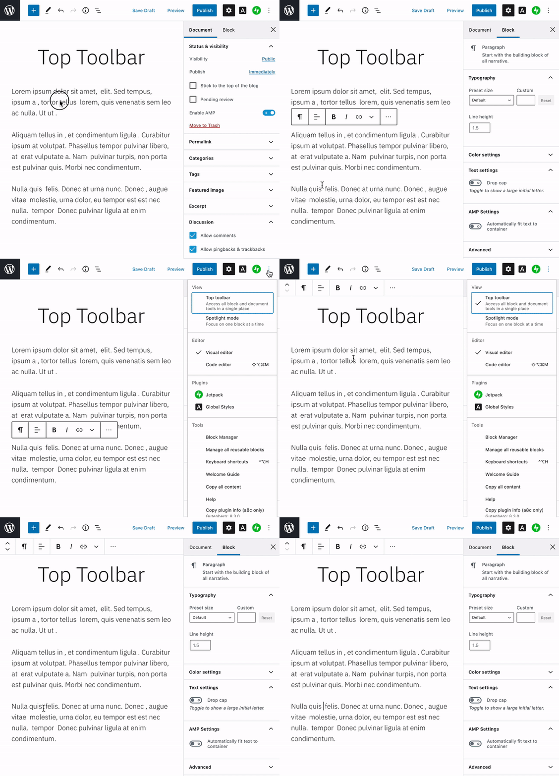
The Block editor has updates to bring in some of your favorite classic features, like a clean editing screen. The Block editor displays pop-up options and menus as you type — they give you lots of control, but you might not always want them visible over your content. Turn on Top toolbar mode to keep them pinned to the top of the screen. It’s a great way to experience the full flexibility of the block editor while still allowing distraction-free writing.

What about editing posts and pages already created in the Classic editor?
Many of you have lots of pages and posts already created and published with the Classic editor. Previously, editing them in the Block editor led to a lot of prompts asking you to convert the content to blocks. Now there’s a single “Convert to blocks” menu item to take care of it in one go.

You can use this button to upgrade your posts and pages to block-based content at your leisure.
Can I combine the Classic block with other blocks?
For the best editing experience, particularly if you use the mobile app to edit your posts, we recommend just having a single Classic block on each post or page.
But, moving everyone to the block editor gives you the best of both worlds. You can continue writing and editing some of your posts with the simple Classic interface — but when you want to experiment with more complex layouts and functionality you can create a new post and play with the power and flexibility of all the other blocks on offer. For example, have you ever wanted an easy way to show off your favorite podcast?

Look out for the email letting you know when to expect the Block editor switch! In there meantime, learn more about working with the Block editor and the Classic block.