Which are two of the most popular page builders for WordPress? If you’re searching for a Beaver Builder vs Elementor comparison, you already know, these are two of the best products out there! As an end user who wants to be able to design your own website yourself, we’re sure you know that these plugins are among your best choices among the many options available out there.
However, there are some differences which you need to know about before you make your choice. Both of these products have their own nuances which you need to know about before you decide.
Because, once you make a decision, you’re mostly in it for the long-haul, there’s (almost) no going back. Making the right choice is critical!
You need to make sure that you pick the right one for your needs and preferences.
If you created pages using any page builder and you decide you remove it, your content will be preserved but you will end up with a messy layout along with shortcodes scattered all over the place. It can be very tedious and time-consuming to rebuild everything again.
To make sure you make the right choice, we’re going to walk through the features of both plugins and compare them so that you can make the right and perfect choice.
This article has been updated in
adding relevant and important information and updates as new features are developed and released to both products. You can rest assured that this article contains the latest, unbiased information.
But you might have a question in your mind right now.
If using a page builder makes your site dependent on it, why use one at all? Let’s discuss that quickly in the next section. If you’re eager to jump-start the comparison, you can skip ahead to the Elementor vs Beaver Builder sections.
What is a Page Builder?
Page builders promise to make designing your website a lot easier and less complicated. In essence, these tools ensure that you don’t need any technical knowledge when it comes to such stuff as HTML, CSS or JavaScript.
Their promise is to allow you to build and design pages that look exactly (or at least as close as possible) as you’ve envisioned it, without having to mess around with any code.
This is contrary to what used to be the norm up to a few years ago, where being a programmer, or at least having good knowledge of web technology was essential to develop a website!
With the advent of these solutions, the need to hire web developers seemed to have become an absurd idea or an unnecessary thing. However, this is not true. Web developers and designers are still the best choices for fully custom solutions, but that is not to say that page builders are unnecessary. Both of them have their own use cases.
The bottom line is that Web Designers and Page Builders will continue to co-exist until probably the end of time. In fact, some developers and designers even make use of page builders to build websites for their clients.
There are many articles, discussions, and debates online regarding this topic if you want to delve deeper about the differences between hiring web designers vs using a page builder.
Because the focus of this article is about Beaver Builder vs Elementor, we’re going to talk a bit about why you’d want to use a page builder instead of hiring a professional web designer.
Why Use One at All?
There are many reasons why you’d want to use a page builder.
A Complete Package
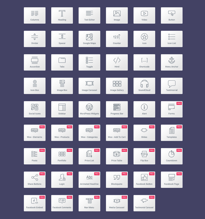
First of all, page builders are like an “all-in-one” plugin. They have buttons, slideshows, contact forms, galleries, content grids, social sharing buttons, etc. in one package. If you don’t use a page builder, you’d have to install multiple plugins instead. One for social sharing buttons, one for slideshows, etc.
You might have to install a lot of them. Then, if you decide to go for the premium plugins, license fees pile up.
And then there’s the trouble of researching which one is the best along with the maintenance work that comes with having so many plugins installed.
Therefore, page builders are convenient and cheaper overall.

Templates and Layouts
The next reason is the most obvious one and is also the primary reason why you’d want to have a page builder installed: beautiful custom templates and layouts.
While we can get premium themes that will offer us tons of customization features and options, most of the time there aren’t many themes that meet our design standards up to the last minute.
You’ll always think that something’s missing or “I wish I could do this or that.” The solution? Page Builders like Elementor and Beaver Builder.
There’s no limit to what you can build. You can customize your pages in any way you want and in some cases, even your entire theme.
There are also pre-made templates that will make your life easier. These are fully developed sites and pages, which you ONLY need to customize with your own content.

No Need to Learn Coding
Although you can make page builders even better by creating more customized designs by knowing how to write HTML and CSS codes, it is absolutely completely unnecessary.
Most page builders, like Elementor and Beaver Builder comes with a drag and drop interface that helps you easily build pages without a single knowledge about what a <div> tag does.
Now that’s this is out of the way, let’s start the comparison.
Elementor vs Beaver Builder: The Interface
One of the most important things to consider when picking an application or software is the interface. While it’s mostly about personal preference, it can be hard to use an application whose interface is not what you’re used to or not to your liking.
So we’re going to take a look at both plugin’s “faces” or rather, interfaces.
The interface alone doesn’t make a plugin great. There are other things to consider such as the availability of features and modules, etc. so be sure to read all the way to the end before making your decision.
But of course, the look and feel and user experience of building a site with it can make or break a product.
Let’s start with Elementor’s interface.
Elementor’s Interface
Elementor’s interface is divided into two main sections. The sidebar, which is located on the left, and the live preview of your site/page.
Visit to download the free version

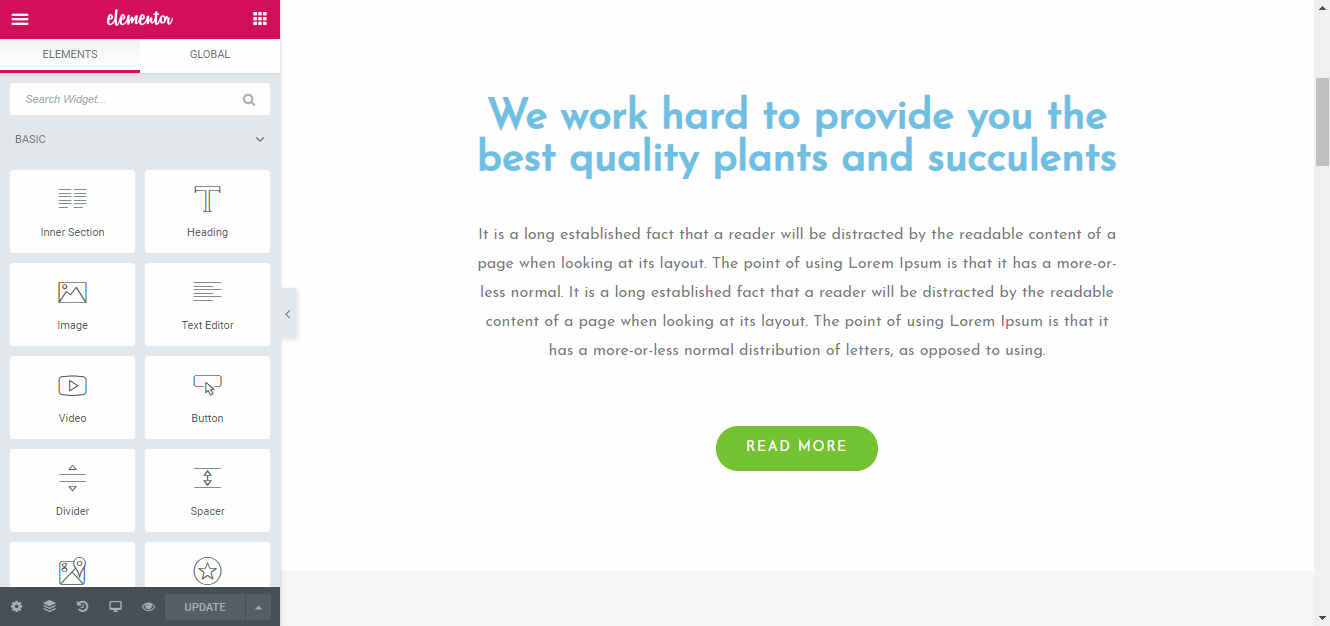
The sidebar contains the widgets and elements you can use to build your pages along with the settings that you can adjust.
You can add elements by dragging and dropping them to the live preview. For example, we added an additional heading on our example site:

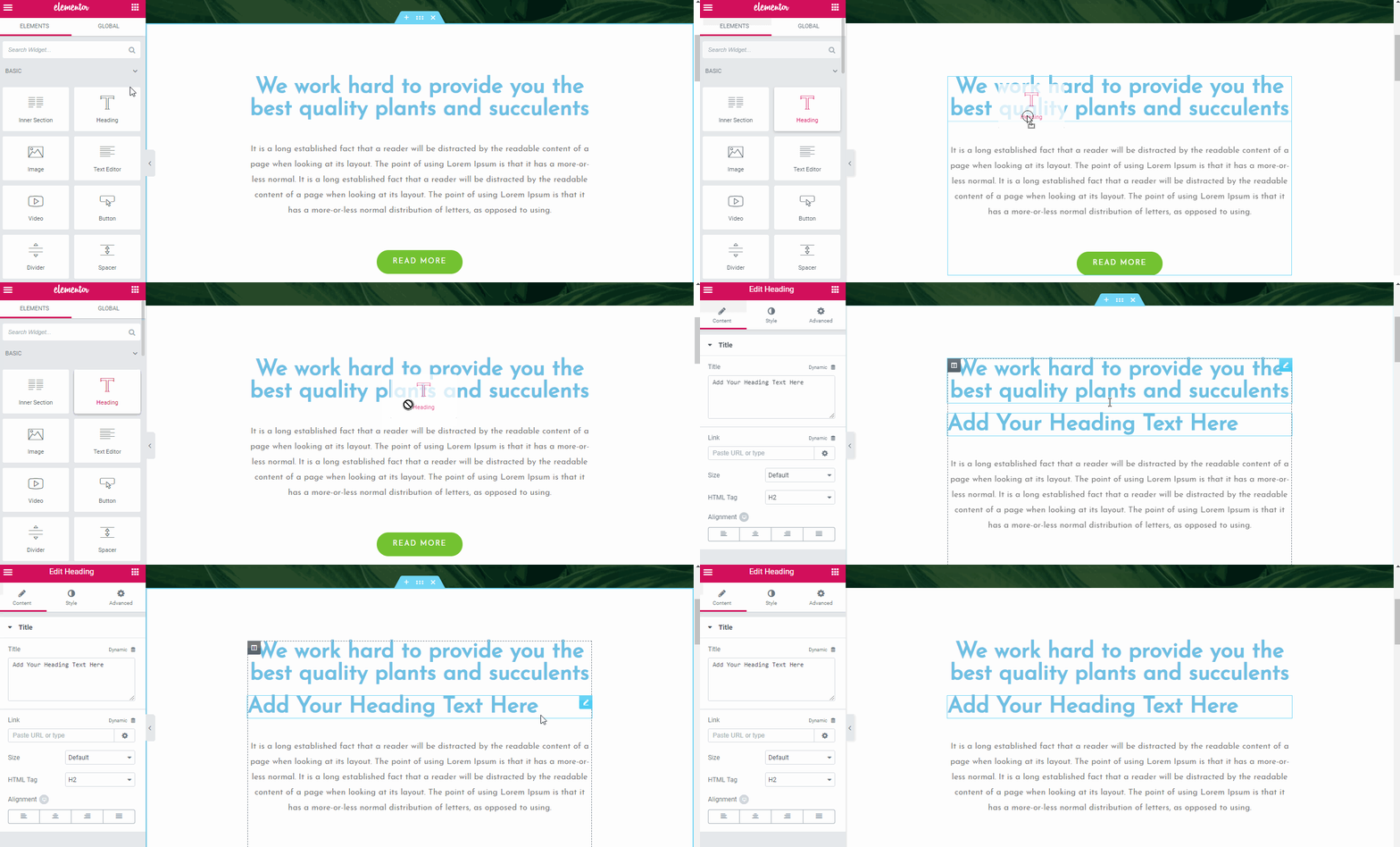
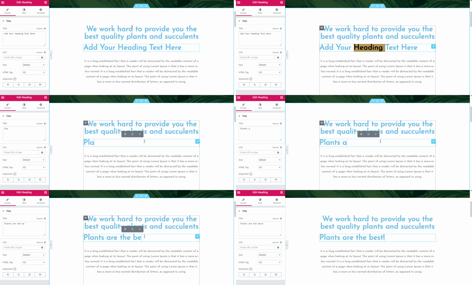
Editing text is easy. Just click on any text element on your site and edit it directly.

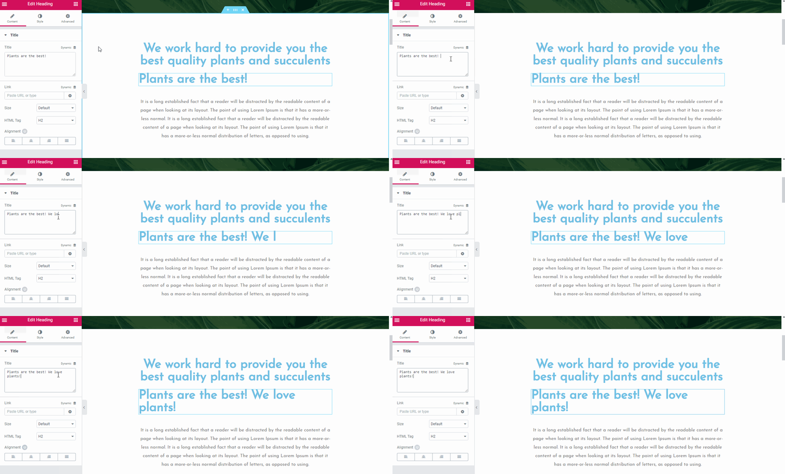
You can also edit text via the sidebar.

Finally, at the bottom, you can access additional settings.

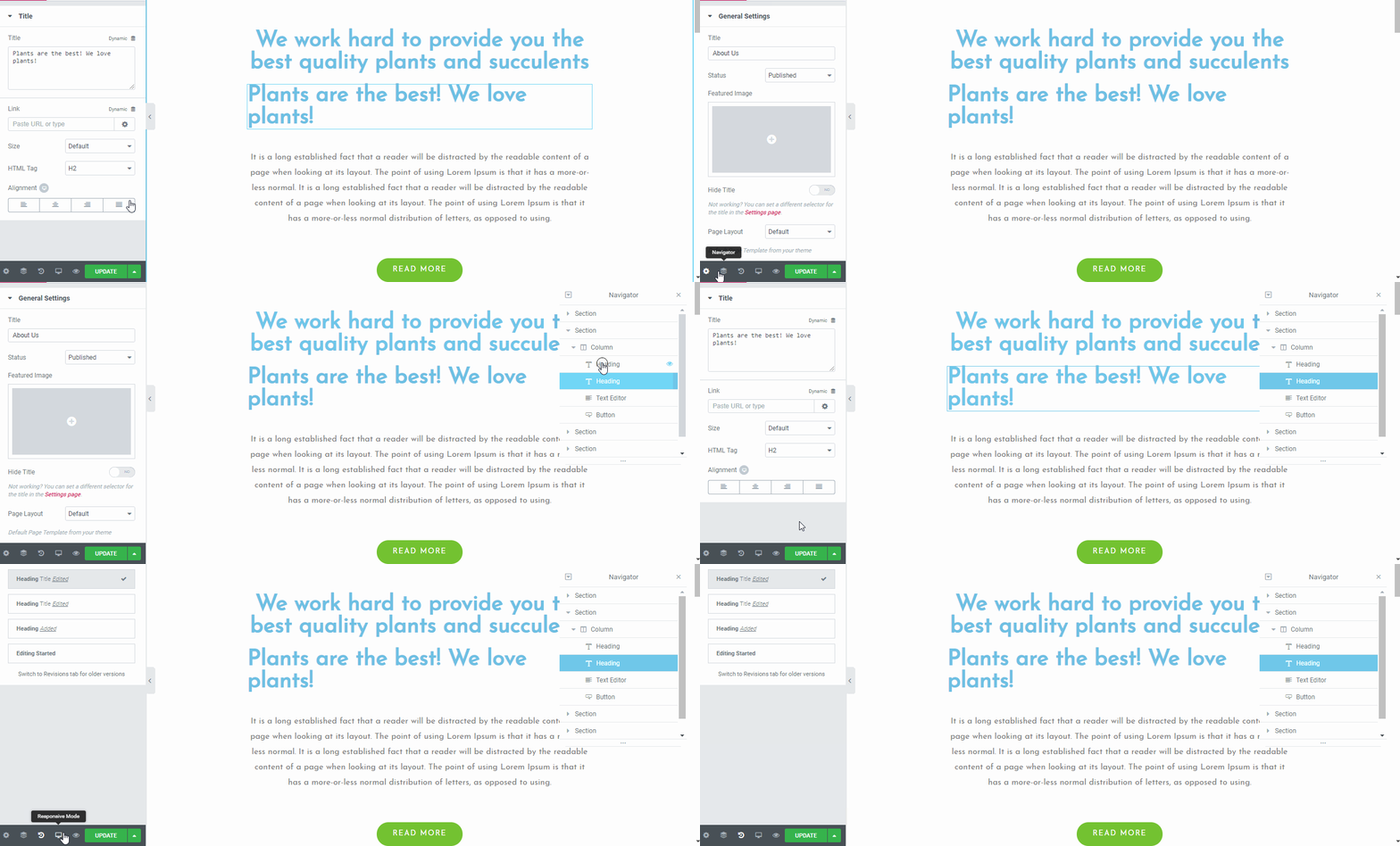
- General Settings – this is where you can see information about the current page such as the page’s title, featured image, its publish status, etc.
- Navigator – clicking this brings out a pop-up displaying a navigation tree panel making navigation easier.
- History – if you want to go back to a previous revision, you can click here. Note that this only displays changes you’ve made for the current session.
- Responsive Mode – allows you to take a peek at how your website looks like on different devices/screen resolutions.
If you hover over an element and right-click, you can access various options:

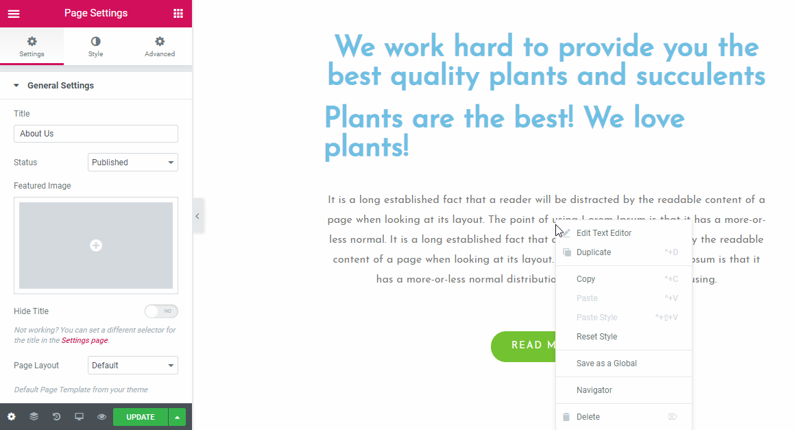
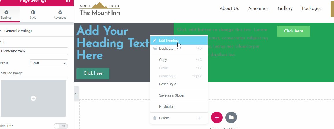
The right-click menu allows you to delete an element, view it on the navigator, save it as a global element (pro version only), duplicate it and more.
Now we’ve seen the main interface of Elementor. Let’s check out Beaver next.
Beaver Builder’s Interface
Beaver Builder’s interface is more minimalistic than Elementor’s by default.
Click here for a live demo
When you edit a page via Beaver Builder, this is what you’ll see:

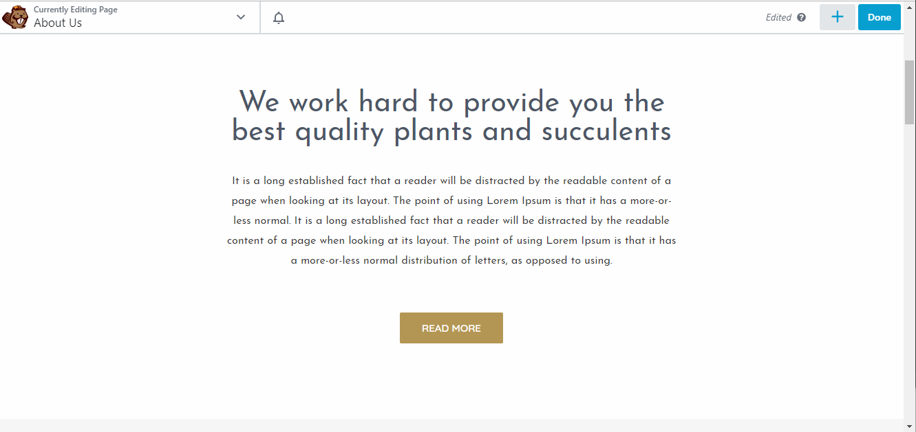
At the top, you have Beaver Builder’s bar displaying minimal but essential information about your current page. To add an element, you click on the “+” button located on the upper right corner.

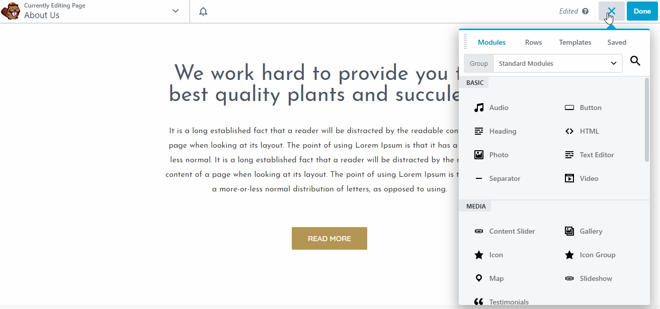
To add an element, or a “module” as per the plugin’s terminology, you can simply drag and drop it.

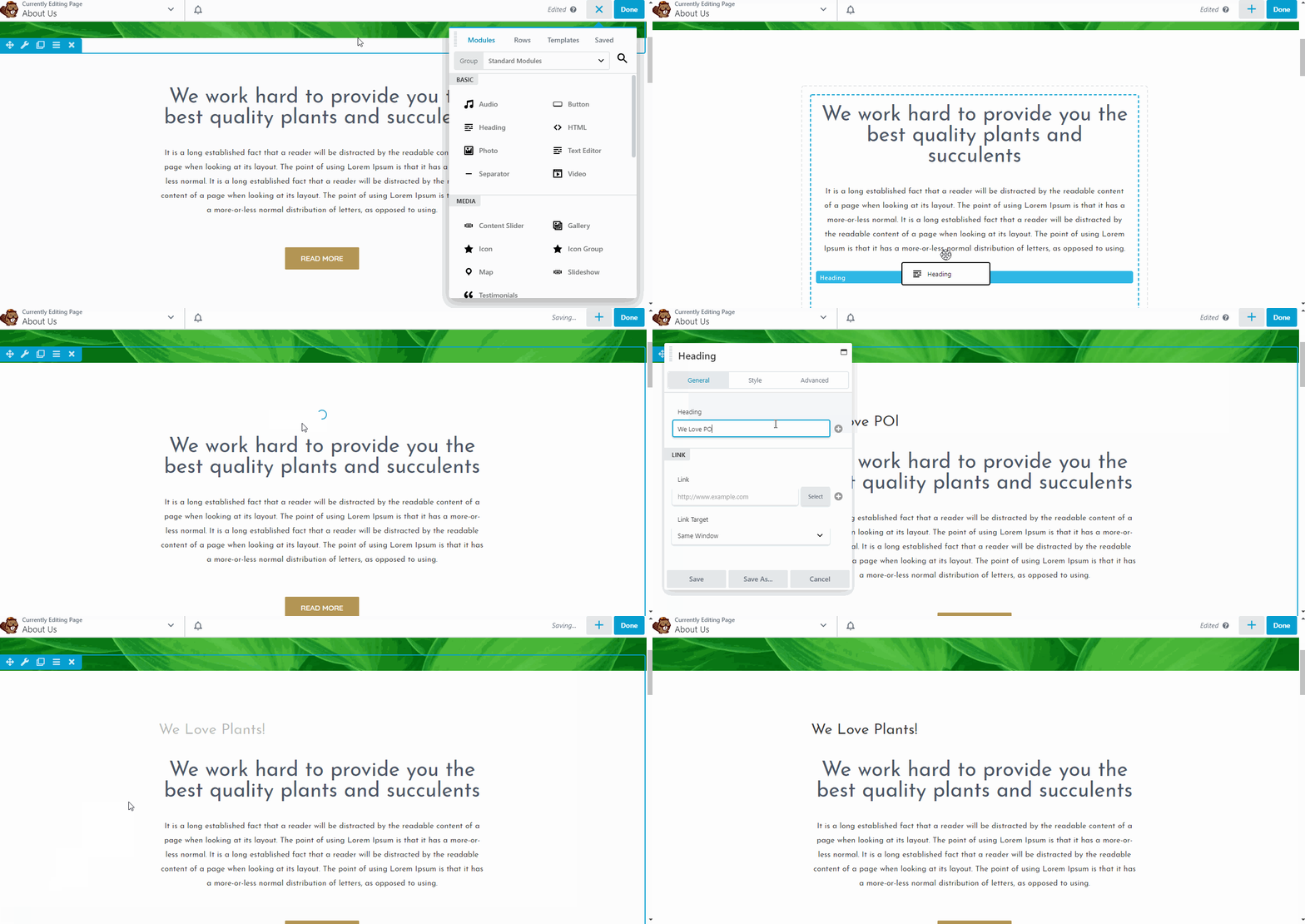
You might have noticed that Beaver Builder’s text editor is slightly different than Elementor’s. We can see from the GIF above that we’ll have a pop-up editor when editing texts.
You can also click on a text module to edit it, which, again, brings up the pop-up text editor.

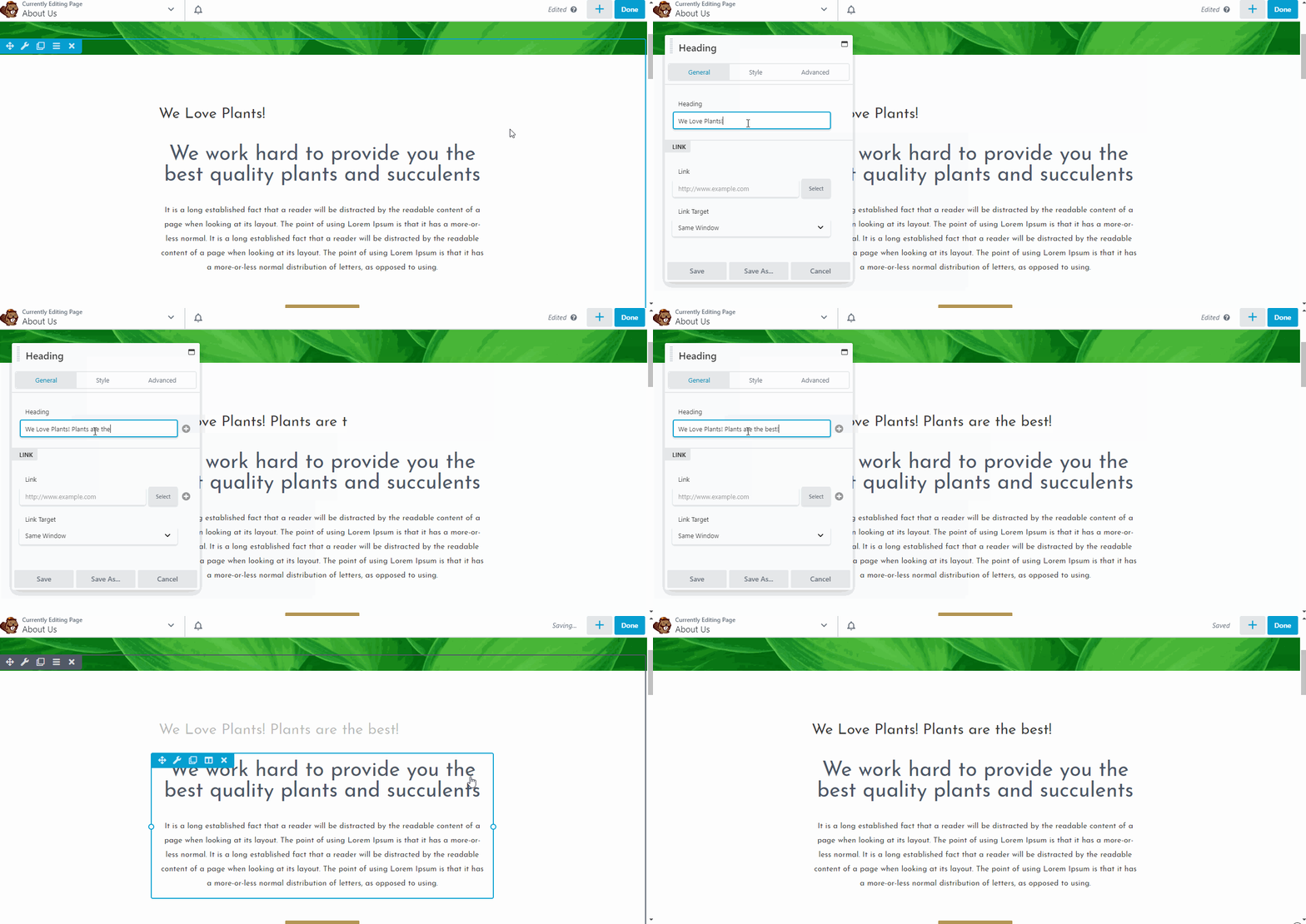
If you don’t like this pop-up thingy, you can drag the text editor to the left or right of the screen to pin it. Once you do that, you’ll be able to perform in-line editing too.

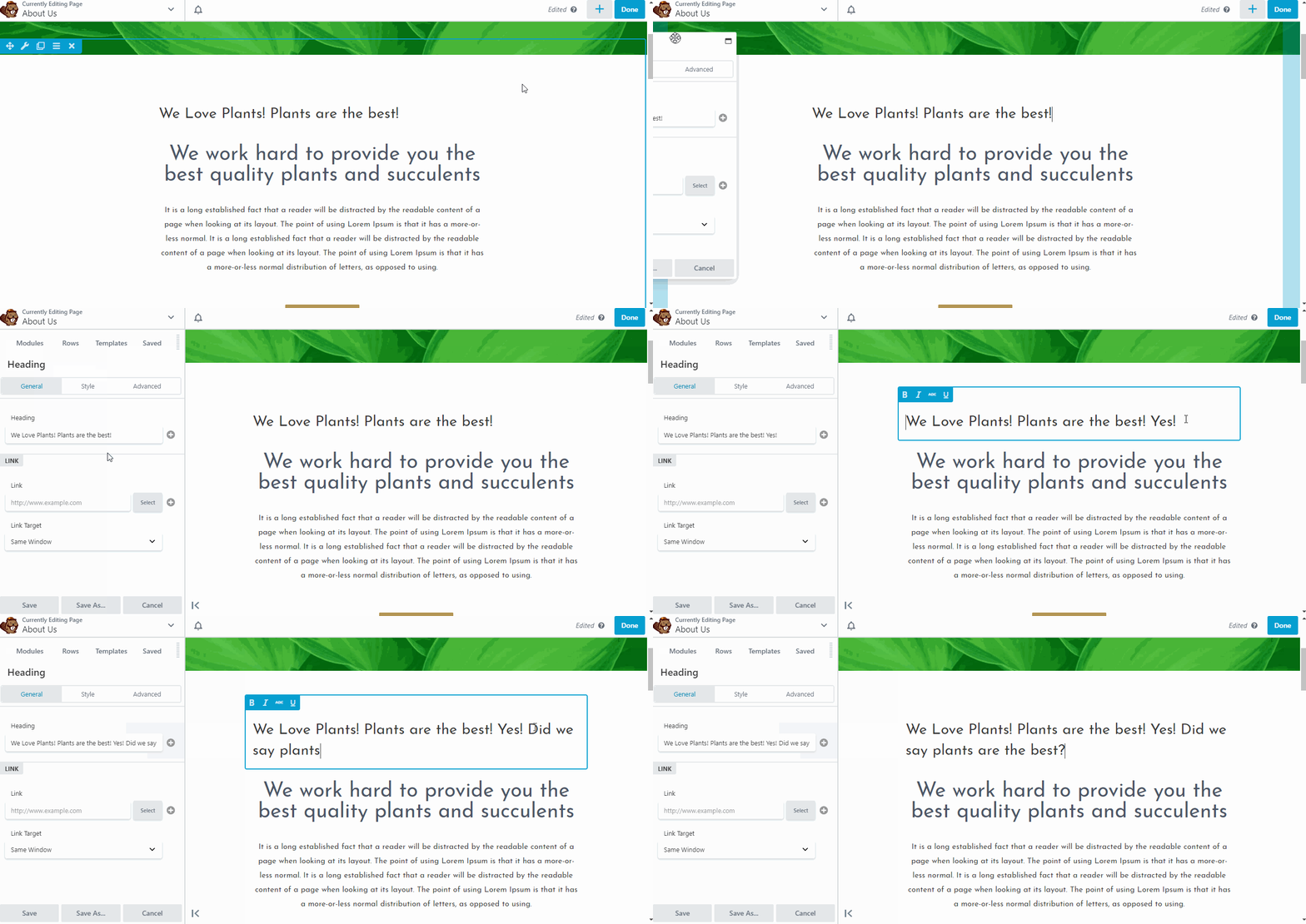
Note that pinning that text editor will also pin everything, making it look like Elementor in terms of layout.

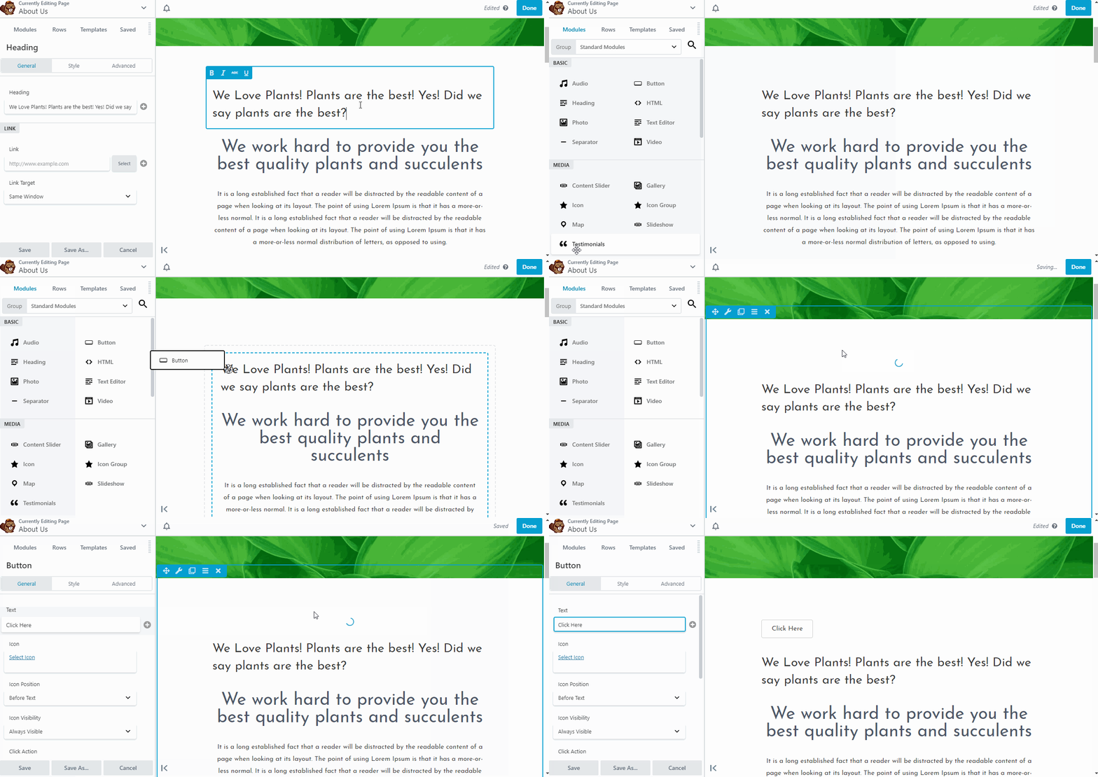
As you can see from above, it now has the same layout as Elementor. If you prefer, you can move it to the right side by dragging and pinning it.
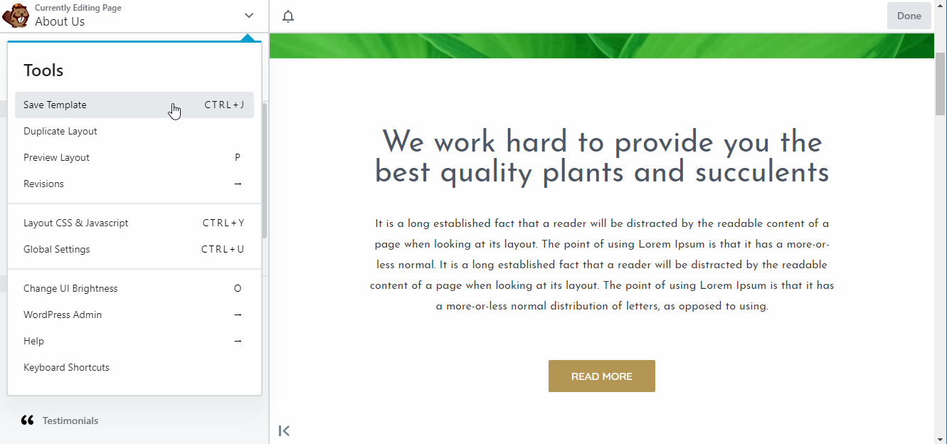
Finally, we have additional settings by clicking on the down arrow button located around the upper left corner of the screen.

Interface Conclusion
One of the biggest difference and perhaps a deal breaker for others is Beaver’s lack of edit history to make undoing edits easier. Aside from this, both plugins offer identical layouts and editing performance. In terms of appearance, Beaver Builder has the advantage with its much cleaner look, although this might’ve been a personal preference. Dragging and dropping items is also a little bit more accurate and easier in Beaver Builder than in Elementor.
Modules and Widgets
Elementor calls its elements “widgets” while Beaver Builder calls it “modules”. Basically, these are the building blocks that you can use to craft your page’s content. They are texts, headings, buttons, gallery, etc. In the earlier examples, what you saw was the text and heading elements. Let’s see how many other elements these plugins have to offer.
Elementor’s Elements: The Sections, The Columns, and The Widgets
Elementor has three types of elements. The sections, the columns and the widgets. The section is the highest in the hierarchy. Every columns and widget are inside a section.
The column is the second in the hierarchy. Every widget is inside a column. The widgets are the lowest in the hierarchy.
The widgets are your content such as buttons, text, and images. The sections and columns are for layout.
Elementor gives you 30 widgets to use in the free version and 52+ widgets in the pro version.
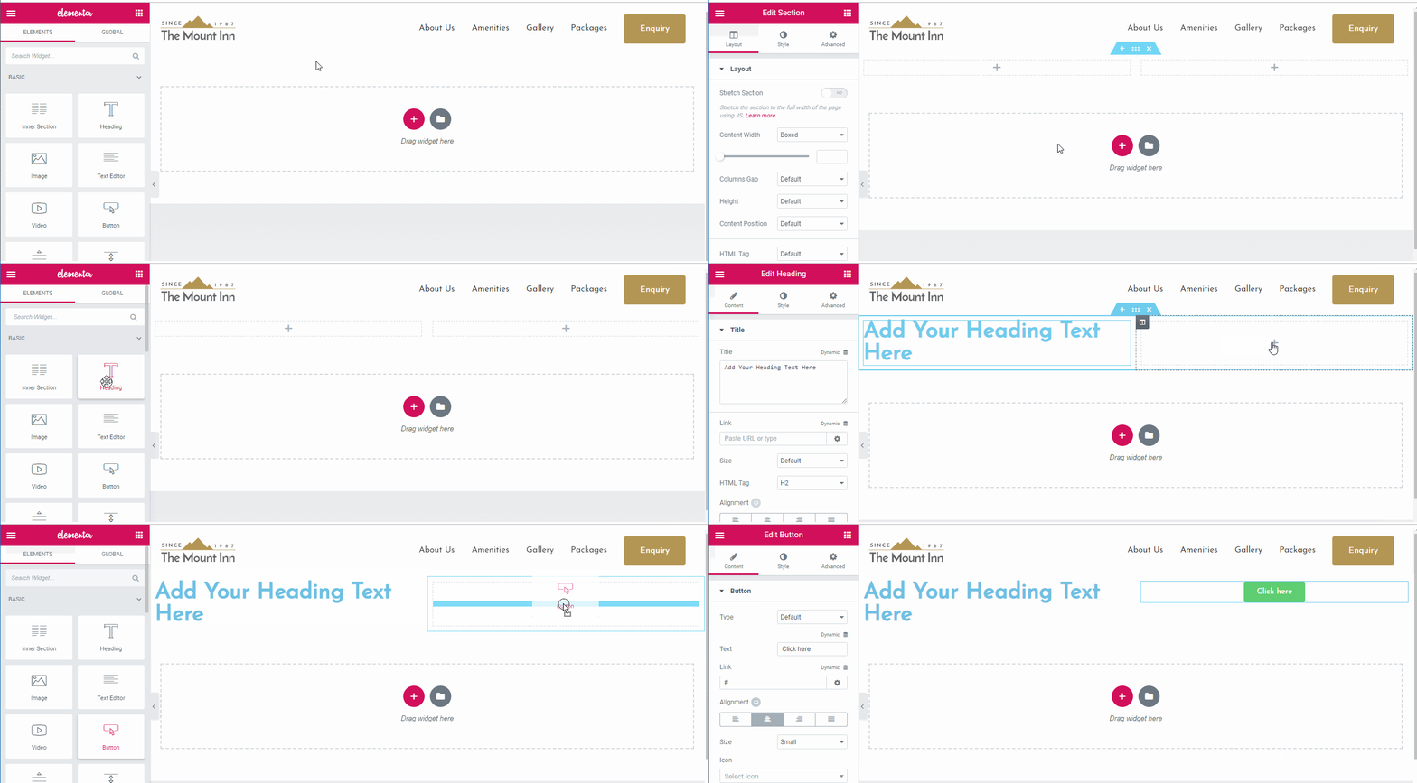
In the GIF below, you can see how we added a section, then we put a “two-column” column inside the section and finally added widgets inside the columns. You can add multiple widgets in a column, which you’ll see in the second GIF below which shows styling.

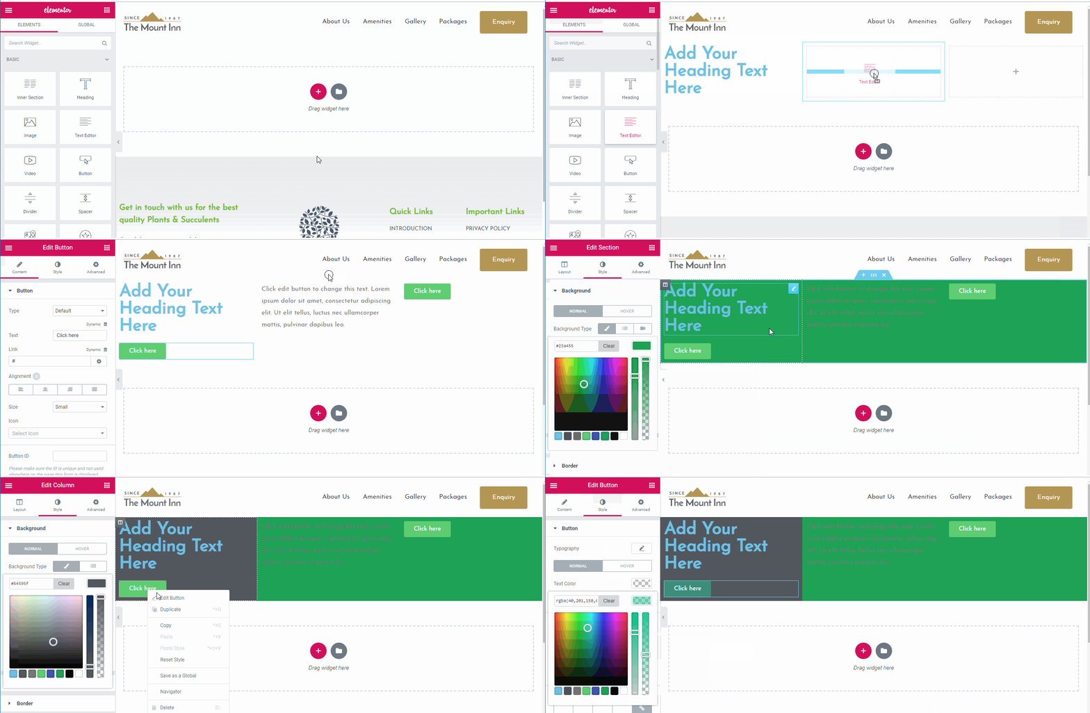
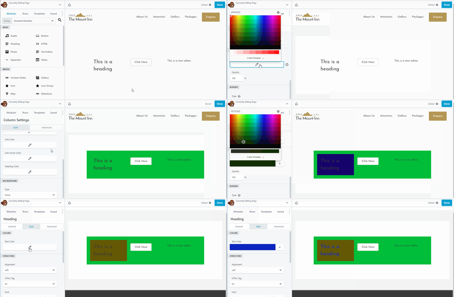
Applying styles on the section affects everything inside it. The same applies to columns, but it won’t affect anything outside it and any style you apply to a widget stays to itself. The GIF below shows this in action.

You might’ve noticed how you can right-click on an element to edit it, duplicate it or delete it, which is very convenient.

Now you have a good overview of Elementor’s elements. Let’s check out the other one.
Beaver Builder’s Elements: The Rows, The Columns, and The Modules
Like the previous plugin, Beaver Builder also divides its elements into three categories: the rows, the columns and the modules.
The Rows are the highest in the hierarchy. The columns go inside rows and the modules inside columns. Modules are your actual content, while columns and rows are for layout purposes.
Beaver Builder free version gives you 6 modules while the pro version gives you 30 modules to play with.
In the GIF below, we added a row containing three columns and filled the columns with different modules.

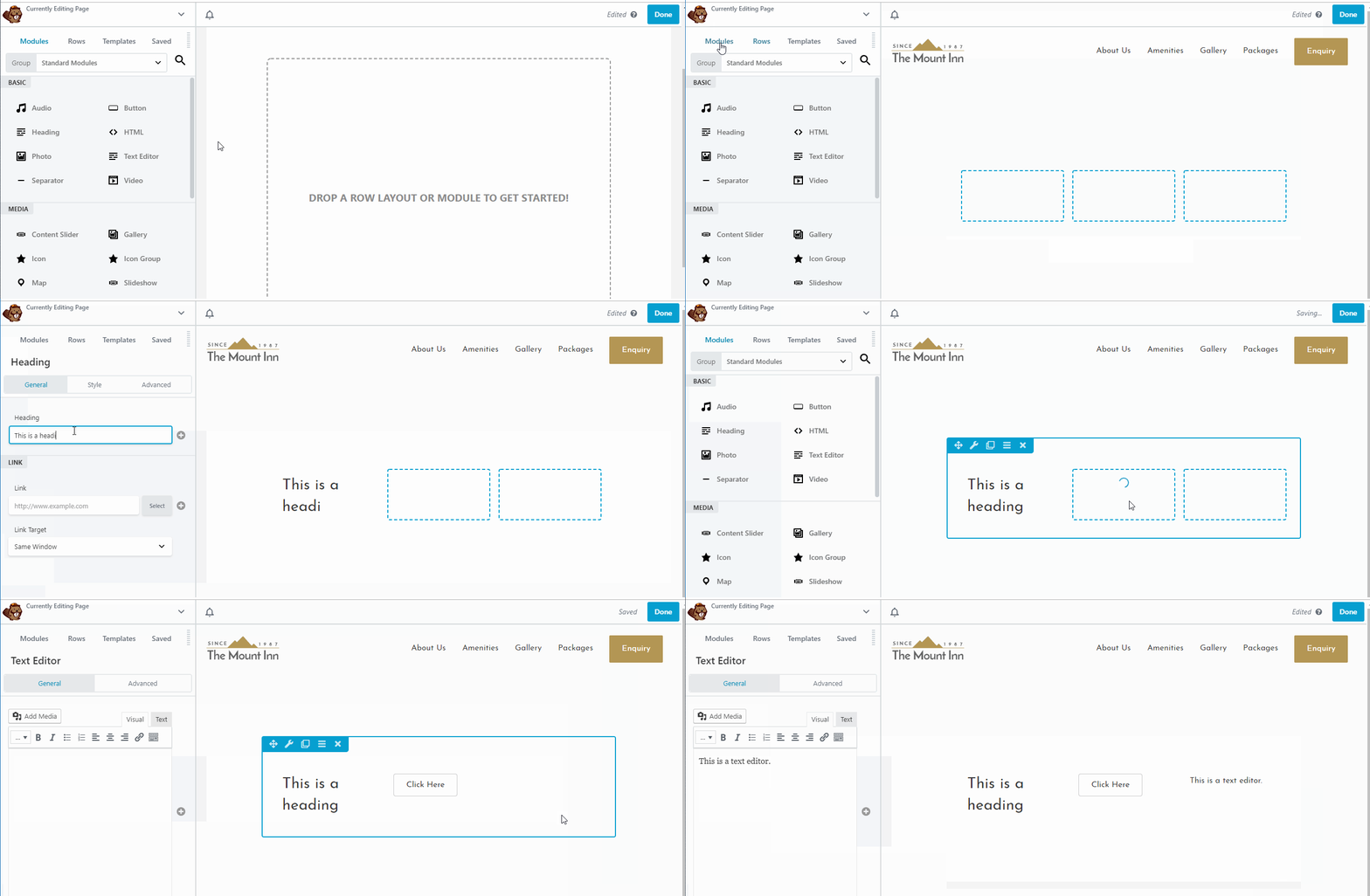
Its styling works in the same say as Elementor. Styles applied in rows are also applied in columns and modules. Styles applied in columns affect modules and you can individually set specific styles to modules.

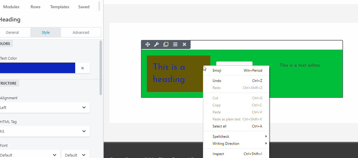
Unlike Elementor, Beaver Builder doesn’t have custom right-click options. You’d have to hover over an element to be able to perform actions on it.

Modules and Widgets Conclusion
Both plugins operate the same way. They both offer easy ways to create a layout for your pages. Elementor, however, do make it a bit easier by having a right-click menu on every element which allows you to directly jump into its settings. As for the number of available modules, it seems that Elementor wins over Beaver Builder, especially in the free version.
Styling
As you’ve seen earlier, both Elementor and Beaver Builder offer fine-grained control over styling options. You can apply to style over sections or rows or fine tune it and have individual widgets or modules have their own style. Let’s delve a little bit more into their styling options.
Elementor Styling Options
Before we check out the styling options available in the editor itself, let’s take a look at Elementor’s styling settings which can be found in Elementor > Settings.

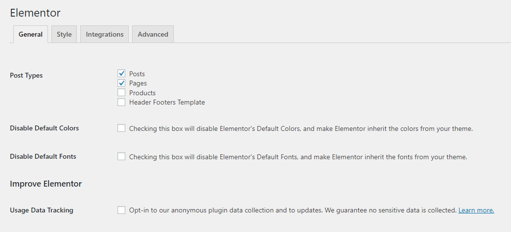
In the General settings, you can configure whether to disable Elementor’s default colors and fonts. It’s recommended to check these boxes to maintain style consistency throughout your site.
Under the Style tab, you can configure various other design settings.

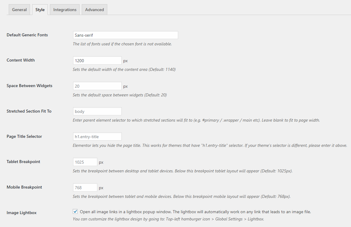
We’re not going to go over all of these, but as you can see, you can fine tune many styling options in this page. Now let’s move on to the editor styling options.
Elementor Basic Style Options
The available styling options remain pretty much similar for most elements in Elementor. Below, you can see the basic style options for the Heading element.

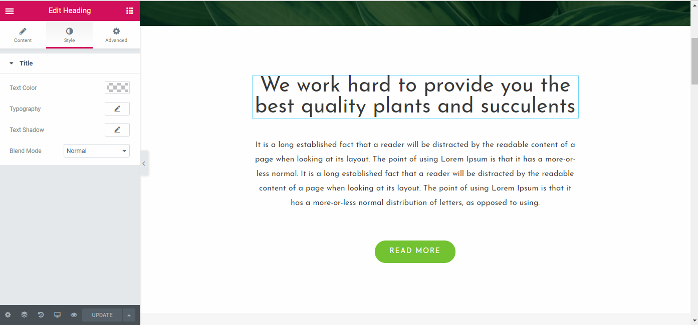
By the way, you might’ve noticed the font style and color changed – this is because we just enabled the Disable Default Colors and Disable Default Fonts in Elementor’s settings. Now, it inherits the theme’s colors and fonts instead of using its own custom ones (which you can see from our earlier examples).
Let’s go back to the style options available to us. Above, we have:
- Text Color
- Typography
- Text Shadow
- Blend Mode
Elementor Advanced Style Options
If you feel this isn’t enough, you can go to the Advanced Tab for more options.
Here, you can configure everything from custom margins and paddings, scrolling effects, background settings, etc. You can also apply a custom CSS if you want (this is only available in the PRO version).
One of the unique features of Elementor is the ability to set custom values for different screen sizes, which can be seen below:
This gives you finer control on how your content is displayed on different devices and screen resolutions.
Beaver Builder Styling Options
Unlike Elementor, Beaver Builder inherits your theme’s fonts and color by default. This allows for consistency out of the box.
Beaver Builder’s styling options vary depending on the element, but basically, you have style, separator, typography, and advanced options.
Styles
The styles settings are shown when you are editing a row as well as other elements like buttons. You can find options for:
- Width
- Content width
- Height
- Colors such as link color, text color, link hover color, etc
- Background type, color, and opacity
- Border
Applying colors, like text, link and hover colors, will be applied to every element inside the row. However, you can override these settings setting custom values per element.
In the advanced settings you can find options for:
- Spacing
- Responsive Layout
- Visibility
- HTML element – you can set custom HTML ID and class for specific element for further customization
Like in Elementor, you have the ability to fine-tune how your content appears in different devices by clicking on the device icon beside a setting (which is only visible for settings that supports it).
Separator
The separator is another styling option that allows you to give your elements a more refined look. Here, you can find options for your separator. If you’re wondering what a separator looks like, then check the red line under the heading in the picture above. That’s the separator. You have options for:
- Separator style
- Separator position
- Line style
- Line color
- Thickness and width
Typography
The typography options are for controlling how your text appears. This setting usually appears for the heading module. Here, you have options for:
- HTML tag
- Font style, size, and face
- Text color
- Margins
Styling Conclusion
Both plugins offer a wide range of styling options and configuration. They allow for endless customization up to the smallest details.
Templates
So far, we’ve seen powerful tools that allow us to build custom pages from scratch. But wouldn’t it be better if we have templates to use? It’ll be faster that way. Good thing both Elementor and Beaver Builder offers templating features.
Templates are ready-made designs that you can use for your pages. Both Elementor and Beaver Builder provides us with tons of templates to choose from. Let’s take a look at them.
Elementor Templates
In Elementor, when you create a new page, you will see that you have an option to either add a section or use a template. In the free version, you have around 40 templates to choose from. In the pro version, you have over 300 different page and block templates to choose from.
Visit website to check out all templates
Upon clicking on the Add Template button, you will be greeted with a menu showing you tons of templates to choose from.
Elementor offers two kinds of templates: Block and Page templates.
Block Templates are section templates that you can use to build certain parts of your page. Example of a block template is a contact form or a CTA section. Below, you can see examples of available CTA templates.
Page Templates are full page templates that are designed for specific pages and purposes.
Below, you can see templates for a landing page and homepage. Furthermore, there are different flavors to choose from. For example, you have a homepage template tailored for restaurants and one tailored for agencies.
You can also create your own custom page templates and save them for reuse. You can do that by clicking the small upward arrow beside the publish button and choosing Save as Template.
You can also import templates made by others by uploading them to your site. This allows for endless customization possibilities.
Beaver Templates
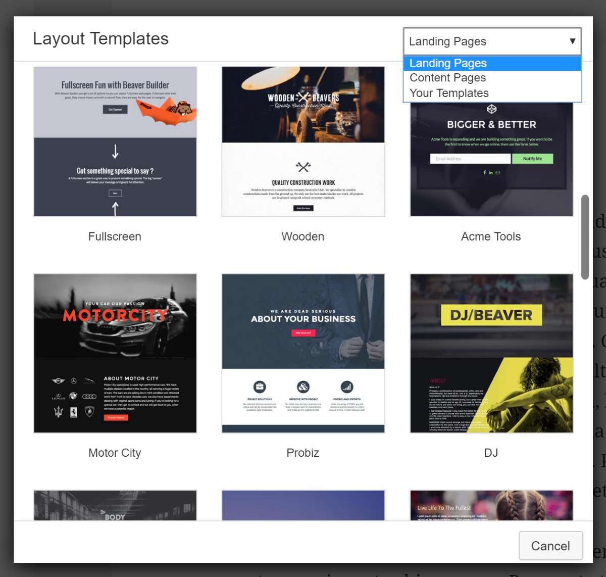
In Beaver Builder, you have three types of templates to choose from: Landing Pages, Content Pages and Saved Templates. Unlike Elementor, it doesn’t have block-level templates, though you can use plugins to get the same functionality.
Click here to see all templates
Be aware that the free version of Beaver Builder doesn’t have templating options at all, so you’ll have to do everything from scratch if you want to use the free version.
Landing Page Templates are for creating elaborate landing pages. As of this writing, you can choose from 30 different landing page templates.
Content page templates are for content pages like about page, contact page, homepage etc. As of this writing, there are 25 content page templates to choose from.
Saved templates are your custom saved templates. Like in Elementor, you can save a page as a template so you can reuse them for later.
Importing templates is also possible on Beaver Builder, but it’s not as intuitive as Elementor’s. You can check out how it does this by reading their documentation here.
Templates Conclusion
Elementor offers more templates to choose from and easier template import and export option than Beaver Builder. As for the design and appearance, both plugins gives you a wide variety of beautiful templates that cater to many different kinds of niches.
As for their free versions, Elementor wins hands down against Beaver Builder because you still have the ability to choose from over two dozen free templates and even the ability to import and export them. On Beaver Builder, you have to upgrade to their premium version to take advantage of this feature.
Theme Building
Theme building feature is a very powerful tool that both Elementor and Beaver Builder offers to its users.
For Elementor, the theme builder is automatically unlocked once you upgrade to their premium version. As for Beaver Builder, you’d have to install a separate plugin called Beaver Themer and is a separate $147 purchase.
Elementor’s Theme Builder
To access its theme builder, you can go to Templates > Theme Builder. From there, you can create or edit theme templates. You can create or edit templates for:
- Page
- Header
- Footer
- Single Post
- Archive
- 404 Pages
- Etc.
Elementor’s theme builder pretty much works the same as its page builder. You have all of the normal elements plus new and specific elements for the type of theme section you’re working on. For example, this is how the theme builder looks like for Single Post.
As you can see, you have a new set of widgets specific for single posts like post title, featured image, post comments, etc.
And if you don’t want to start from scratch, there are also pre-made templates that you can use, which you can access by pressing the folder icon in the content editor just as you would on the regular page builder.
Once you’re done building your custom theme template, you can control when and where it appears. For example, you can choose to display your custom single post template only for a particular post author.
Beaver Builder’s Theme Builder
Beaver Builder’s theme builder, while activated in a different way, works similar to that of Elementor’s. You can only access the theme builder once you install the Beaver Themer plugin. Once you’ve activated it, you can access Beaver Builder > Themer Layouts and from there, you can create a custom template for the following:
- Header
- Footer
- Archive
- Single Posts (Singular)
- 404 pages
- Part
Once you’ve decided on the layout you want to create or edit, you can customize it further by choosing where and when it would appear. For example, for the custom footer, you can choose whether it appears on your entire site effectively replacing your default footer or whether to display it only on certain posts or pages. You can also further customize it by displaying it only when a post is written by a certain author, etc.
As for the editor itself, you will have the same UI as the page builder. Below, you can see the theme layout editor in action where we are editing the custom footer we’ve created. You have access to the same number of modules and other elements as in the regular page builder.
Theme Builder Conclusion
Both plugins give excellent control and customization over theme building. However, if we are to talk about pricing, Elementor is cheaper as its theme builder is integrated into the premium version.
Pricing
We’ve compared the two plugins quite a bit already and we’ve seen what you can get in their free and pro versions. But how much do they cost?
Both of their premium versions come into three pricing tiers.
Elementor Pricing
Let’s start with Elementor. There are Personal, Business, and Unlimited pricing options.
- Personal – $49 for a single site.
- Business – $99 for three sites.
- Unlimited – $199 for unlimited sites.
All plans have the same amount of features and will continue to receive premium support and updates for 1 year and comes with the theme builder.
Click here for the lowest price on Elementor
Beaver Builder Pricing
Like Elementor, Beaver Builder also comes into three pricing tier.
- Standard – $99
- Pro – $199
- Agency – $399
The standard license doesn’t have multisite support and Beaver Builder Theme. The pro license is capable of multisite support and comes with the Beaver Builder Theme but there’s no white labeling. Finally, the agency license has all of the standard and pro features plus white labeling. All plans are for unlimited sites.
Keep in mind that Beaver Themer is a separate purchase which costs $147.
Click here for the lowest price on Beaver Builder
Free vs Pro
Both plugins come with free and pro versions, however, in this section, Elementor is the clear winner.
Elementor offers a free version that comes with dozens of modules and templates for free. Beaver builder on the other hand only comes with the most basic ones, making it almost useless in its free version.
Pricing Conclusion
If you don’t want to spend a dime, Elementor is your choice. As for the premium versions, however, while it might seem that Beaver Builder is more on the pricier side, its higher tier plans offer more developer friendly feature, especially white labeling. Plus, if you are a developer looking to resell hosting, then you might want to take a look at this discussion. In short, Elementor doesn’t allow you to host a client’s website by yourself and charge them a monthly fee if you used Elementor to build or design their website.
So, for this section, we can say that Elementor is better for solo users, while Beaver Builder is better for developers – especially because of the white labeling and hosting options.
Conclusion: Elementor vs Beaver Builder
Overall, these are currently the two best page builder plugins for WordPress. Elementor offers a massive amount of templates and elements, while Beaver Builder tries to keep it simple, yet still meets the need of every user.
Beaver builder is more developer friendly because they offer white labeling options and doesn’t have any restrictions on how developers can sell their services or the websites they’ve built using the plugin.
Elementor is not open source while Beaver Builder is, which, again, makes the latter more developer friendly.
From the security perspective, Elementor has had a serious security vulnerability in the past but that has been resolved and the product keeps going from strength to strength, reaching 2 million active installs recently and with a strong strategy to reach 10 million soon! So yeah, you’re buying a good product!
If you are a solo developer or user looking for an excellent plugin with tons of features and rapid updates, then go with Elementor. If you are a developer or a user who doesn’t want to get overwhelmed by tons of features and rapid updates, choose Beaver Builder.
But in the end, it’s all up to you to make the final decision. As they are both continuously evolving, there is no clear winner, though you can easily make the right decision based on the factors we’ve outlined and your current needs.
Please leave a useful comment with your thoughts, then share this on your Facebook group(s) who would find this useful and let’s reap the benefits together. Thank you for sharing and being nice!