Some time ago, I released a component that seemed accessible by all tests. Keyboard navigation was functional. ARIA roles were correctly used. Automated audits showed no issues. Yet, a screen reader user couldn’t activate it. Testing with keyboard-only navigation and NVDA revealed the same: the interaction didn’t behave as expected.
The checklist didn’t show any errors. Technically, everything was “correct.” But practically, the component wasn’t predictable. Here’s a simplified version of the problematic component:
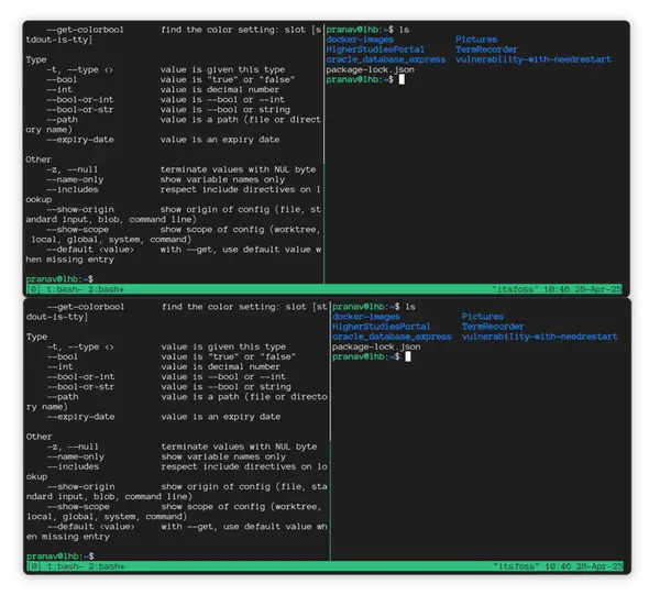
The demo shows straightforward markup:
The fix was simpler than anticipated. I removed the ARIA `role` attribute added with good intentions.
The markup became even simpler:
This experience changed my perspective on accessibility. The key lesson: Semantic HTML already achieves much for accessibility — and ARIA can easily be misused when used as a shortcut or supplement.
We often know the first rule of ARIA: don’t use it unless necessary. In my case, the accessible benefits and functionality were already present before adding the `role` attribute.
Here’s a step-by-step outline of what happened, as I believe my mistake is common. Many articles discuss this, but hearing it through real experience often helps internalize it.
**Note:** This article was tested using keyboard navigation and a screen reader (NVDA) to observe real interaction behavior across native and ARIA-modified elements.
### 1: Start with the simplest possible markup
This is a minimal page with a single native `
If the interaction triggers an action, then it’s a button. In this case, the `
That single line provides:
– Keyboard activation with `Enter` and `Space`
– Correct focus behavior
– A role understood by assistive technology
– Consistent announcements across screen readers
At this point, there is no ARIA — intentionally. I had an existing class for styling buttons, so I added that:
### 2: Observe the native behavior before adding anything
With the native element, I tested:
1. **Keyboard only** (`Tab`, `Enter`, `Space`)
2. **A screen reader** (listening to announcements)
3. **Focus order** within the page
Everything behaved predictably. The browser acted as users expect. This step sets a baseline. If something breaks later, it wasn’t HTML that caused it. We can see everything working by inspecting the element in DevTool’s Accessibility panel.
### 3: Add well-intentioned ARIA
The problem arose when I tried to make the button behave like a link:
I did this for styling and routing reasons. The button needed a different style from the default `.cta` class, and I thought I could use the ARIA attribute instead of a modifier class. I let styling influence functionality. A `
On the surface, nothing seemed broken. Automated tools were silent. But in real use, issues appeared:
– `Space` didn’t reliably activate the control.
– Screen readers announced conflicting roles.
– Keyboard users faced behavior not fully matching a button or a link.
ARIA added ambiguity, not clarity. I’d “tested” my work, and nothing alerted me to the role conflation. Again, a quick look at DevTools shows the issue.
### 4: Back to semantics
The fix was simple. I reverted styles, used a class for styling, and returned to semantic markup before changing the role:
It sounds easy: if it’s an action, use a `
With the correct element and no ARIA, issues vanished. I defined a new classname and kept styles separate from functionality.
The user confirmed everything worked as expected. It was a mistake from misunderstanding ARIA’s role in the stack.
### Why this keeps happening
ARIA attributes