I dedicate a lot of time to typography in my designs, and if you’ve read traditional typography books, you might recall “the measure.” If not, it’s just the length of a line of text. But measure encompasses more than that, and understanding its significance can transform your approach to layout.
So, why is it called the measure?
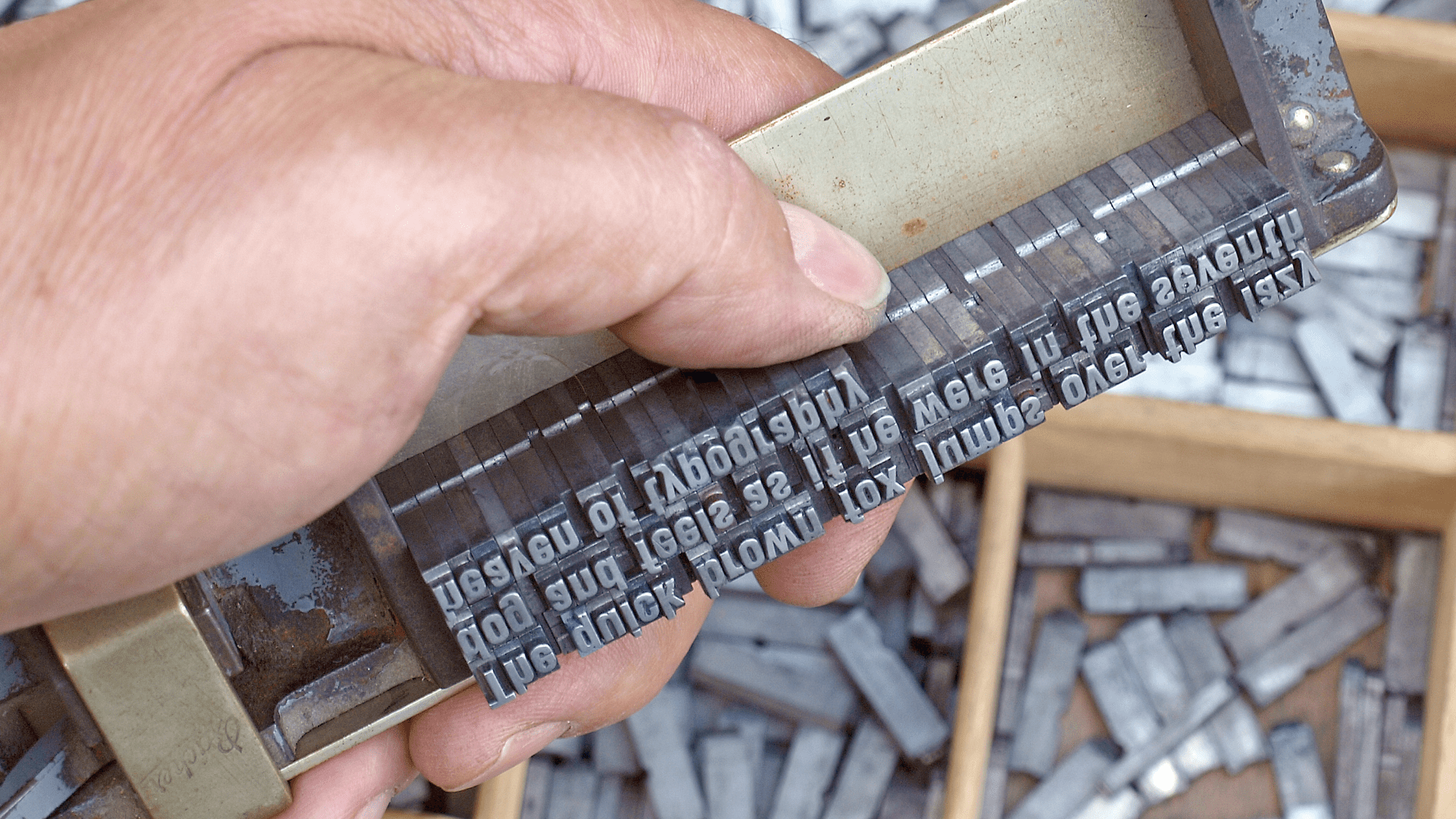
Before desktop publishing, typesetters used physical metal type. They arranged text lines within a composing stick, and the stick’s width was called the measure. It was the literal space for type, and everything on the page — column widths, margins, and gutters — was designed around it.
A good measure makes reading comfortable, while a bad one complicates it.

Similar Posts
I’m Happier Living In South Africa Than In The U.S. — Here’s How Much It Costs
Living as a black woman in South Africa presents an extraordinary narrative of empowerment, resilience, and…
Arsenic is everywhere – but new detection methods could help save lives
Arsenic is a nasty poison that once reigned as the ultimate weapon of deception. In the…
Drupal CMS Docs: Should We Combine the CMS and User Guides?
When Drupal CMS 1.0 launched, we rushed to create an MVP of the Drupal CMS Guide….
Live Saturday Special Podcast With InfoSec Pat & Zeta Two
The topics to be discussed will be and will not be limited to CTF, reverse engineering,…


