In this article:
- Testing Tools
- HTML Elements
- Plugins
- Remove CSS
- Training
Web accessibility doesn’t require high server performance. Shared Hosting customers don’t need to upgrade for a bigger hosting plan. VPS Hosting customers don’t need to use root access. All you need to improve a website’s accessibility is admin access to the content management system (CMS) or raw code.
From testing to training, below are ways to improve website accessibility.
Testing Tools
There are multiple ways to test web accessibility. Below are some popular online web tools.
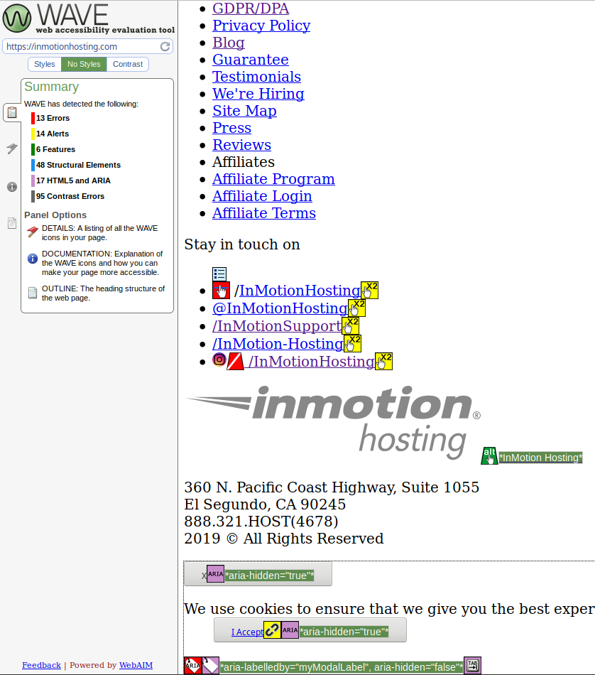
- Tenon.io goes in-depth with Section 508 and WAVE.webaim.org checks your website against WCAG1 and Section 508, view it without CSS, and preview contrast options
- AChecker.ca checks webpages and HTML files against multiple guidelines – e.g. BITV, Section 508, Stanca Act, and WCAG – and HTML/CSS validators
- Firefox Accessibility Inspector within its Inspect Element section can detect navigation, contact form, and color contrast issues when enabled
CMS Plugins
Many CMSs have plugins to improve accessibility. This is especially helpful since CMS themes are coded to loose standards. Many are more accessible by default than others. Below are suggestions for some popular CMSs.
- WordPress – WP Accessibility and Access Monitor
- Grav – Grava11y (Accessibility for Grav)
- Joomla – Simple AccessKeys
Accessible HTML Elements
There are many HTML attributes to improve user experience. Beyond the basic HTML tags, there are other helpful attributes. Your CMS may have a visual editor with these options but HTML-based CMSs likely have an option to edit the raw code without issues.
Media
- alt – Alternative text describes visuals for sight-impaired users using screen readers
- figcaption – Figure caption adds context to media for all users
- title – A11y Project recommends only using this attribute for embedded media
An accessible img example:
<figure class="figure-image">
 <img class="css-class1" alt="Company logo" title="Company logo" src="images/brand-logo.png">
<figcaption>Take action to resolve issues listed</figcaption>
</figure>
Forms
There are multiple ways to write an accessible contact form:
- Visually show the
labelelement - Hide the
labelelement - Use
aria-labeloraria-labelledby
Below are helpful guides for determining what’s best for your websites.
- W3.org Web Accessibility Tutorials
- A11y Project for Labeling Recommendations
- ContactForm7.com for WordPress Sites
Links
Write accessibly. Hyperlink text should add context explaining what the user should expect to see upon clicking the link.
This isn’t accessible:
To learn more about web analytics software, click here.
Interested in web analytics options? Learn more here.
This is accessible and easier to read:
Learn more about who views your your website with our web analytics comparison guide.
Some sites use the title attribute to create a tooltip that shows when you hover over the hyperlink.
Others use a Link to [page-title] format for screen readers able to read it – e.g. title="Link to XXX". Keep in mind that these two methods aren’t recognized as best practices for accessibility. As of now, they’re mostly for non-disabled users’ experience.
A potentially more accessible example:
<a href="/support/web-analytics/choose-the-best-analytics-tool" title="Link to Web Analytics - Factors to Consider" rel="nofollow" target="_blank">web analytics comparison guide</a>
Skip Navigation
Create a #maincontent anchor link to skip navigation and other header elements to jump directly to the main content – generally above the H1 header.
<body>
<a href="#maincontent">Skip to main content</a>
...Nav and other code
<main id="maincontent">
<h1>Heading</h1>
Do you have any thoughts on these accessible HTML attributes? Let us know in the comments below.
Remove CSS and JavaScript
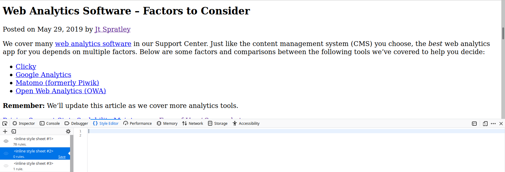
Check your website without CSS to test the flow and skip navigation. WAVE.Webaim.org and No-CSS.com can do this. You can also ignore CSS stylesheets within your browser’s web developer tools among other editing options.


