Creative work—whether you’re a visual designer, developer, UX designer, etc.—comes with a challenge most jobs don’t have: the occasional total lack of inspiration. Stumped as to how you can keep the ideas flowing when you’re feeling tapped out?
One solution: Take in some design inspiration to kick-start your creative process. And while you’re at it, discover new and dazzling ways to present your work to potential employers and clients.
Our first pick for professional and portfolio examples all in one place is Behance. Behance is an online platform for creatives who want to showcase their digital design work in a community setting where they can get feedback and network. Prospective clients and other visitors can see profiles full of projects, which run the gamut from simple illustration concepts to complex content strategies for digital products. Behance is a somewhat limiting format—it’s up to you to upload a string of videos, illustrations, gifs, or text in a way that’s visually pleasing, well-organized, and best shows off your project.
Want to bust through that creative block and get inspired about how to showcase your work? Keep reading to discover six Behance projects that will spark new ideas.
1. DOXXbet.com by Lukas Majzlan

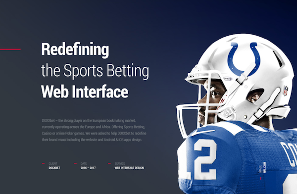
Designer Lukas Majzlan’s Behance presentation for sports betting site DOXXbet.com is a work of art in itself: He breaks it down into seven stunningly designed sections, making it easy to follow the creative process behind the design. Majzlan nails it when it comes to showcasing the simpler landing pages as well as the more complicated internal pages, and he clearly communicates the thought that went into creating them. A potential employer can quickly see how good this designer is at organizing information for a better user experience, and will likely appreciate the stylistic touches that went into the Behance presentation—like the numerical organization and the headphones with the computer screen for an added tie to real life use.
2. STROLL by YOMAGICK

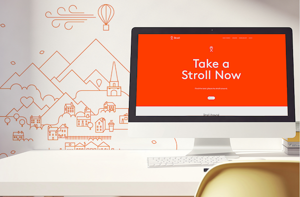
Looking for something cute but not cloying? STROLL, a concept for a social network for aspiring flâneurs, is minimal and fun. It goes heavy-duty on the user experience by letting the user choose the vibe they want for their walk (e.g., romantic, secret, Zen) by tapping on a list of icons. If the icons aren’t doing it for you, you can choose a popular walk from a photo-rich page that features strolls based on the locations and features you select as interests.
The Behance page starts with a bright and striking hero image of a desk setup styled to show off Stroll’s landing page. It progresses through a series of branded assets that include web, video, and even print assets. It’s easy to see how the designer proposes incorporating everything from video ads to physical pop-up tents, all while maintaining strong brand recognition. Thinking big like that is seriously attractive to a potential employer, who wants to see design chops that go beyond a single application.
3. Onstreet by Jaejin Bong

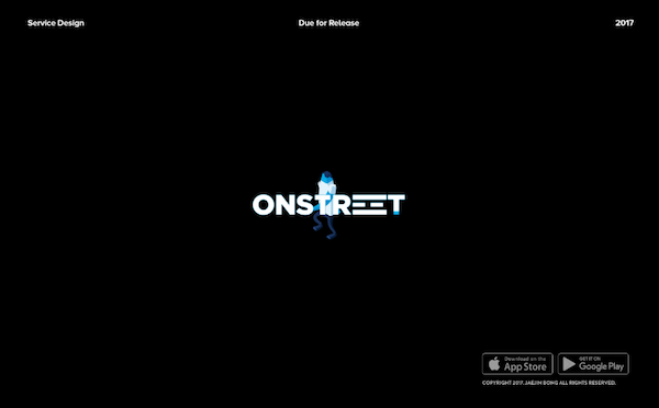
In order to showcase the Onstreet app, designer Jaejin Bong starts with a graphic, animated hero image mostly in bold blue and black, which pops well against Behance’s white background. Jaejin uses dynamic designs throughout to illustrate the multipurpose concept (street photography, community commenting, and purchasing through retailers), and intersperses short pieces of copy explaining the concepts and process. This project shows examples not just of user-friendly features, but also of brand-building elements that could be repackaged for other purposes, such as advertising.
4. Potatoes on Mars by Omair Muhammad

A killer design and a science experiment for the greater good? Potatoes on Mars has it all. As the Behance profile explains, Potatoes on Mars is an initiative to grow potatoes in a Martian environment in order to combat hunger on Earth. Muhammad displays his art direction and UI/UX design gorgeously by pairing simple animation and colorful logos with high-resolution photo layouts, giving viewers a keen sense of the project’s scale. (Big shout-out to the live-feed page with a surprisingly mesmerizing time-lapse of potatoes emerging from alien soil.)
What’s most engaging about this page is that Muhammad shows us the fun stuff—potatoes in space, the final frontier—as well as the nuts and bolts of the execution in such a way that it all seems equally important and entertaining. If you’re using Behance to pitch your best elements from a design, you want it to feel like this one does: fully engaging, and indicative of the highest level of branding work you’re capable of.
5. Delirio by Aleksandr Zagoliuk, Andrii Denysov, and Vlad Palchikov

The design team behind the website for coffee company Delirio crafted the project’s Behance page almost like a movie. The experience fits the design: The versatility of the bright, minimalistic homepage makes it easy to view on all devices, while the information customers need to shop for coffee is always front and center. The real stars of this project are the animated icons that usher users through different pages, so naturally they are what the designers highlighted on their Behance page.
The page finishes with a “Thanks for Watching” card—with credits to the designers and developer—carrying the cinematic feel through to the end. A round of applause.
6. Gardener by Promojit Koley

Let’s start with the design here: Koley’s visual concept for Gardener has the look of recognizable apps like Seamless and Airbnb, with unique icon options and an intuitive screen layout. Gardener’s objective isn’t dissimilar from Airbnb’s; it connects gardeners to easily buy and trade plants and equipment. You can find events in your area, build a list of plant preferences, and chat with other gardeners near you.
Koley did an excellent job laying out the Behance page. The images are all simple and flat, proving you don’t need a ton of bells and whistles to make a strong impression. Broken down numerically into sections of text and images, the page takes you through the user experience of the app itself. The branded background is a thoughtful touch that makes the whole thing feel cohesive, rather than just a series of images. Note that early on, Koley mentions this is a “portfolio project”—one that exists in concept alone. This is a perfect way to show employers your original thinking, passion, and drive: You had an idea, so you mocked it up. Beautifully.
The post 6 Inspiring Behance Projects to Help You Out of a Creative Block appeared first on Skillcrush.