Each year, novel approaches to the design of websites come to the fore. In 2023, websites will have a greater emphasis on addressing larger issues and improving broader aspects of the customer experience, such as accessibility, responsiveness, and user experience. This trend is expected to continue for the foreseeable future.
This post will evaluate five current trends in web design and will also include ten website examples created with the BeTheme framework that explains how to apply each trend to the design of a website. These examples will be presented alongside the analysis.
BeTheme, which has made 268,000+ sales and has an average user rating of 4.83 out of 5, is one of the WordPress themes that has received the highest ratings, and it is one of the most well-known worldwide.
5 Avant-garde Trends in Web Design for 2023
Web designers should have a broader perspective on the factors that affect user experiences and take into account both the positives and negatives associated with each factor. After that, they will be able to build more engaging digital experiences.
These website design trends for the year 2023 would be helpful in addressing the most important concerns that have been raised:
Iconography That Floats
When designing websites, one of the most important things to keep in mind is making the user interfaces as straightforward and easy to understand as possible. Accessibility may be hindered for some users as a result of the plethora of shortcuts utilized in the design of online content, particularly when it comes to iconography.
Certain images have meanings that are crystal clear and unmistakable. For example, because icons are used in the headers of websites so frequently today, the majority of people, if not all of them, are aware of what they do and what occurs when they click on the icons.
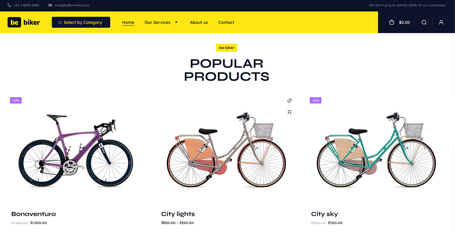
On the BeBiker 4 website, for instance, the left-hand navigation bar features links labeled “Account,” “Search,” and “Shopping bag/cart.”

If the same iconography is utilized across all websites, users won’t be confused about how to use this area of a website header. This is because all websites will use the same iconography.
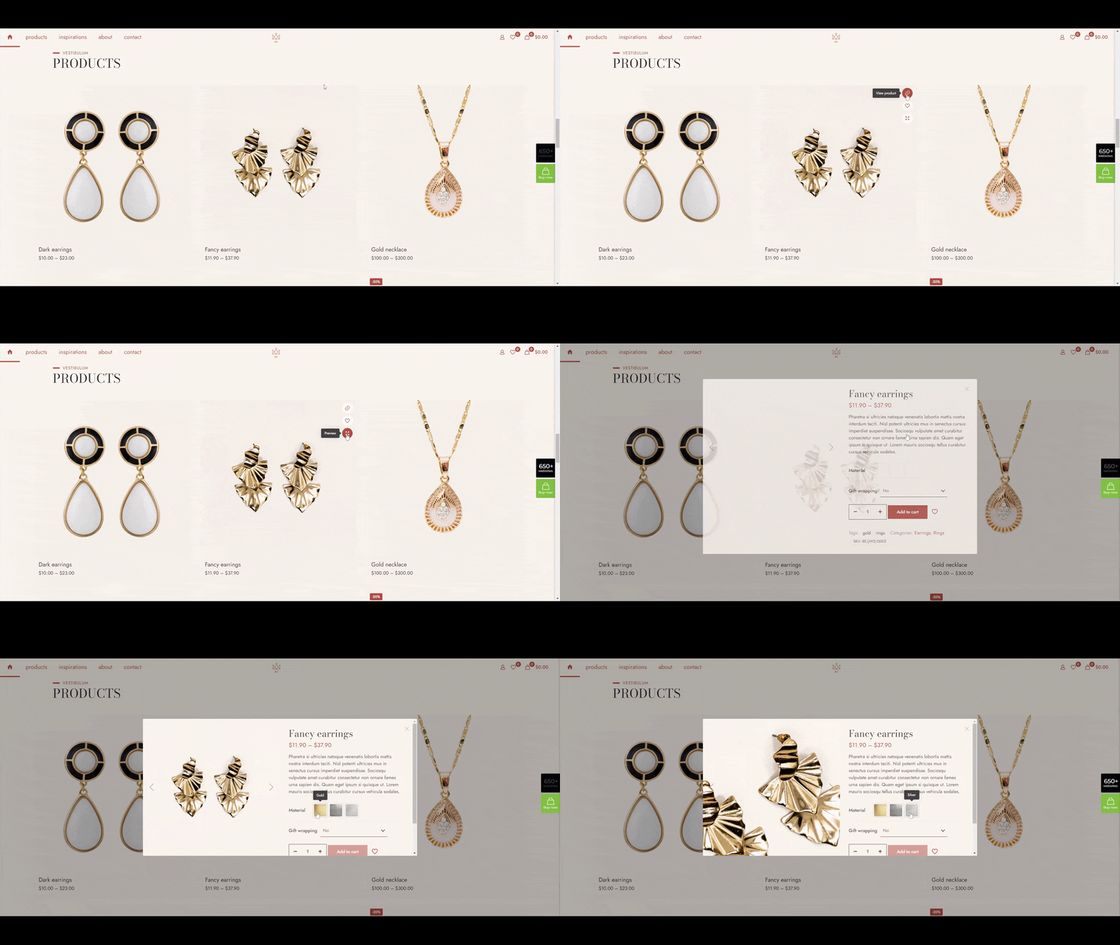
However, you need to take into account the diverse nature of your customer base as well as the myriad of ways in which a single person can have their own unique interpretation of certain less common imagery. In 2023, hover-triggered help words will begin to appear above symbols on web pages. This change, which is being made to improve the user experience when interacting with iconography on websites, will take place.
On the website BeJeweler 2, you may examine an example of this pattern to get an idea of how it looks:

Help text can be visible when consumers hover over variant swatches in addition to when they click on product icons. This takes away all space for interpretation and guarantees that all visitors can interact safely with website material going the future.
2. More Social Proof
Building relationships with clients, whether they be personal or business-related, requires trust.
Any efforts to foster trust must begin there since websites are where people encounter firms for the first time. Web designers will do this in 2023 by utilizing social proof and trust indicators.
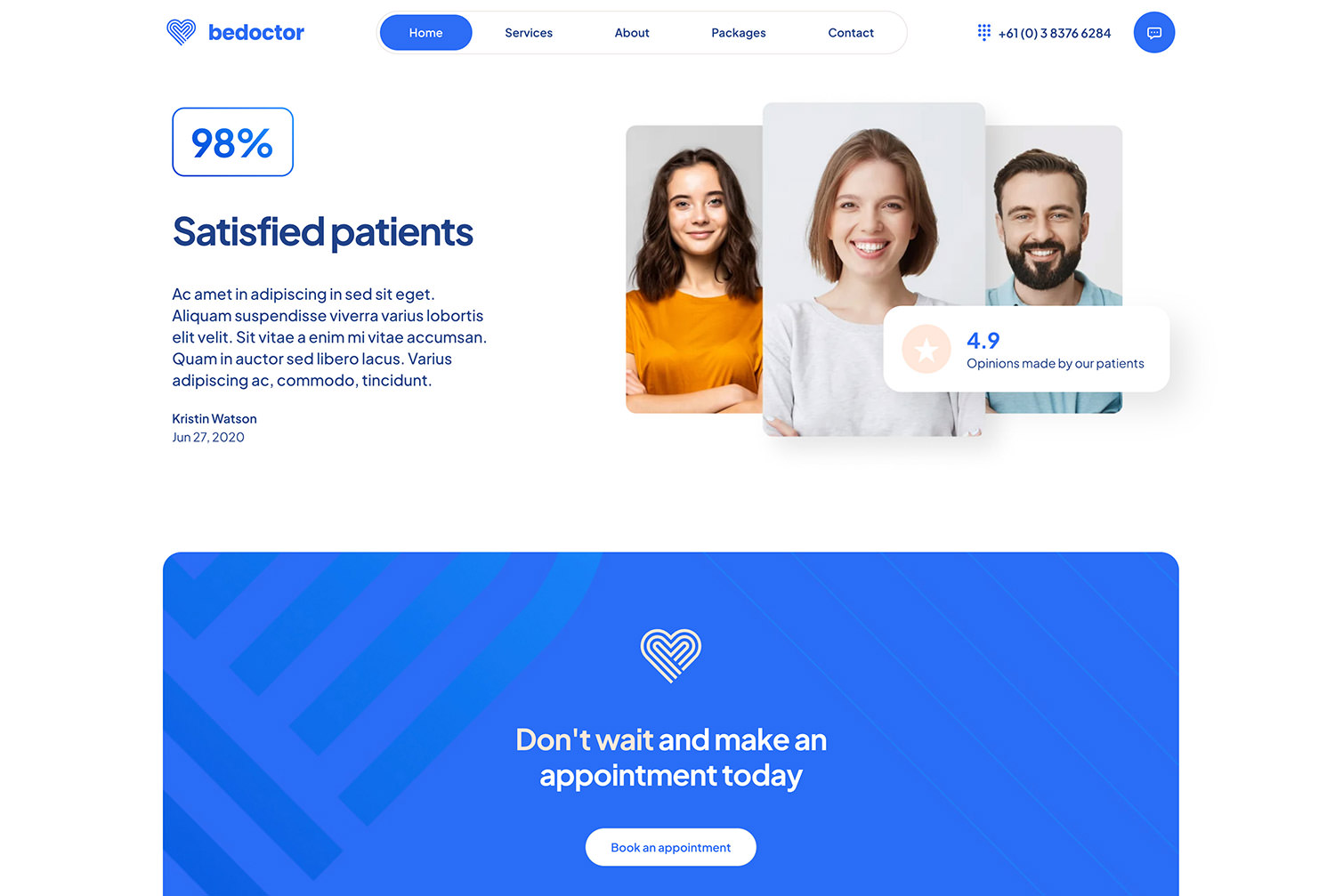
These trust-builders can be used in a wide variety of other ways on websites. BeDoctor’s website employs one of the most well-liked and successful methods to address this problem by including both a page and a section on the home page with authentic evaluations and/or testimonials:

This particular image displays three distinct types of content that could assist in increasing consumers’ levels of confidence in a website:
- A recommendation from a previous customer
- An overall rating of the level of satisfaction experienced by the customer base
- A reference from a previous customer
If this describes your firm, it is possible that it is still too soon for you to have amassed a substantial amount of social proof. If this is the case, you should refrain from making any boastful statements on your website and instead focus on building up your customer base. In this case, trust marks have emerged as the most viable alternative.
Customers are given the peace of mind that their financial dealings are secure thanks to the implementation of security seals such as the logo that appears next to the “Checkout” button. According to BeMarketing 2, one more technique to boost the credibility and trustworthiness of a website is to add additional context to the statements that are made on that page.

An explanation of the statement that has an asterisk next to it can be found further down below. This section may contain a link to a website or a disclaimer that provides additional information.
3. Specific Mobile Features
With more and more people recognizing and comprehending the fundamental concepts behind responsive design, its implementation will eventually become simpler. The fact that the great majority of WordPress themes are responsive by default significantly reduces the need for assumptions to be made by the designer.
Despite this, the development of mobile websites has come to a standstill as a result of this. Despite the fact that responsive websites provide an exceptional user experience, web designers rarely feel pressured to come up with innovative ways to enhance the functionality of these sites.
This will change in the year 2023, when there is a greater emphasis placed on the mobile experience. The process that designers use to create functionalities that take into account the challenges and friction that are specific to mobile devices.
For instance, the design of the navigation system will function as an illustration of this point. Consider the website of BeLanguage 4 as an illustration:

You can utilize any of the page links found on the standard, non-mobile website. The “Call us” button can be seen at the very top of the list of available links on mobile devices. On a computer, it is shown at the conclusion.
We’ll notice minor changes in the way that key components, like the navigation, are produced when designers examine the data they have on user habits and goals for the different devices that people use.
By 2023, an increasing percentage of websites will include functionality that may be used with mobile apps. It must be carried out by BeFurnitureStore. A sticky bottom bar has been added to the top bar of the desktop site, which previously had a multi-level header design and had connections to the user’s account, shopping cart, and favorites.

In the upcoming years, web designers that reinvent and improve the mobile web experience will be able to present their websites as high-end products.
4. Shape Texturization
Since skeuomorphism was first developed many years ago, a range of real-world textures has been added to the screens of our computers and cell phones. However, as soon as people realized that such textured backgrounds were unneeded and obtrusive, they went out of style and the design fad was dropped.
Despite this, using digital texturization is not a bad idea just because a particular web design trend is no longer in vogue.
Before 2023, web designers will test out organic shapes to incorporate textures into their designs that are delicate and strategically important. As an illustration, you might encounter something similar on the BeRenovate 5 website:

Every webpage on the website has a rounded, curved background. Without taking over the design, they improve the UI’s aesthetic appeal.
Another option is to apply digital texturing wisely. BeCoaching 3 is an effective illustration of how to direct readers’ attention to specific pages.

The entire website, which consists of a single page, makes use of two formats. It will be significantly easier to guide visitors’ attention in the right direction due to the regularity of the texturization.
The forms are typically found closer to the page’s right margin. Since users’ eyes are frequently directed to the left edge of the screen, these forms should increase the quantity of content that users view and interact with.
5. Additional Video
Online information access preferences among consumers are incredibly varied. The benefits of reading blogs can be reaped by anyone with the time to do so. For individuals who would rather watch or listen than read, video blogs or vlogs would be ideal.
However, not all of the content you offer on your website can be accompanied by a video. To begin with, the design can soon become unmanageable if you intend to offer a unique manner of content consumption. The addition of videos can significantly slow down a website’s loading time due to the enormous file sizes that go along with them.
By 2023, only when it is absolutely required will designers utilize a video substitute or supplement.
For instance, halfway of the page on the BeBusiness 6 website has a full-width video area that may be accessed. This must be taken into consideration:

There are several ways to use this video clip: to display video testimonials, to give a succinct explanation of the technical specifications of the product or to summarize all that was discussed earlier.
Additionally, supplementary footage need not take up much space to be beneficial. As an illustration, the video is available as a little cutout under the BePregnancy hero section:

By clicking the sizable, flashing “play” button, viewers may begin viewing right away (if they want to). Again, there are a variety of uses for this data.
By utilizing video selectively and avoiding autoplay video backdrops and portions, designers can help speed up website loads.
What Do You Think About These Web Design Trends?
Some of the most obvious predicted shifts in how websites look and function, such as the increased use of creative typographic usage, fluid animations, and other aesthetic embellishments, are rarely included on lists of web design trends. New color schemes, inventive typography, and fluid animations are all examples of such alterations. But by 2023, designers will have to change their focus to trends that will boost the quality of the web as a whole and promote more active participation from users.
Building reliable relationships and being approachable to others are challenging tasks. In contrast, websites made with BeTheme will exude an aura of simplicity because many of the more than 650 example websites included with the WordPress theme already take these characteristics into consideration.
The post 5 Web Design Trends That Will Dominate 2023 appeared first on Hongkiat.