Desk.com, states: 72% of people think that self-service is a fast and easy way to resolve issues. Not only that, 40% of customers proceed to phone support only after they DON’T find their answers using the self-service option.
So it’s clear: support content in the form of FAQs and more are the modern day user’s preferred means of accessing support.
Such support channels don’t just appeal to the customers; they appeal to the business owners as well. As the customers get habituated to helping themselves with these resources, they tend to raise fewer tickets (thus saving many support hours).
But I get it… creating all kinds of help content is hard. Even FAQs. So, to help you offer a sleek FAQ experience, I’ve rounded up 5 stellar examples of FAQs.
Some of the criteria for choosing these FAQs is the same that a popular FAQ user experience deconstruction study established.
A few other things that I considered:
- Do the FAQs need categorization? If so, are they categorized?
- Is it easy to find the questions?
- Is the design easy on the eyes?
- Is a search functionality included?
As you can tell, I’ve looked at the overall FAQ experience — that’s like looking at both the design and structure.

Build a searchable FAQ so your users can find answers quickly.
Get the Theme
1. MailPoet
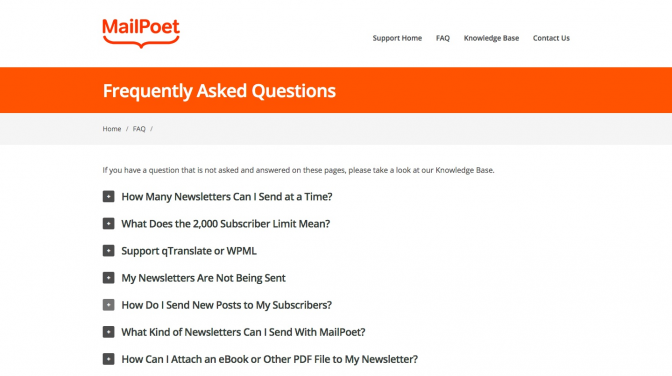
MailPoet, a friendly email marketing service for WordPress sites, offers a great FAQ experience with the right structure and organization for listing questions paired with a great font.

A simple list-based structure: Since MailPoet is a relatively simple service with limited FAQs, it makes sense to display the questions as a list rather than introducing unnecessary categories or structures.
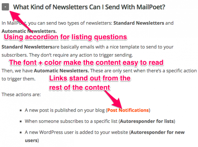
Also, the use of accordion elements for offering the answers give the FAQs a neat look. Using accordion elements makes sense in this case because most of the questions don’t have 2-3 sentence answers. If this were the case, the answers could have well been answered inline.
Readable font: MailPoet’s FAQs are easy on the eyes – thanks to the highly readable font. The font’s color too contrasts with the background thereby further improving the readability.
Easily identifiable links: Since a lot of FAQs link to different help articles in the answers, it’s important that the links are easy to recognize, which is the case here.

2. FreshBooks
FreshBooks, the accounting software from small businesses, takes the pain out of their FAQs by categorizing their questions for quick access.

Thoughtful categorization: As expected, a big solution like FreshBooks generates a lot of questions. And so, to make it easy for the users to find their questions (and answers), FreshBooks offers as many as 10 categories.
Chunking for better scanning experience: FreshBooks displays their questions with a refreshing style created using chunking. This makes the questions pretty scannable.
Featured questions: Since FreshBooks FAQs list too many questions, it’s likely that users might need several minutes to look for their answers (even with the categorization). So, to help users with the most common queries right away, FreshBooks features 9 of their most popular FAQs on their support page. Thus, a lot of users are saved from the effort of browsing through the different categories and questions.

3. TaskRabbit
TaskRabbit, the online marketplace of freelancers to do local jobs, creates a meaningful FAQ experience by splitting their FAQs for their main audience types.

The right FAQ structure: Since TaskRabbit caters to 2 audience types: the people who want to get the jobs done (Clients) and the people who do the jobs (Taskers), TaskRabbit breaks down their FAQs into 2 main parts: (1) Client resources and (2) Tasker Resources.
By introducing this broad level categorization, TaskRabbit ensures that users belonging to either of the groups don’t waste their time browsing through irrelevant questions.
Categorizing questions: Questions on the same theme are grouped together under categories. And for each category, TaskRabbit features the most popular questions (right under the category name) thus providing one-click help to most users.
Easily recognizable links: All the links in TaskRabbit’s FAQs are easily identifiable; thus the overall user experience is enhanced.

4. Lynda
Lynda, the online learning platform, adds a dash of color to their FAQs and well… features the most popular categories!

Featured categories: With 15 categories, Lynda sure does a great help to their users by featuring their popular categories. This way, most users can at least choose the right category to dig into to find their questions.
Featured questions: As you hover over the categories, you are immediately shown the most asked questions in that category. Doing so ensures that most users are offered their answers immediately.

5. AirBnb
AirBnB, the ultimate accommodation solution for anywhere in the world, has a handy and heavily branded support / FAQ page that displays their most popular help topics and questions

A prominent search bar: AirBnB isn’t the first item on this list that comes with a search functionality, but it’s definitely the first one where the search bar is easily noticed.
The search bar’s placement is important in support content because 63% of customers find the search bar experience frustrating. Desk.com recommends placing it prominently on the page.
Featured categories: By featuring categories, AirBnB facilitates the process of finding help.
Featured questions: Below the categories, you can find 5 of the most popularly asked AirBnB help questions. So, most users can find help immediately on the page.

As can be seen in the above examples, design is one of the core elements that helps create meaningful FAQ (or support content) experiences. This brings us to the next point – of choosing the right support content solution for your business.
Note: You should go for a ready-to-deploy solution for this one because getting such a system developed from scratch will cost you a lot (plus, there will be a high recurring maintenance fee.
Choosing the right FAQ or support content solution
Based on the above FAQs, if I had to compile a list of the must-have features in an efficient FAQ or support content solution, they’d be:
- An easily readable font
- A scannable structure
- A search feature (even better if it came with auto-suggest and a prominently placed search bar)
- Support for categories
- Ability to feature popular questions
And some nice-to-have features would be:
- Analytics (to see how the content is performing)
- Ability to collect feedback (to keep improving the content)
- Password protection (to protect the help content in case you want it to be available only to your logged-in users)
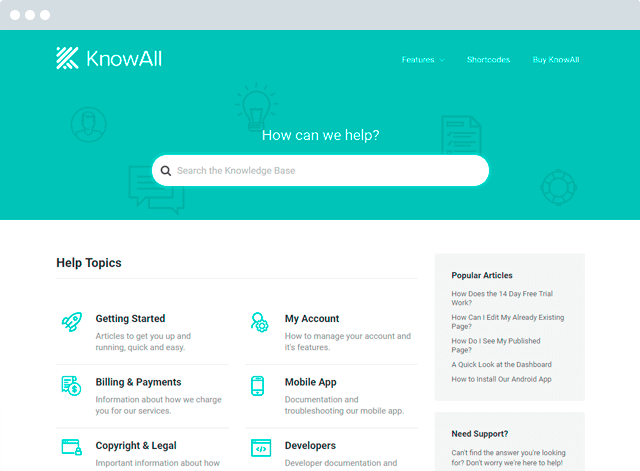
Now, if you’re a WordPress user, you’re in luck because we’ve developed a product that offers the above functionality right out-of-the-box.
HeroThemes has developed a range of products that deliver these features.
No matter what business you run, you can use a Knowledge Base to take care of your support content. All you need is packed right inside this powerful plugin.
Check out our Knowledge Base plugin for details.
Conclusion
Like we keep saying on this blog, good FAQs (or any help content for that matter) are more than just questions, answers, and how-to articles. The truly helpful ones go beyond content. They are thoughtful of the overall user experience. So, in addition to content, pay attention to their design and structure and organization.
Which is your favorite example from the above list? And what are some other examples of FAQs that you find impressive? Do share in the comments!
The post 5 Examples of Effective FAQs to Inspire You appeared first on HeroThemes.