While the average conversion rate for eCommerce websites is 3.5%, top-performing eCommerce sites far outstrip this meager figure, converting at a whopping 25.8%.
But what makes the difference between these masters of sales and the rest of the heel-draggers?
Easy — a focus on conversion optimization.
Want to drive more sales this festive season? Instead of feeling around in the dark, test, measure, and analyze the website features that directly affect conversions.
By doing this, you can identify the best eCommerce website practices that will optimize your site for more conversions over the holiday period.
Keen to know the top tactics to drive Christmas sales?
Read on to learn the top actionable website practices that high-performing eCommerce sites use to drive conversions and boost sales.
What are Conversion Optimization Website Practices?
To start, let’s consider what conversions actually are.
Typically, people tend to think of conversions in relation to sales — more conversions means more people transitioning from potential customers to sales.
While sales certainly count as a type of conversion, conversions occur any time a website visitor completes an action you want them to complete.
For example, conversions could be:
- Email opt-ins
- Newsletter subscriptions
- Free trial signups
- eBook downloads
- Form completions
Conversion optimization refers to the practices used to increase the number of conversions on your website.
The most effective conversion optimization practices for eCommerce websites aim to make the conversion process clearer, easier, faster, and more appealing to your target audience. These techniques include everything from tweaking your website performance to altering wording.
Read on for the top website practices high-performers us to drive eCommerce conversions.
3 Actionable eCommerce Website Practices For More Sales and Conversions
If you want more conversions, you need to make it easy for your customers to convert. If the sales process is disjointed and overly-complex, buyers will simply jump ship.
Reduce cart abandonment rates by simplifying the buying and conversion process using these there actionable eCommerce website practices.
1. Enhance your website performance
There’s nothing worse than trying to purchase something from a slow-loading, clunky website with broken links and missing images.
Make sure your website’s performance is up to scratch and easily accessible by secure connections to encourage sales and fuel higher conversion rates.
Speed up your website
81% of marketers are in agreement – slow-loading websites experience fewer conversions. This is because shoppers are far more likely to abandon websites that don’t load quickly enough.
If you want more sales, you need to keep visitors on your website. You’ll keep 90% of traffic from abandoning your site if it loads between one and three seconds. However, if it tips over the five second mark, your abandonment rate will climb to 38%.
If your page loading speed reaches 10 seconds, you’ll lose 65% of your visitors.
To speed up your website, try compressing images, optimizing code, cutting back on third-party scripts, and choosing a speedy web host.
Responsive design is imperative
Mobile traffic accounts for 53% of eCommerce sales. If your website isn’t optimized for mobile devices, you stand to lose over half of your conversions.
But mobile-first design isn’t all you need to worry about. As it happens, tablets convert much better than mobiles — 53% better, in fact.
In this respect, your website design needs to be fully responsive to all smart devices to enable eCommerce sales across various shopping channels.
Consider how well images load on smart devices, how easy text is to read, and whether it’s difficult to click on call-to-action (CTA) elements. Equally, make sure your page isn’t too heavy to load on a mobile device or too cluttered for customers to understand what to do.
Test web design elements
Testing in the best way to determine which web design elements encourage conversions and which prevent sales going through.
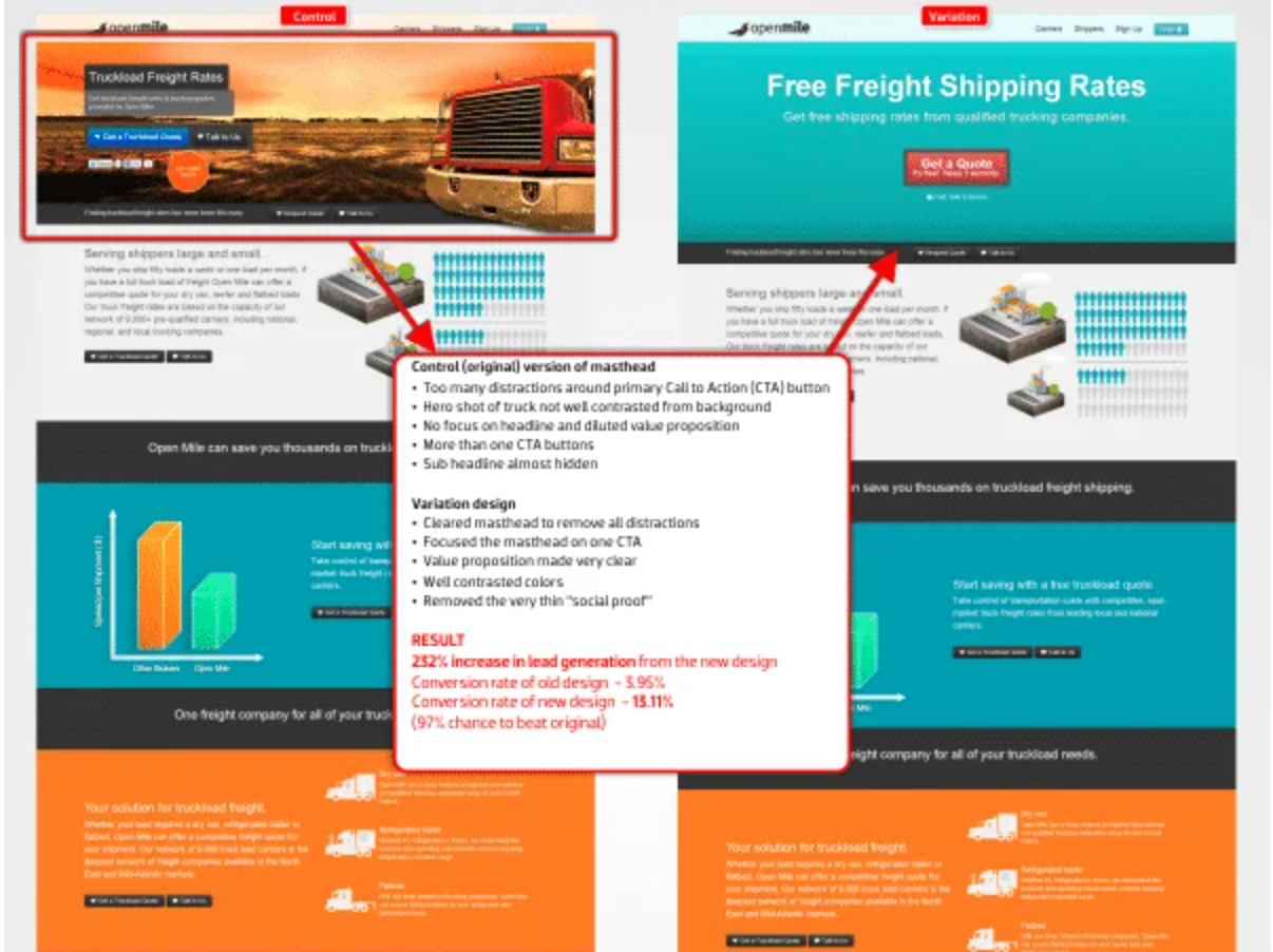
One way to do this is to A/B test landing page design. In this kind of test, you design two different landing pages and some customers are sent to one, while others are sent to the other. From here, you can see which landing page receives more conversions.
This is how Open Mile increased its conversion rate by 331%.

(Image Source)
By testing two different mastheads, VWO was able to work out that a less cluttered header image would leave more conversions.
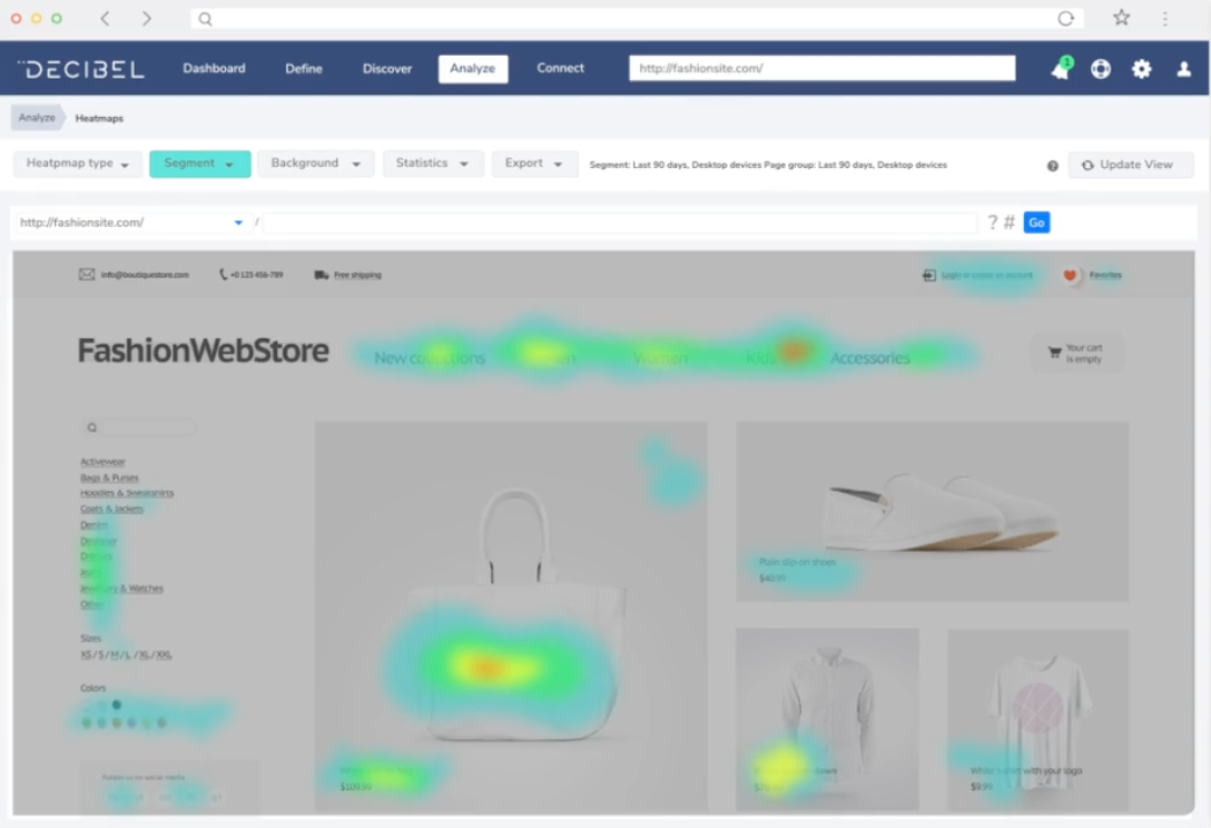
Another way to test the performance of your web design elements is to use a heat map tool like Crazy Egg, Decibel, or HotJar.
Heat maps show you which elements your customers hover over and click on the most.

(Image Source)
By studying a heat map of your website, you can get rid of low-performing web design elements in favor of those that incite conversions.
2. Prove your worth with social proof
While the internet makes it easier to get your product to the masses, it also makes it easy for customers to compare your products with your competition.
Your eCommerce website needs to show your customers that your products and services solve their problems better than your competitors.
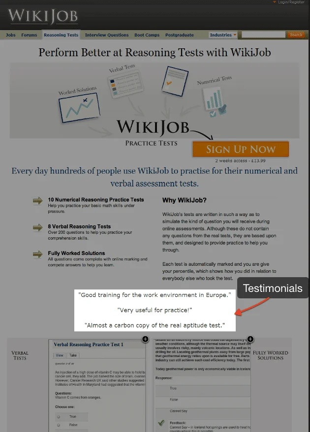
Add testimonials and reviews
The modern-day eCommerce shopper uses reviews as a benchmark to compare similar products online. In fact, 92% of shoppers read reviews before buying a product.
Reviews and testimonials serve as evidence that customers are happy with your product and that it solves their problems.
This kind of social proof can increase conversions by over a third.

(Image Source)
Just look at WikiJob. By adding testimonials to its website, the graduate job site managed to increase conversions by 32%.
Add trust badges
Trust badges indicate that customers can trust the quality of your product.
Trust badges might demonstrate that your products and website are:
- Highly secure
- Ethically sourced
- Award-winning
- Endorsed by a third party
Other trust badges might show that you offer free shipping and returns or that customers have a money-back guarantee.
By adding trust badges to your website, you help consumers to believe in the quality of your product — which increases conversions.
Take Scandinavian children’s clothing brand, House of Kids, for example.
Using the E-market trust badge to signal that its website is highly secure, the children’s wear firm managed to push conversions by 32%.
3. Streamline the customer experience
Make it easy for customers to buy your products.
If your website is confusing or the buying process goes on too long, customers will simply lose interest and abandon their purchase altogether.
Streamline the customer experience to increase the chances of conversion.
Include obvious CTA buttons
Let customers know what they need to do next by clearly indicating the path they need to follow.
CTAs signal to the
customer the correct steps to take next. Your CTAs should directly relate to the actions you want your customers to carry out, whether that be to join your newsletter or purchase your services.
Make it clear what they need to do and how they need to do it by adding buttons that show exactly what and where customers need to click.
Test your CTAs to find which work best. For example, tests have shown that red buttons tend to convert best. What’s more, with the right CTA wording, you can amplify conversions by 621%.
Note that click-through CTAs work 2.8 times better than CTAs that ask customers to fill out forms, so try CTA buttons for more conversions.
Build anticipation and express joy
Emotionally-charged wording can have a considerable effect on your eCommerce conversion rate.
Shoppers wanted to feel excited about the purchases they’re going to make, so gearing language toward anticipation and joy will push more sales. In fact, recent studies show that wording that increases anticipation can boost conversions by 5.5%, while words that insinuate joy push conversions up 5%.
In contrast, negatively-charged wording can cause conversion rates to drop by 2%.
Bear this in mind when describing the problems your product solves.
For example, if you sell hair care products, try wording like ‘Craving a good hair day?’ instead of ‘Having a bad hair day?’.
Top positive words to try on your eCommerce site include:
- Passion
- Gift
- Freedom
- Enlighten
- Winner
- Cheer
- Vivid
- Abundance
- Smile
- Love
Enable various payment methods
Half of all consumers will cancel a transaction if their preferred payment method is not available.
Since there are now so many ways to pay online, this means you’re missing out on a great deal of custom if you only have one payment method available.
Go beyond card payments — offer alternative payment methods on your website. Think about digital wallets like Paypal, Stripe, and Alipay as well as cryptocurrencies like Bitcoin and Litecoin.
Declutter your website
eCommerce shoppers like simplicity when purchasing online. You should declutter both the look of your website and the wording.
In terms of visual design, remember KISS (keep it simple, stupid).
With clean, simplistic design eCommerce shoppers can more easily see where they’re supposed to click to move along the customer journey. Without lots of images and wording cluttering the page, you can draw customer attention directly to what’s important, such as a product image or a CTA.
Think about the above example of Open Mile.
By using a less cluttered masthead, they found that conversion rates rocketed by 331%.
In terms of wording, keep your content below 300 words and make sure it’s aimed at a middle-school grade reading level for the best conversion rates.
Conclusion
As you can see, by focusing on the website elements that directly relate to conversions, you can identify the features that’ll increase your holiday sales this year.
Remember that your website performance is as important as how it looks. If your website’s slow and clumsy, people will abandon your site before they’ve even started their Christmas shopping.
If you’d like a little more help optimizing your eCommerce WordPress site for conversions this festive season, contact us, we’re experts at developing sites that drive high sales.
The post 3 Actionable eCommerce Website Practices To Boost Your Sales and Conversions appeared first on Torque.