
What do Facebook, YouTube, and Amazon have in common, besides being some of the most popular websites online?
Despite their different content offerings, a recent consumer survey from Clutch named them as the top 3 websites with the best user experience (UX). Despite how users might feel about the companies themselves, they have a positive experience interacting with their websites and products.
Because Facebook, YouTube, and Amazon are so highly trafficked, they establish user expectations across the internet. Businesses would be wise to follow the example they set in website UX.
We take a closer look at these companies’ websites can shed some light on what small businesses can do to improve their own website UX.
They Prioritize Content
Facebook, YouTube, and Amazon all prioritize content on their sites. Each site has a complex array of content offerings, but they use design and UX to ensure their users find what they are looking for.
Almost half of people Clutch surveyed (48%) say they would return to a site if they found the content to be useful. Keeping your content relevant and useful can help convert casual website visitors into returning customers and readers.
What makes content useful, however, depends on a users’ intent. Useful content looks different on Facebook, YouTube, and Amazon.
For an e-commerce business, useful content might be a picture of a best-selling product or a navigation toolbar to help someone what they want to buy.
For content-driven platforms like Facebook and YouTube, what makes something relevant depends on the user and their reasons for searching.
On YouTube, 300 hours of video are uploaded every minute. Because of this high volume of content, YouTube’s UX condenses the videos users see into feeds based on data collected.
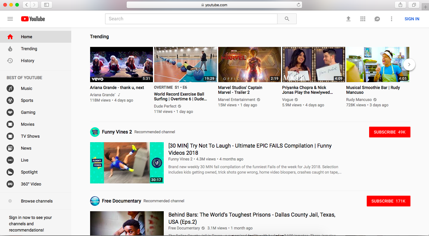
The first thing someone sees is the “Trending” video feed – a thread based on videos previously viewed. If a user is looking for something specific, they can search in the search bar or use the “Best of YouTube” navigation menu on the left-hand side.
Developing content that is relevant and useful is one way to personalize the user experience on your website. It shows that your business cares about its customers, and ensures that they’ll return to your site for more.
They Optimize for Mobile
It’s no coincidence that the most popular websites also look great on mobile web. Facebook, YouTube, and Amazon all optimize their websites for mobile – despite having mobile apps with great UX.
People like having information at their fingertips – whether they are on the go or at home on the couch. Almost half of people surveyed (47%) user a mobile device the most when they browse websites.
It’s important, therefore, to optimize your website for mobile to maximize your reach and provide the best possible experience for your users.
Facebook, for example, simplified its complex platform for the mobile web and presented the most relevant information for mobile users.
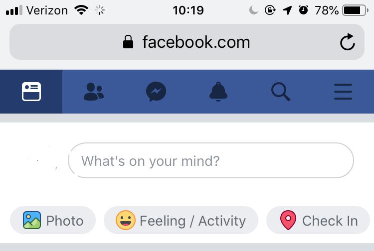
The timeline feature is easy to scroll through, and the toolbar at the top presents a clear set of options to people looking to use the site.
The site still prioritizes content, but the design and layout of the content are adjusted to meet mobile users’ needs.
This is particularly important since people now prefer browsing using mobile web browsers rather than downloading apps.
Mobile apps are useful for businesses, but downloading a mobile app is an extra step for people who want quick access to content and information.
Emerging global markets such as India rely heavily on mobile web to access content and services online.
Developing a great website UX on mobile means that you’ll reach more people with your content, and that those people will have a great experience with your brand.
They Avoid UX Mistakes
A UX mistake can be anything that frustrates people browsing online. The top two website frustrations, according to the survey, are:
- Unreliability (Broken links, 404 errors, etc.)
- Slow load time
Facebook, Amazon, and YouTube all take care to avoid these website UX pitfalls. They employ entire departments for quality assurance testing, and they rarely display broken links or pages. The content on each of these sites is also valuable enough that they can afford the occasional UX pitfall. Small businesses don’t have that luxury.
Unreliability, slow load speed, and excessive pop-up forms can each cause over half of the website users to abandon your site for good. Because there’s plenty of quality content on the internet, there are few reasons for them to stick around for a slow page or a pesky pop-up.
All three of these mistakes can cost you – both in website traffic and SEO. They can also damage your brand’s reputation with readers or customers.
Google penalizes sites that exhibit any of these three UX mistakes. Page speed is particularly detrimental. Earlier this year, a Google webmaster update announced search rank penalties for slow-loading mobile sites.
Making sure your website is reliable shows your site’s visitors that you care about their loyalty to your brand. Make your site a stable source of content for them.
A reliable, functional, and fast website demonstrate a commitment to your users’ experience on your site. Don’t drive them away with bad UX.
Final Thoughts: What You Can Do
Facebook, Amazon, and YouTube are all large companies with resources and staff to make their websites the best on the internet. They put content first, making the site revolve around the users’ needs. They have great mobile sites, and they avoid costly UX mistakes like unreliability and speed.
Here are 3 things you can do today to improve your site’s UX in line with the big players:
-
- Create customer journey maps to determine what content your users want. Once you’ve identified what people want to see on your site, work with your web designers to make sure that content is front and center.
- Run Google’s mobile-friendly test to see how your site stacks up. Once you’ve identified any problems, it’s easier to work with web designers and developers to fix them.
Develop a comprehensive quality assurance plan to catch broken links and unfinished pages on your site. It could be as simple as documenting glitches as you come across them over a period of several months.
By following the example set by top websites and taking these steps, you’ll be closer to good website UX for your company.
The post What Facebook, YouTube, and Amazon Get Right about Website UX first appeared on Web Design & Digital Marketing Tips.