
If your website was a house, your header would be the lawn. It’s the first thing users see, and it dictates whether they keep driving or stop to take a look the house. With so much riding on the header, it can be tempting to jam it full of bells and whistles.
A header can accomplish the following:
- Display the brand identity, including photos, slogans, logos, and colors. If the brand has a visual element, the header can display it.
- Interaction fields for search, subscription, and/or language options.
- Call-to-Action fields (i.e., a button that says “try” or “shop”).
- Basic navigation links.
- Social media network links.
But is the capacity enough to justify fulfilling every function? No. If every available element of a header is used, the quality of the user experience (UX) will dissolve. Headers should be easy to access and easier to decipher – remember, this is the website’s lawn. If the lawn were covered with shrubbery from curbside to door, it would be inaccessible. In the same way, a cluttered header signals that navigation and content will be difficult to reach from their current location.
Header Design Aspects
Defining which functions a header should fulfill will vary from site to site. If the goal of the site to provide information on a product, a CTA field and brand identification would be higher priorities than linking social media networks. But if the site were devoted to showcasing a marketing agency’s work, social media links would have a much higher priority than the first case.
There are some constants to consider for header design, however. Most websites want users to engage and explore the content. One of the most important header design aspects is how it facilitates site navigation.
Navigation Options
Perhaps the most popular option for providing navigation within the header is the hamburger button (displayed as ? ). This button, sometimes called the pancake or hotdog button for its layered appearance, has two advantages over other navigation styles.
The first advantage is that it allows the designer to display a full menu easily from the header without displaying complicated paths, as in the classic navigation style. Instead of displaying textual based hierarchy (i.e., home > gallery > cats > gifs), users can use a visual hierarchy to access the end page they want in fewer clicks.
The second advantage, and likely the reason that the hamburger menu harbors so many top left corners, is that it’s highly compatible with mobile viewing. These compressed menus allow mobile users to appreciate the style and content of a header without significant amounts of screen space being occupied by the navigation pane.
Typography
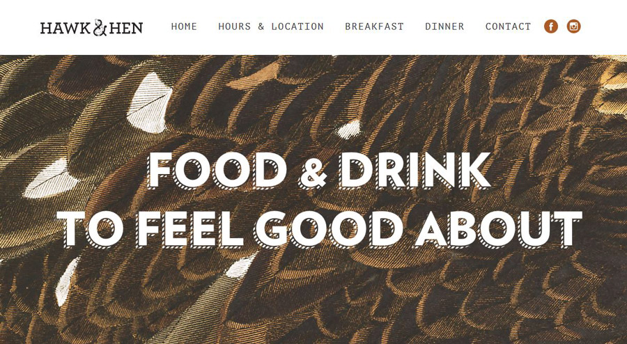
Source: Hawk & Hen
Clean, smart typography is half the visual battle for a header. The text must be visually distinct without losing readability. If the type face in a header is too stylized, it can detract from the credibility of a site and discourage users from reading further. On the other hand, if the type face is so generic that it’s unremarkable, what it gains in readability it may lose in interest.
But in the battle of form versus function, typography will always favor function. It’s more important that text is legible than it is to establish brand identity through type face.
Of course, in an ideal situation, the type face can accomplish branding and readability at the same time. But when in doubt, focus on visual acuity above all other facets in header typography.
Illustrations and Photos
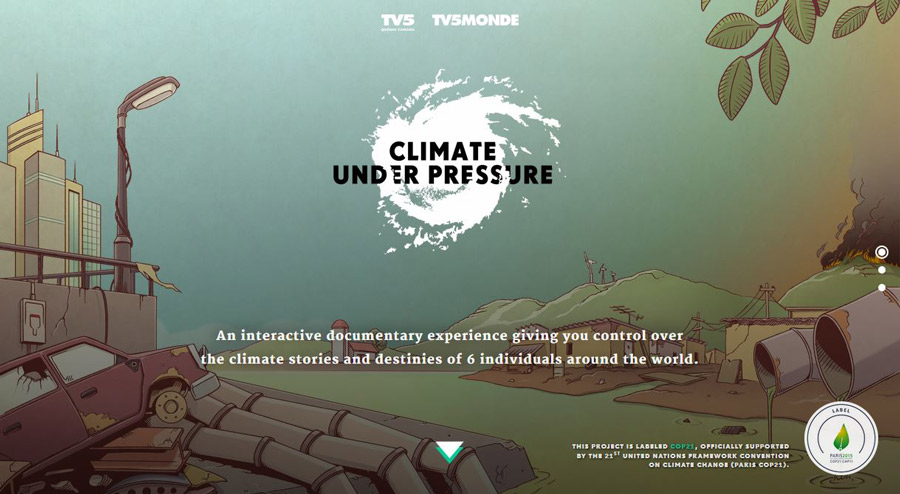
Source: Climate Under Pressure
There was a time when a header was defined as the static image behind a site’s navigation. While a header can still be defined that way, the use of imagery has changed significantly in recent years. Illustrations are more popular than ever for website designs and can offer the right level of abstraction to improve aesthetics without decreasing readability.
Photos and illustrations used on the header should be large enough to accommodate the widest displays while maintaining a ratio aspect to scale down to the smallest of them as well.
Trending Header Styles
Two header styles have taken the main stage in website design trends lately: Hero and video. Both trends have pros and cons for use. Ultimately, which header style (if either) is ideal for a website will be determined by user research and target demographics.
Hero
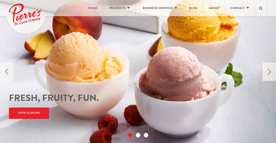
Source: Pierre’s Ice Cream Company
The hero header design features a large image, often the total or near total view of the above-scroll space a user sees, with navigation elements overlaid on top of it. Provided it’s a standard image file, these headers are easy for users to load and often translate well to a mobile display. For merchant websites, hero headers can make a bold impression by featuring flagship products behind the navigation and encouraging users to investigate further.
The downside of a hero header style is that the image chosen defines the user’s first impression: If it’s the wrong picture or a stock photo, they may not be left with a positive–or any impression at all; rarely do websites get the chance to make a second. If you choose to incorporate the hero header design, devote extra time to image selection and testing.
Video
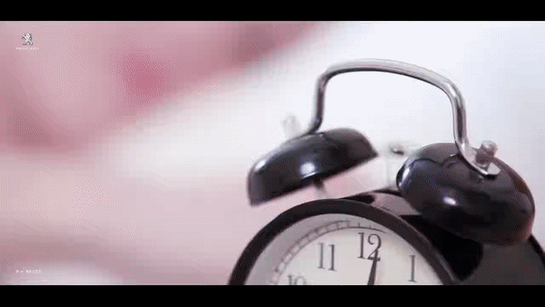
Source: Follow-Your-Intuition.com
Video headers, usually part of a hero layout, are an exciting new trend in web design. These headers allow web designers to display video clips that can make a striking impression and keep users intrigued longer than static images. However, this trend is a relatively recent emergence for a reason: The videos should be at least 720p quality.
High definition translates into higher loading times. On a desktop with a high-speed internet connection, this usually isn’t a problem, but mobile users will have issues with loading and playing videos regardless of their phone OS.
If your website uses a video header, hero-style or not, disable them for mobile users. They’ll appreciate it.
Narrowing Down Your Header Design
Determining which bells to include in your header and which whistles to cut can be a lengthy process, but it boils down to one important question:
“What is the goal of this content?”
When you narrow down what you want your website to do, say, and mean for users, choosing header attributes will come naturally.
Remember, it’s not form versus function. It’s form as a function.
The post Building a Captivating Website Header first appeared on Web Design & Digital Marketing Tips.