

Motion and animation, when done properly, can make your website more attractive. Websites which use data presentation and infographics are the perfect example. Using the animation framework we created previously, in this tutorial you’ll learn how to animate three infographic examples: data counters, progress bars, and circular progress bars.
Before We Begin
I highly recommend you read the previous tutorial before starting, just so you are familiar with the main concepts and the JavaScript functions we’re using.

In addition to the framework we will need a couple of JavaScript plugins and Fontawesome:
In the exercise files I already included these plugins combined in the controller.js file.
Animating Data and Infographics
Infographics by themselves are not animated, they are static forms of data presentation. We are going to take a static infographic web page and add a sprinkle of animation. From the previous article you’ll have gathered that our animations happen when they’re executed by an event. In our example we will use the web page scroll event, so we will animate our various infographic pieces on page scroll once they enter the window viewport.
Animated Counters
First let us start with data counters. Here they are, mid-animation:

Scroll down the demo page to see them in action. Open the controller.js file and find the INFOGRAPHICS section (line 151). You’ll see the code:
$('.et-counter').each(function(){ var $this = $(this); var $thisTo = $this.data('to'); $(this).waypoint({ handler: function(direction) { var element = $(this.element); element.addClass('active'); element.find('.counter').countTo({ from: 0, to: $thisTo, speed: 2000, refreshInterval: 30 }); this.destroy(); }, offset: '75%', }); }); Using waypoints we can detect when each counter enters the viewport and execute the data count at that time. Open the index.html file and find the element with the class et-counter. It has one important and required attribute data-to–this is the number we should count to from 0. Put any integer value you want here. And if you want to animate more than one counter just make copies and change the data-to value; they will animate with the same duration. Once the counter enters the viewport we will add an active class and execute the plugin call.
With the counter element you can use Fontawesome icons and number postfix, like 1000k or 10b. You can also modify this to use a prefix like $1000.
To make the animation more attractive I combined the columns animation with the counters animation.
Animated Progress Bar
The next element is our progress bar. This element is useful for percentage-based data animation. Open the index.html file and find the element with the class et-progress. It contains a div with bar class–you’ll notice it has an attribute data-percentage. Enter any integer value from 0-100, then open the controller.js file and find the code:
$('.et-progress').each(function(){ var $this = $(this); var bar = $this.find('.bar'); var percentage = bar.data('percentage'); var percent = $this.find('.percent'); $(this).waypoint({ handler: function(direction) { bar.addClass('visible') .animate({width: percentage+'%'}, 2000); percent.addClass('visible') .countTo({ from: 0, to: percentage, speed: 2000, refreshInterval: 30 }); this.destroy(); }, offset: '75%', }); }); As you can see from code, we first make sure the progress bar is in viewport with the waypoints plugin. After that we animate the width of the bar div from 0 to the percentage value entered and we also animate the percentage number using the countTo plugin that you are already familiar with from previous example. Here you can also modify the progress bar to have a dynamic color data attribute (I made predefined colors). And again to make the presentation more attractive I combined the progress bar animation with the columns animation.
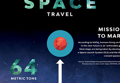
Animated Circular Progress Bar
Our last example is a circular progress bar. The logic behind this element is very similar to a regular progress bar element, but the styling is different.

Again, using waypoints we will need to make sure the circle progress bar is in viewport. After that we will call two plugins: the easyPieChart and the countTo from our first example.
Open the index.html and find the element with the class et-circle-progress. You will see it has data-percentage and data-bar attributes. The first one is the percentage value from 0-100. The second is the color of the animated bar. As the plugin creates a canvas to animate the circle’s progress we will need to pass the color.
$('.et-circle-progress').each(function(){ var $this = $(this); var bar = $this.data('bar'); var track = $this.data('track'); var percentage = $this.data('percent'); var percent = $this.find('.percent'); var size = 200; if ($this.hasClass('size-medium')) {size = 240;} if ($this.hasClass('size-large')) {size = 300;} $this.waypoint({ handler: function(direction) { $(this.element).addClass('visible'); $(this.element).easyPieChart({ barColor: bar, trackColor: (typeof track == "undefined") ? "#eeeeee" : track, lineCap:'square', lineWidth:16, size:size, animate:'1500', scaleColor: false }); percent.countTo({ from: 0, to: percentage, speed: 2000, refreshInterval: 30 }); this.destroy(); }, offset: 'bottom-in-view', }); }); Conclusion
These are just three examples of data infographics you can add to your HTML pages, but even these will take your presentation experience to the next level. If you use data infographics in templates or CMS themes I highly recommend you add as much customization as possible, like the sizes, additional icon support, and micro animations.
You are free to use all of the examples in the exercise files, and you are free to modify and make suggestion in the comments below. Thanks for reading!


![15+ Top Black Friday & Cyber Monday Deals for Developers and Designers [2023]](https://wiredgorilla.com/wp-content/uploads/2023/11/15-top-black-friday-cyber-monday-deals-for-developers-and-designers-2023.jpg)