Technically, there’s no limit to the amount of design and content elements you can place onto a website. But the reality is that the space for getting a user’s attention is finite.
That’s because a visitor typically reacts to what they see in the first few seconds after page load. Anything not visible within that timeframe will likely be missed. Designers and content creators alike have to carefully consider what is included.
While some items will be effective in getting the point across, others will fail. This is what I like to call “wasted” space. Unlike whitespace, the wasted variety takes up valuable screen real estate without adding any real value of its own.
How do you know what’s worthy and what’s not? Let’s take a look at some telltale signs that point to a waste of space.
 Web Templates
2,000+ Templates
 Newsletter Templates
270+ Templates
 Dashboard Templates
150+ Templates
 WordPress Themes
1,200+ Themes
 WordPress Plugins
550+ Plugins
 Mockup Templates
8,200+ Templates
Large Images That Distract from Your Content
Both designers and website owners alike are big fans of utilizing large photos. Whether they serve as the background to a section of content or the entire page – full-width photos are in fashion.
While this can add some real beauty to your design, the context in which these images are used is important. It’s worth considering how they impact the rest of your content.
For instance, a stunning photograph that fills up the screen may look cool. But, does it serve a specific purpose? Does it provide some context for visitors?
If the image isn’t directly accompanied by content, you’re forcing users to scroll down to look for what they need. And if the image is too busy, it may further distract from your content. Complex images that serve as a background to text and calls to action could negatively impact legibility as well.
It’s great to have images that stand out. But without purpose, they’re likely taking space away from something more important.

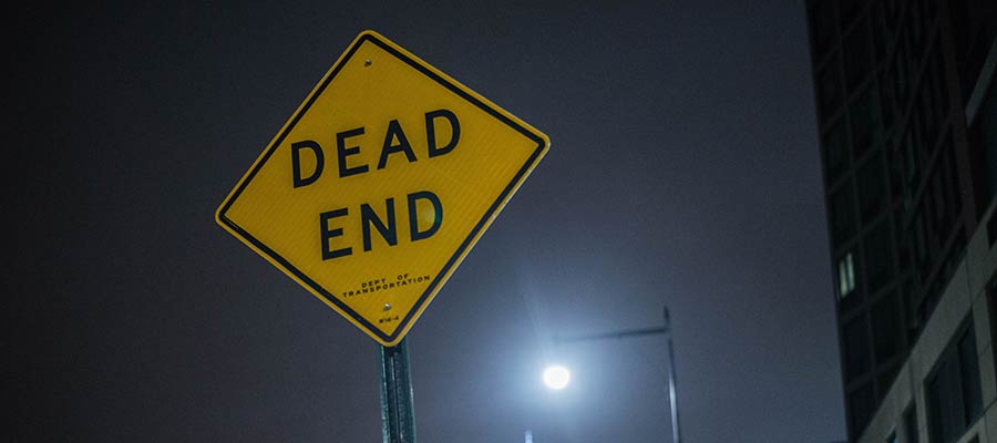
Hero Areas That Lack Actionable Information
A well-crafted hero area will draw a user’s attention. By using a photo, video or contrasting color background, this element naturally separates itself from everything else on the page.
This is why we often utilize hero areas for vital information. Within them, our most important sales pitches and messaging find a place to shine. These are the items that we want to be at the forefront of a visitor’s mind.
Unfortunately, there are times when this element isn’t so informative. The included text may be vague and fail to make a coherent point. The design itself could suffer from the same affliction, with no discernable places to click or actions to take.
No matter how compelling a hero area looks, the content must be every bit as detailed. It needs to provide a simple path for users to follow. In essence, it should include a clear message that motivates the user to do something. That could be contacting you, viewing a pricing page or adding a product to their cart.
Otherwise, the risk is in gaining a user’s attention without giving them anything to do. It’s the web equivalent of a bridge to nowhere.
Long Passages of Uninterrupted Text
A user’s time is precious. They tend to scan content in an effort to find something of interest. Thus, their attention spans aren’t conducive to long passages of text.
The shame of it is that, no matter how great your writing is, users may simply ignore it. In that respect, the content may as well not exist. The result is an expensive, time-consuming waste of space.
But don’t throw your hard work in the trash just yet. There are ways to spruce things up in a manner that is easier-to-digest:
Use Headings
Headings are perhaps the easiest way to break up a long passage of text. With sound use of typography, they instantly stand out to users. This makes it much easier to pick out a relevant section and scan it for more information.
Separate Content via Design Elements
The practice of sectioning off content with the use of design elements has become increasingly popular. It allows designers to create some visual separation and develop a rhythm. The idea is to place separate-but-related portions of text into dedicated containers that look differently. By using multiple background colors or text styles, this content can be both appealing and effective.
Add Smaller Details
It’s often the little things that make a design truly great. And they can be quite useful for helping to break down content into bitesize pieces. Elements such as dividers, images and blockquotes are all great methods to implement.

An Effective Use of Space = A Better User Experience
Design and content strategy are very much intertwined. When one fails, they both suffer the consequences. Therefore, it’s vital to think about both when building a website.
Part of the challenge is in making sound decisions. For instance, you’ll have to decide which elements should be front-and-center. What is it that users need to know right from the start? What can wait or be tossed aside? It’s a competition to determine what belongs and what doesn’t.
In practice, it’s about making the most of the space and time you have to make a good first impression. When users have a clear path to find or do what they want, they’re more likely to stick around.
The post Avoiding Wasted Space on Your Website appeared first on Speckyboy Design Magazine.