We recently updated WordPress.com’s fonts and wanted to give you a behind-the-scenes look at how we chose the list. Here’s an example of a few of them in use.

We looked at several criteria when curating our selections to give your site’s visitors the best experience.
First, we looked at the overall popularity and quality of each font, paying close attention to the letterforms of the most common and most quirky characters. We made sure that these worked well in specific layouts, at different scales, and as part of the entire collection.

To make the cut, fonts had to contain a breadth of styles and weights, including true italics.

It was important to select fonts with broad character and language support beyond basic Latin. We also looked to showcase a diversity of type designers and open source fonts.
Careful consideration of all the criteria mentioned above allowed us to end up with a list that facilitates attractive font pairings for headings and body text.
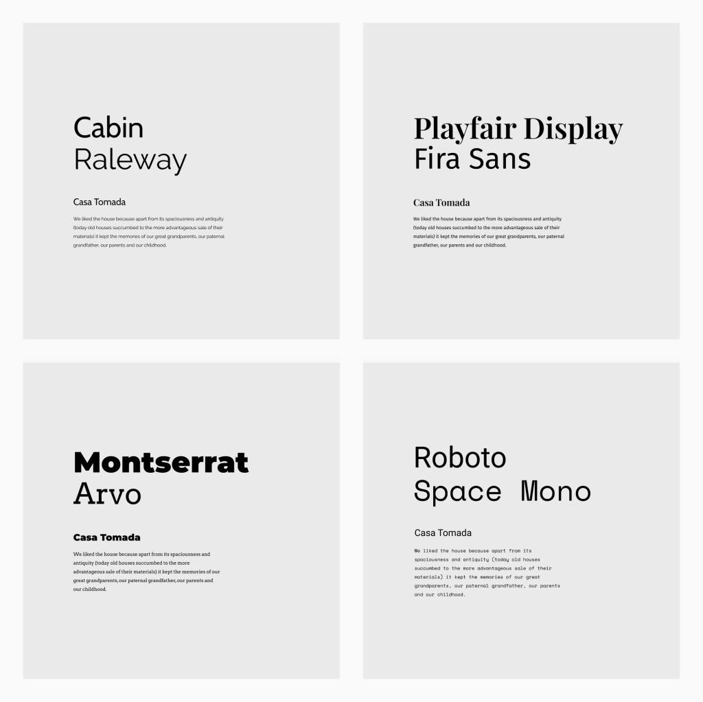
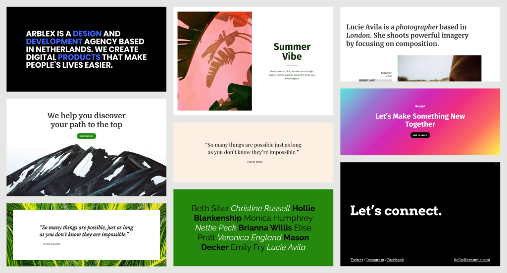
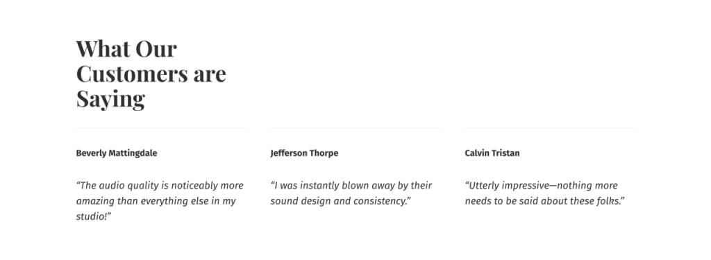
Here’s a closer look at a few patterns you can create with a keen typographic eye.


check them out in Global Styles and the Customizer today. We’re looking forward to seeing how you use custom fonts on WordPress.com! Your feedback will help us continue to grow, refine, and improve the font choices we offer.