Not every designer gets a chance to work on the design of a popular brand or their websites. However, most of them have their own view of how Facebook, BBC, Twitter, Youtube, and other sites should look. That’s why a lot of designers all over the world take their time to create redesign concepts for these famous sites.
They’re not limited by specific guidelines and time, which is perfect for their creative visions and innovations to take root and then take flight. In this showcase, we have collected 33 redesign concepts of the sites you have come to know and love. Let us know which of the redesign concepts you love best, or if you prefer what the official sites look like right now.
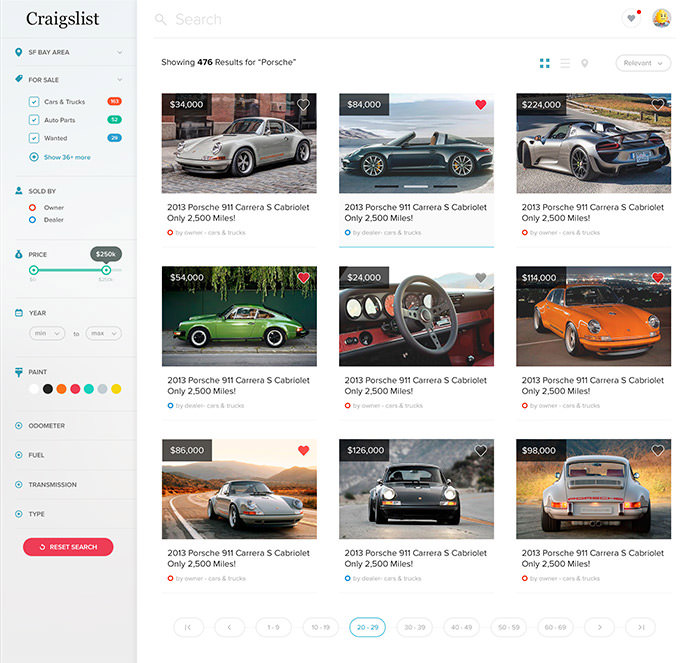
Craigslist
Here is a concept redesign of the famous e-commerce website Craiglist. The designer has worked on the listing page of the website by making it cleaner, adding a prominent search bar, and working up with placement of filters.
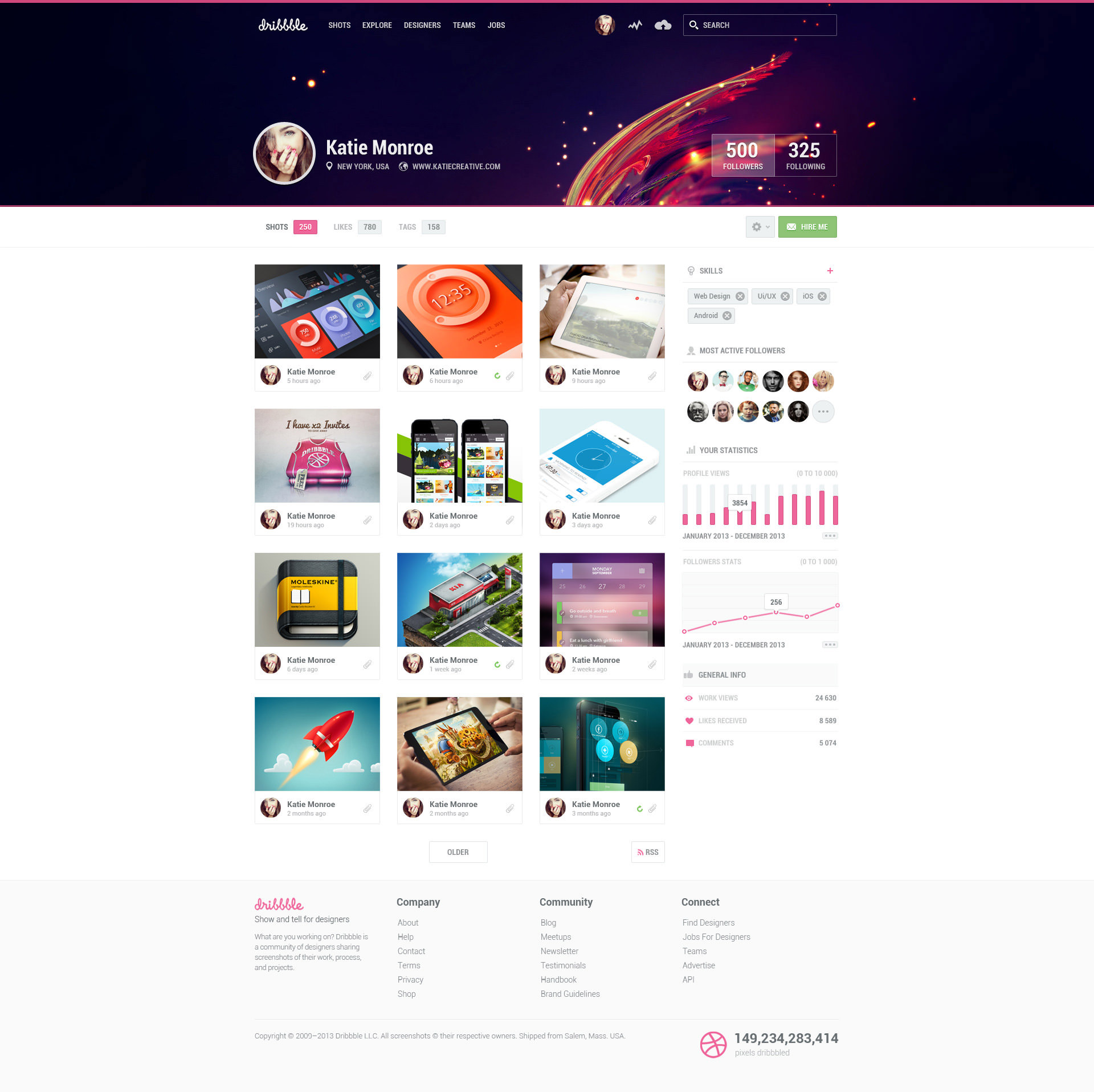
Dribbble
Dribble is the hub of the most excellent designers and it is only natural that one of those brilliant minds does a redesign of the website. What I like is the use of (Twitter and Facebook-like) cover for the profile page as well as the layout of project shots.
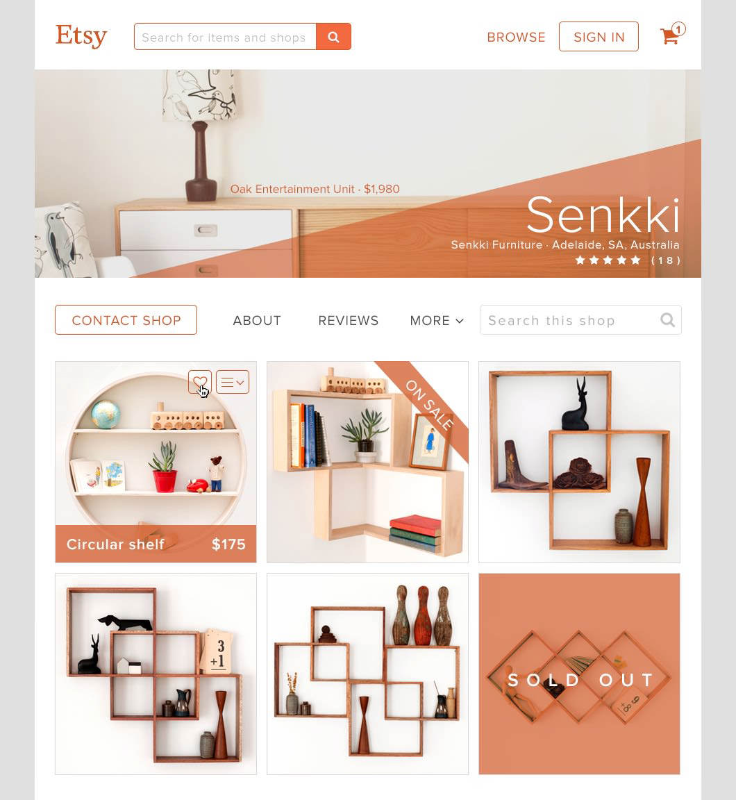
Etsy
This redesign concept of Etsy uses visuals more boldly and neatly than its current web design. You can see bigger product images and a small dropdown menu box that gives you some information about the product as you hover the mouse cursor on it.
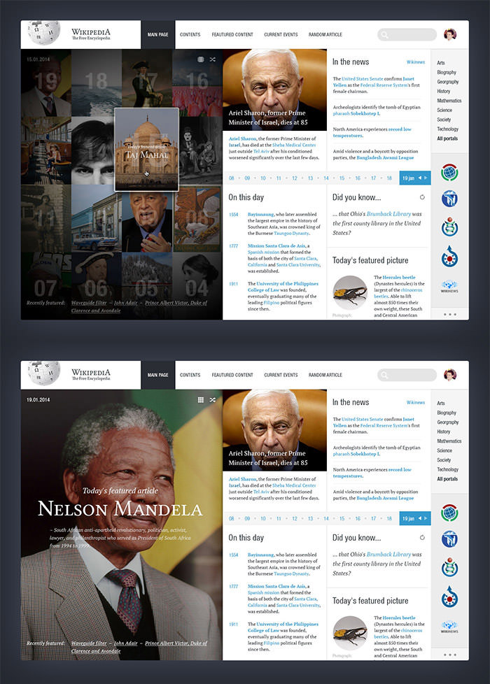
Wikipedia
Despite being used by millions, Wikipedia has a very unimpressive web design leaving much need for a redesign. This design concept lays out the information in well-composed blocks and also features image tiles that open up a large image when clicked. Hopefully, Wikipedia gets some inspiration from this…
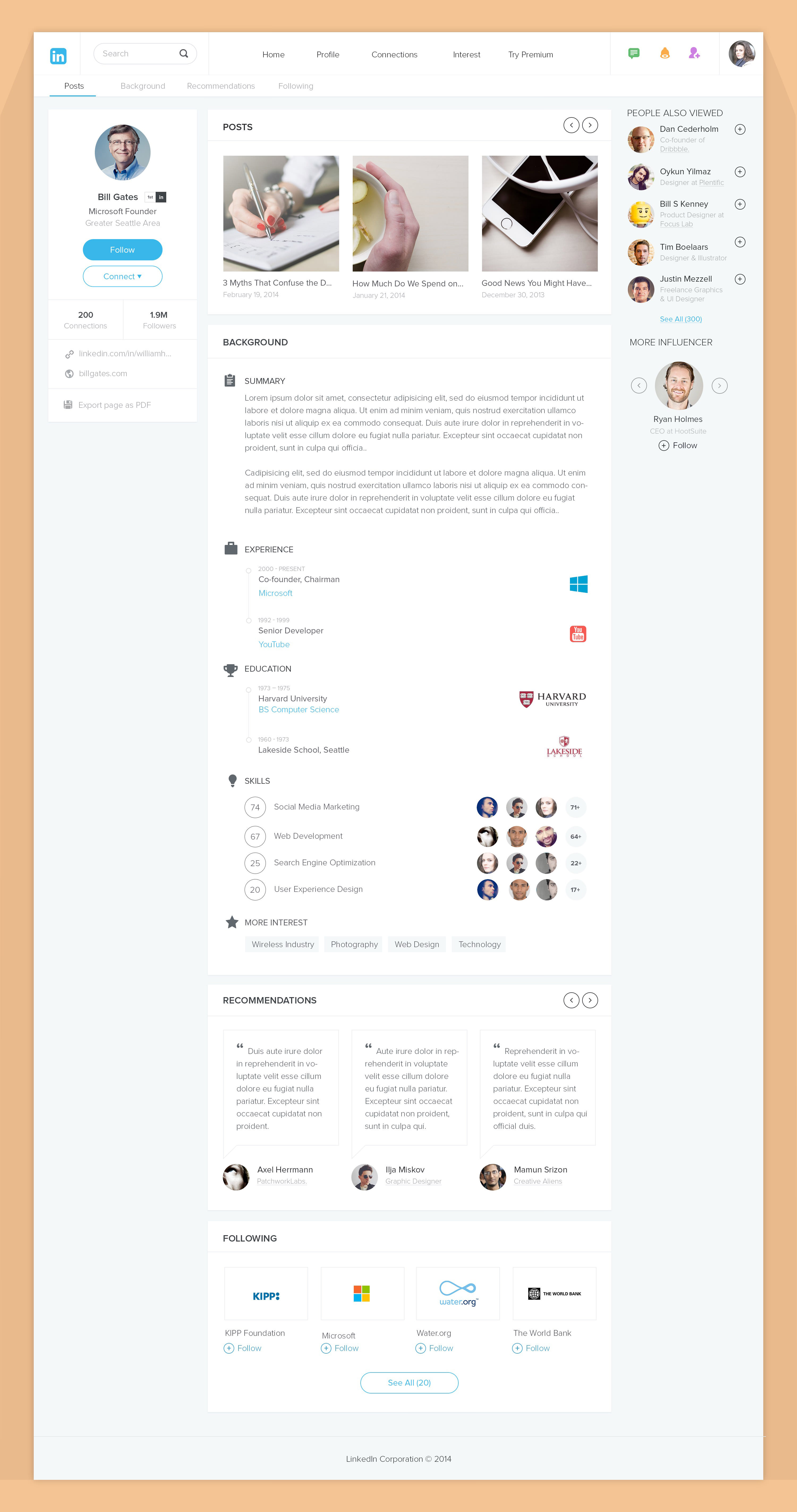
This is an interesting redesign concept of LinkedIn that features a cleaner and modern layout as compared to the current one. I especially like how suggestions and recommendations have been placed neatly at the side and bottom respectively, however, LinkedIn’s brand blue is a bit lacking in this design.
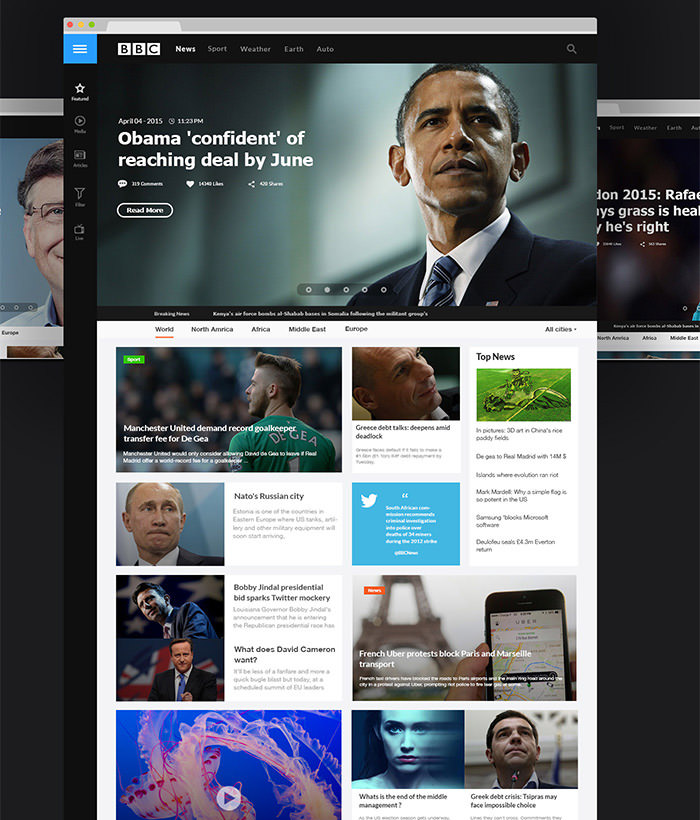
BBC
Here is a completely new, simple and modern UI for the famous BBC news website. The designer has emphasized on clean and simple reading experience with full-view article page. Also, the image slider right at the top gives an imposing look to the design.
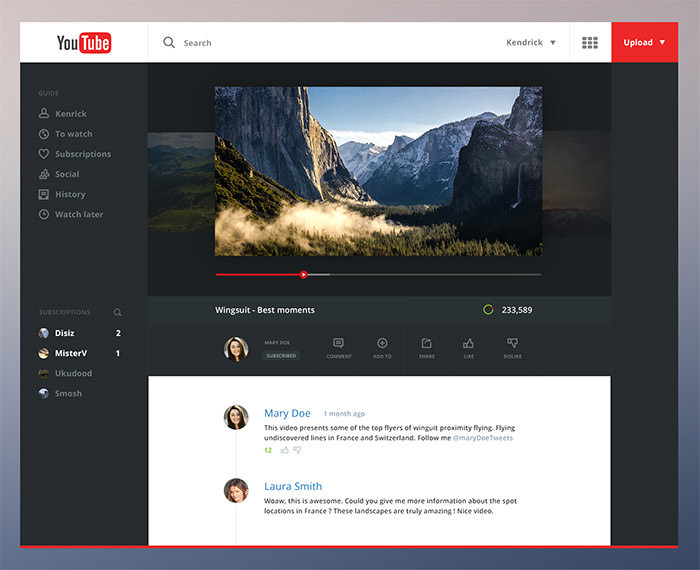
Youtube
A cool redesign of YouTube that features a darker interface, a play button that follows along the slider, volume, settings, and subtitles appearing by mous movement, and video description appearing as the first comment. Moreover, you can see other videos of the same author by clicking on the background.
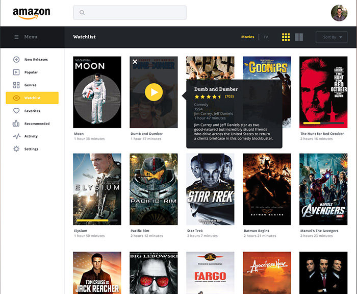
Amazon Streaming
Here is an experimental redesign of Amazon’s movie streaming service. The two design options show minimal yet visually striking layout. In one option Amazon’s signature yellow appears as bold sidebar featuring categories. In the other one, the sidebar appears white with yellow highlight as you hover.
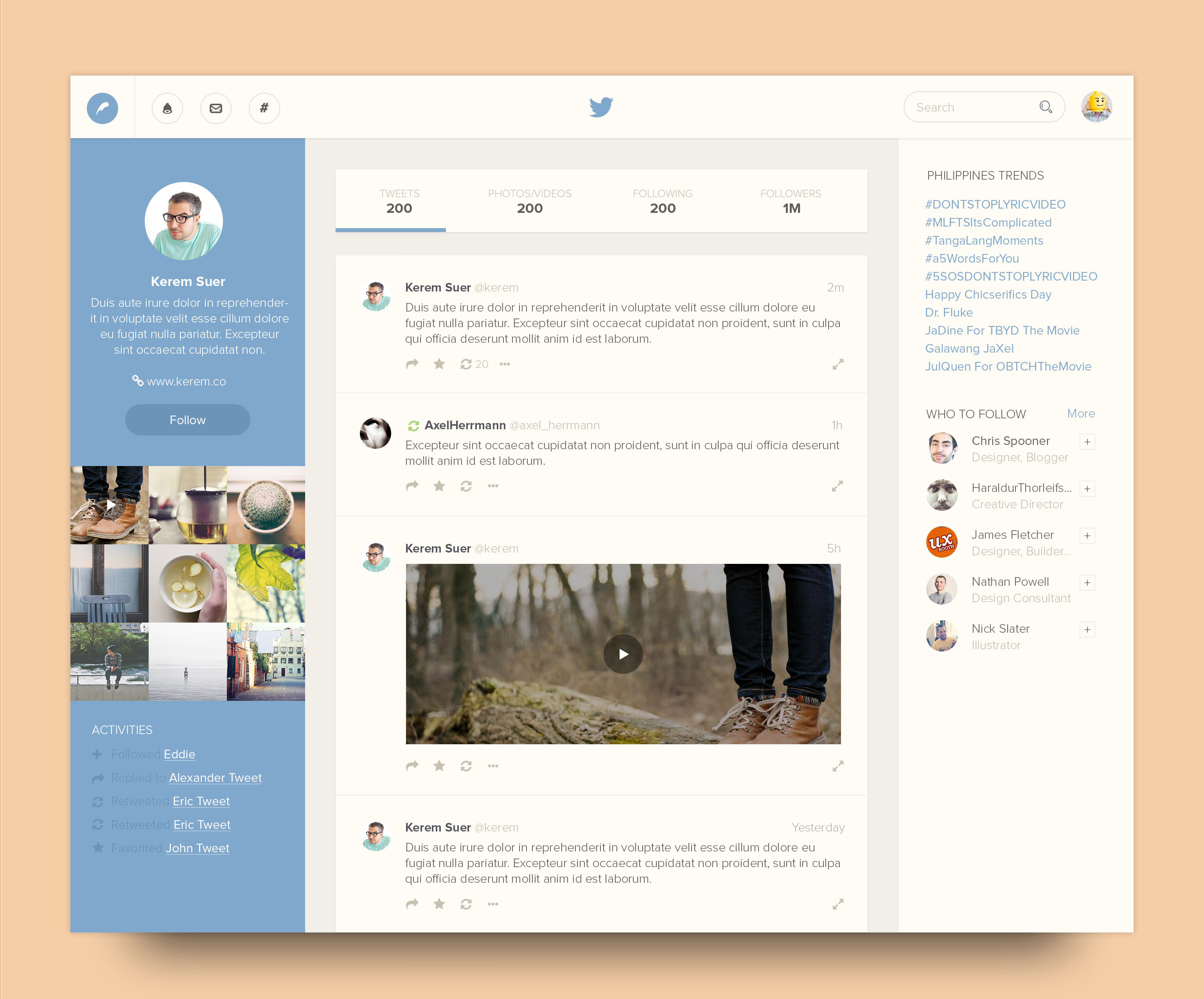
Twitter Profile
Inspired by Twitter’s latest profile page redesign, this is concept design features a very modern look and great use of space. The sidebar on left has a solid blue color that gives a certain balance to the layout. The use of flat design and placement of toolbar icons give it quite a fresh look.
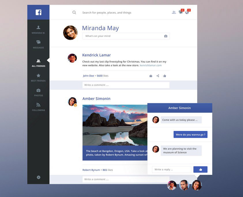
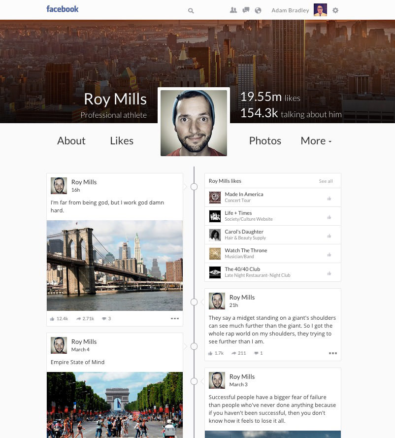
Here is a designer’s version of Facebook redesign with a clearer interface and less cluttered content presentation. The Like and Share have been moved to the Comments box and a new button Save Post has been added. Additionally, you can add your current mood to your avatar as a badge.
Social Network
This is a clean interface concept design mainly for a generic social media website. It shows great use of white space and well-organized content.
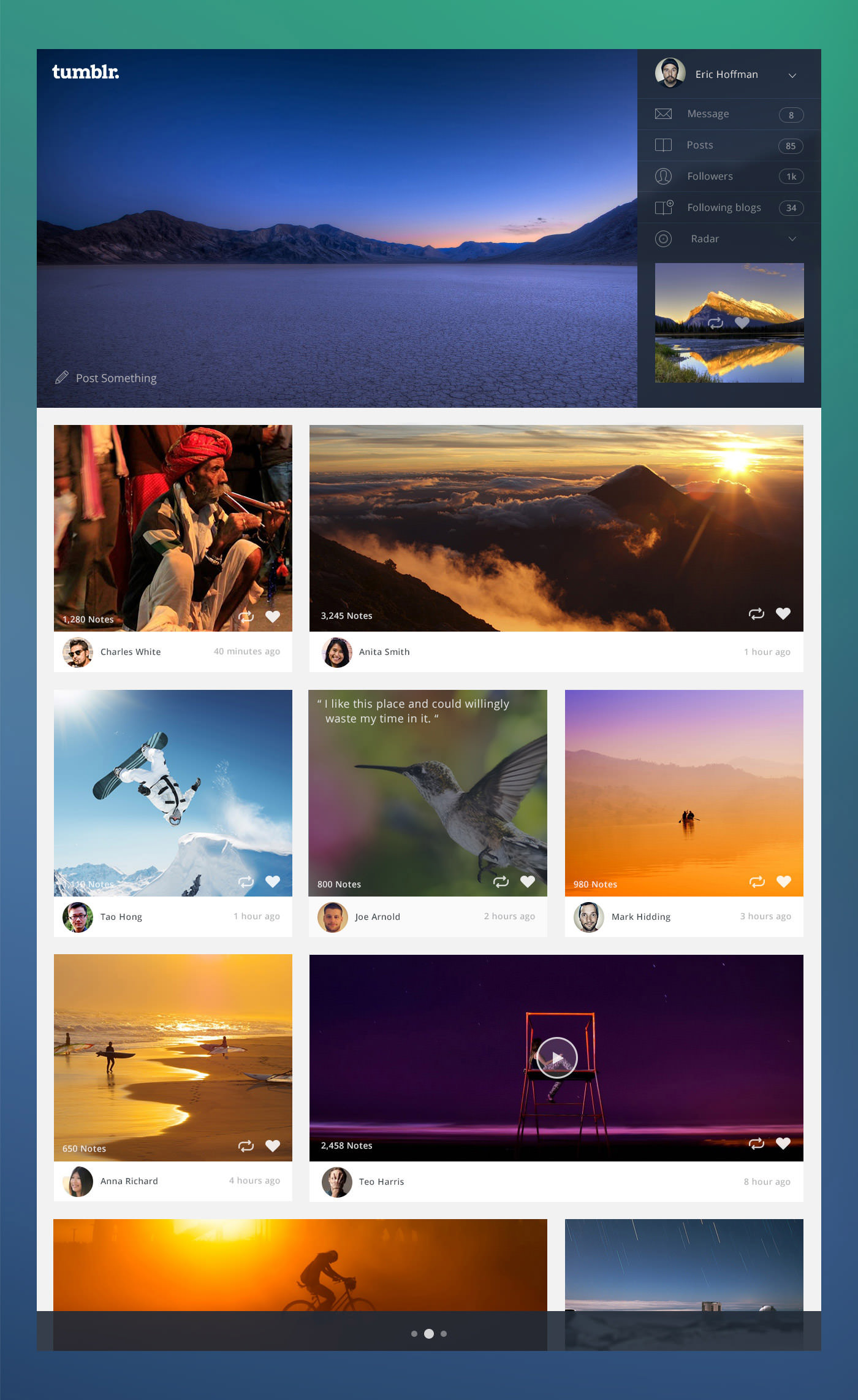
Tumblr
The image-based social media network Tumblr is already famous among millions but it won’t hurt to give it a nice redesign. Here is a concept design that shows a neat and clutter-free interface. Messages, Posts, Followers and other tabs have been organized in a nice sidebar with larger bolder image display.
Facebook Timeline
This is a Facebook Timeline concept redesign in the form of an actual two-column timeline. What I find really interesting is the profile page where coverphoto, name and other information is displayed quite boldly.
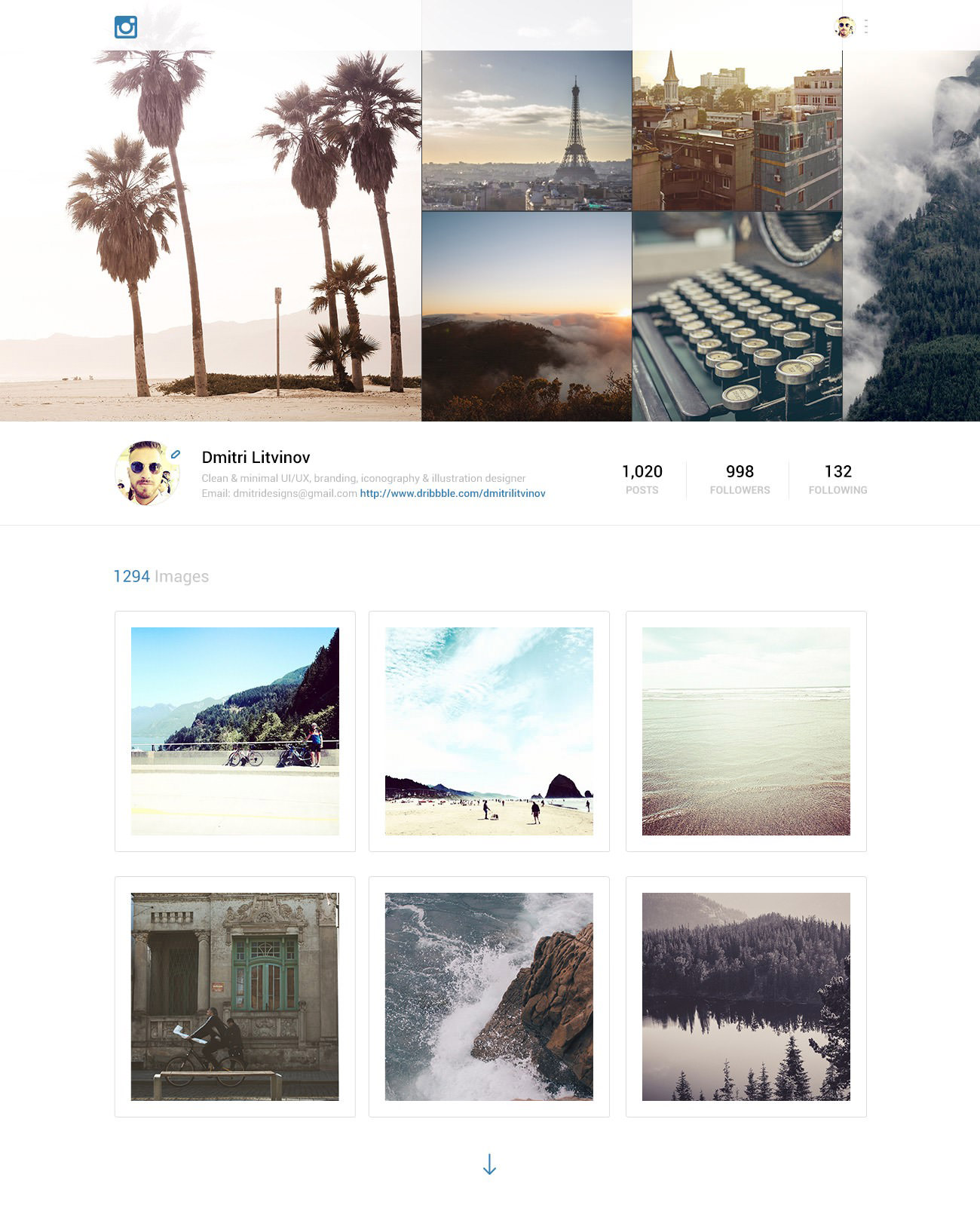
Though designers have given a lot of thought on the current interface of Instagram, but this concept also plays with some vital UI and UX elements. The flat design ensures minimalism so the user can navigate easily. However, it would be interesting to see what happens when you hover over an image.
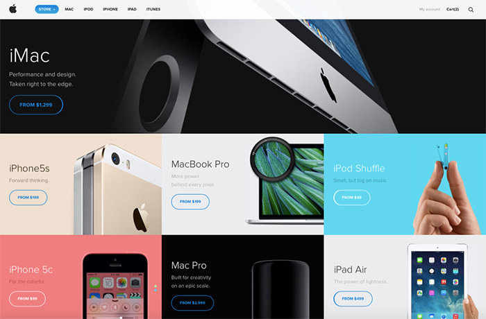
Apple Store
This concept redesign of Apple Store has been built on top of a modular UI/UX approach. You can see the designer has used bigger images and less text, thus directing the user’s attention to the products.
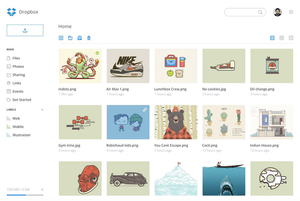
Dropbox dashboard
Most of us are quite used to the current dashboard of Dropbox, however, this redesign concept takes an even minimal approach towards its design. You can see Dropbox’s own blue and white color scheme with flat design icons and a neat interface.
Basecamp
Here is a redesign concept of Basecamp that uses minimalism and flat design as it’s main focus. I really like the color scheme as well as the choice of icons.
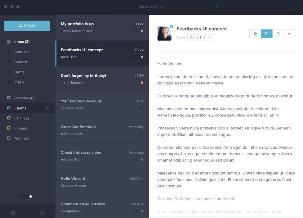
Sparrow
A talented designer has given Sparrow a new look as a tribute to this project. This neat design uses an excellent color scheme and a dark UI that’s popular among users.
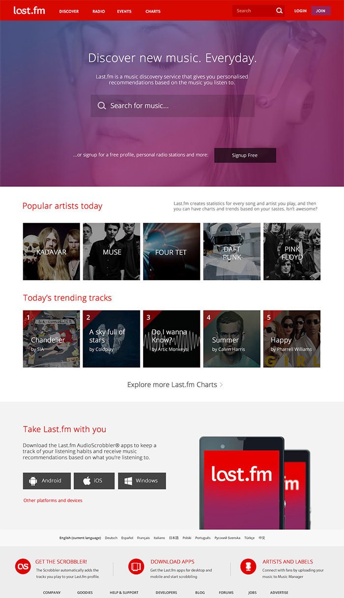
Lastfm
This redesign is based on certain problems that have been highlighted in Lastfm website. It features a modern, ua-simple yet functional landing page. The designer has experimented with placement of tabs, cleaner layout, and extracts of important content to improve the overall user experience.
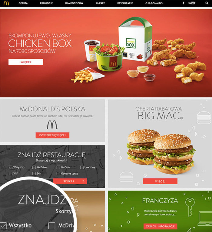
McDonald’s
This McDonald’s website redesign concept highlights large images and blog typography. With a neat menu bar, textured background and interesting icons, this design looks quite appealing.
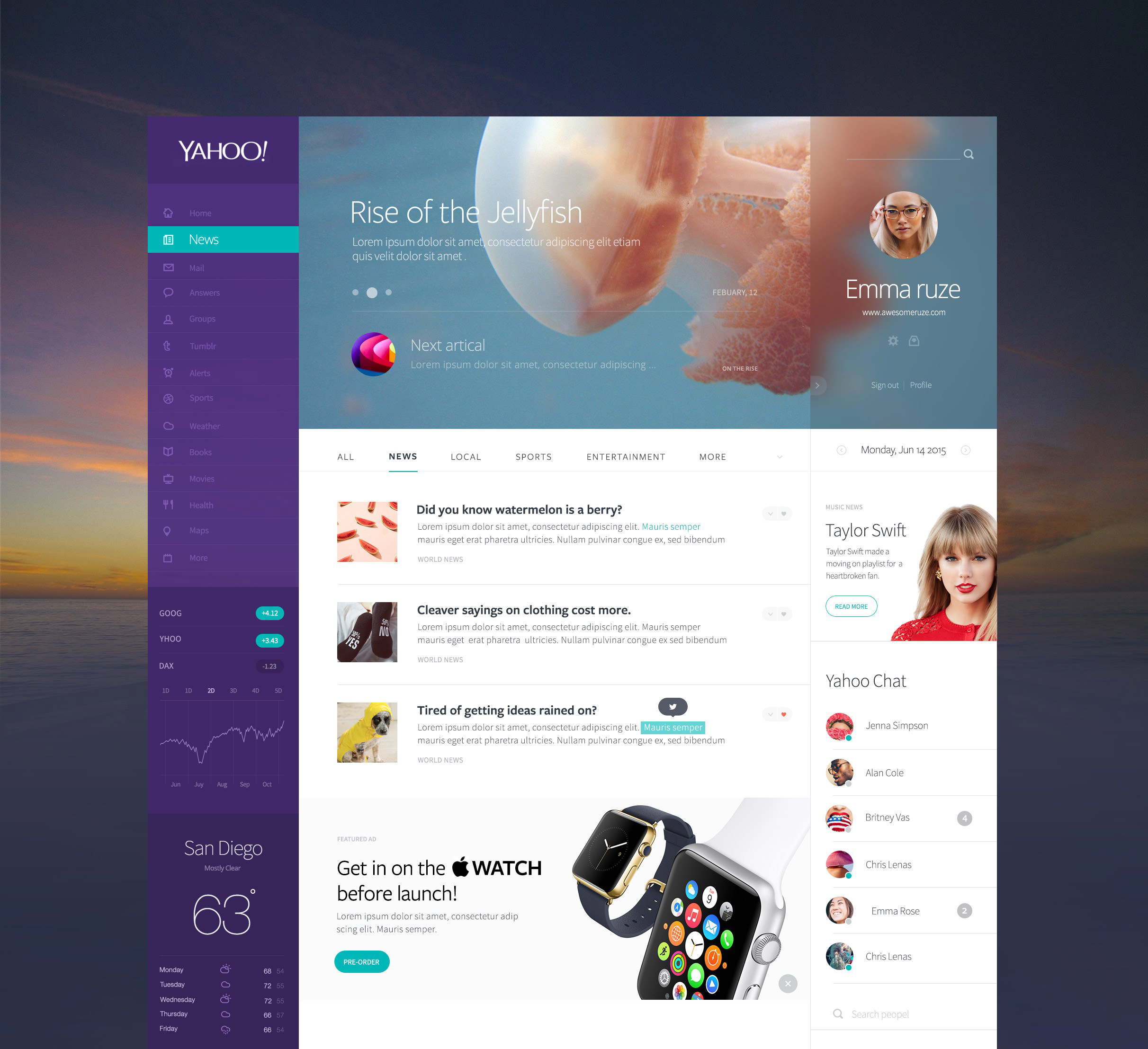
Yahoo
A neat and consistent approach towards concept redesign of Yahoo website. The sidebar in Yahoo’s own purple color has different pages and forex graph and the right panel has profile, chat, and section of the news.
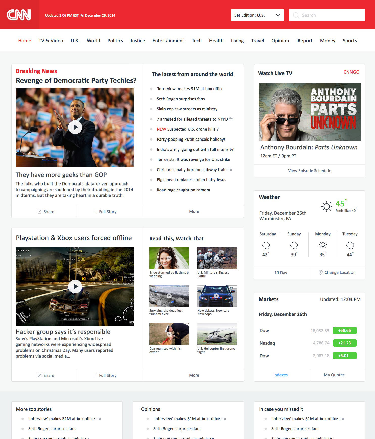
CNN
This redesign concept of CNN website is not very different than the current one, still, in this version, the content has been arranged in a much well-organized way. It also has a separate side panel for latest and breaking news.
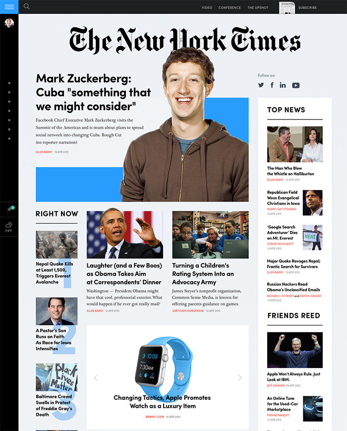
NYTimes
This rethink design has been created after much research into user behavior. Readers can sync messages in Twitter, read the news that they prefer, customize news layouts by photo and video materials, quotes, screenshots from social networks and so on.
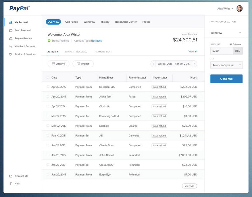
Paypal
In this redesign, the focus lays on user experience by adding quick action on the right-hand bar and minimizing steps involved in regular activities on PayPal website. Though I would’ve liked to see some more colors in the redesign.
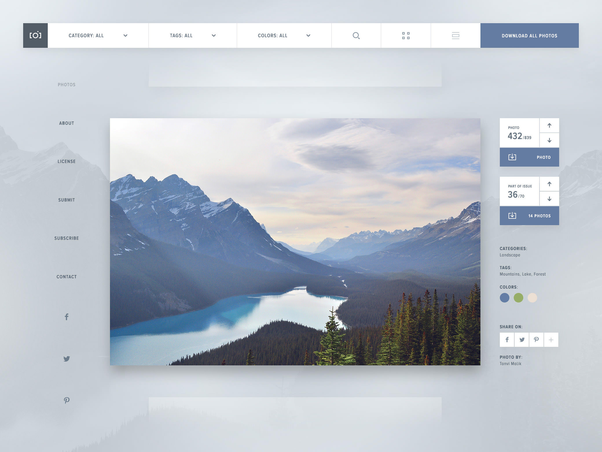
Unsplash
A cool redesign concept for the stock images website Unsplash. This neat design uses different blocks of information and website elements. I really like the font they have used but a few more colors would have been better.
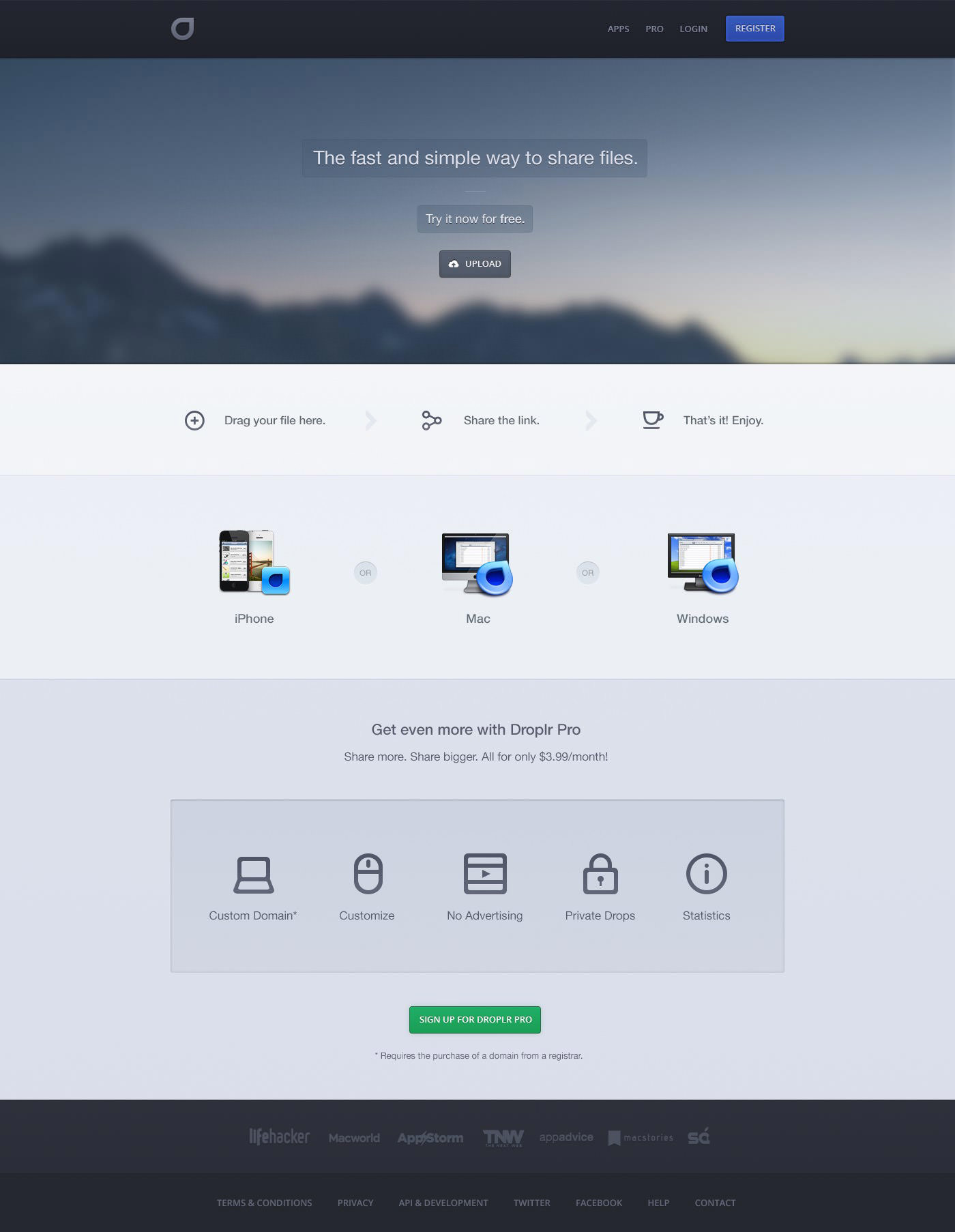
Droplr
Though the current Doplr website has quite a good UI design, here is a clean redesign of the website that makes it much easier for the user to navigate. However, the buttons could have been made a bit bigger so the design doesn’t look too empty.
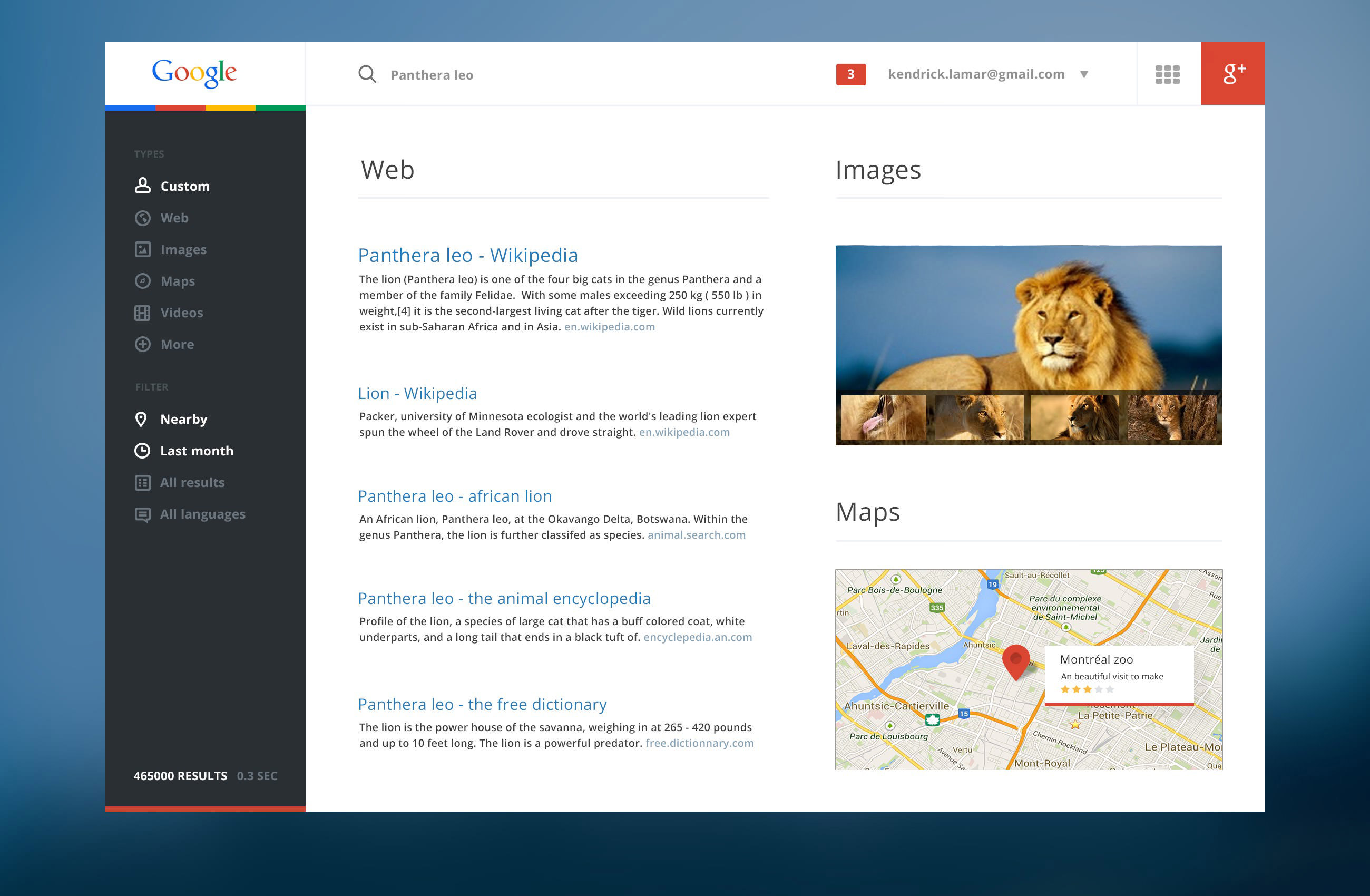
An attempt to improve Google search page’s user experience, this redesign concept highlights a sidebar that allows you to filter results and define types of files and settings that offer customized result preferences. The interface is also quite modern and cleaner than the current.
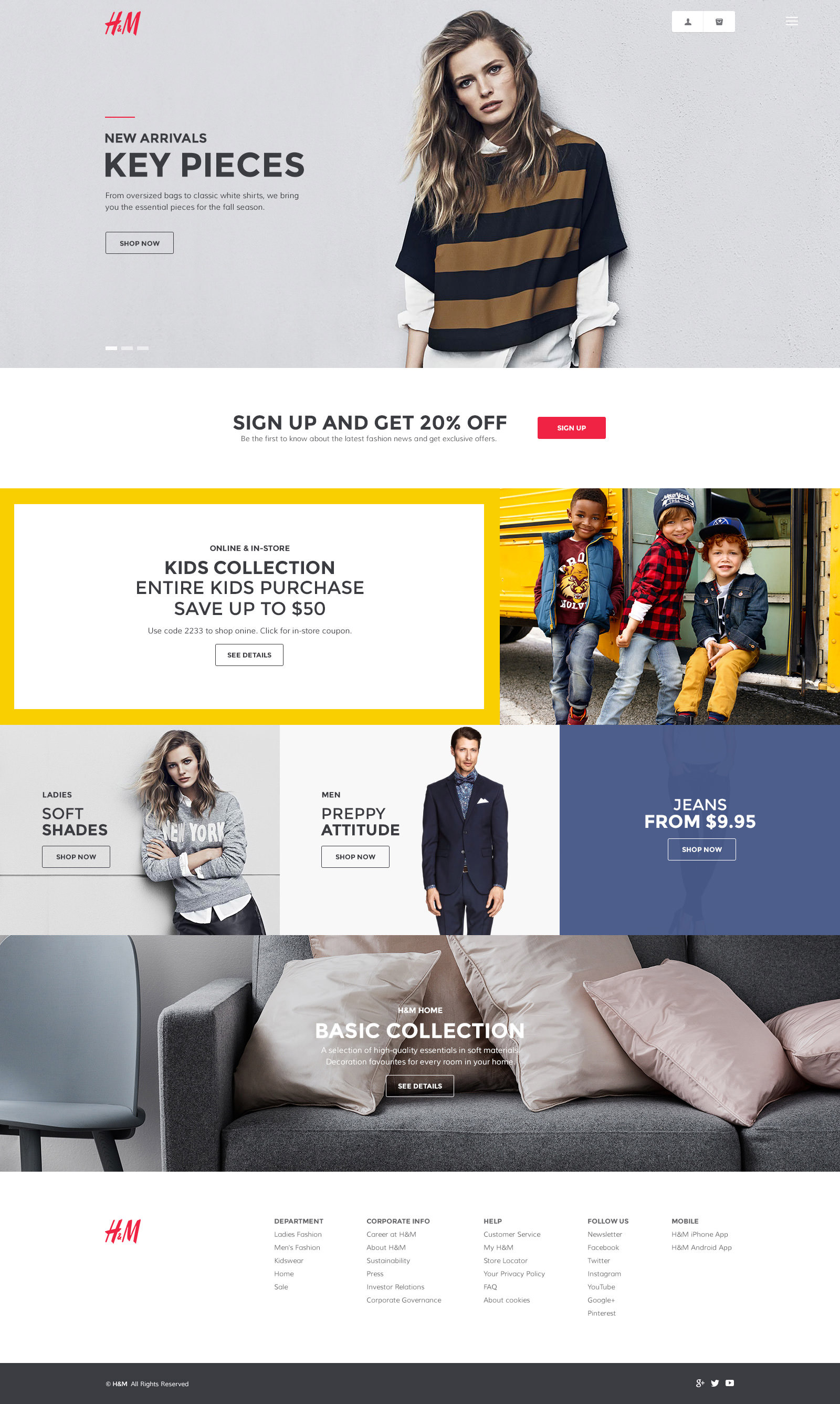
H&M Homepage
A fresh clean interface experimental redesign of famous clothing and apparel website H&M. The design features effective use of color and imagery along with some new fonts.
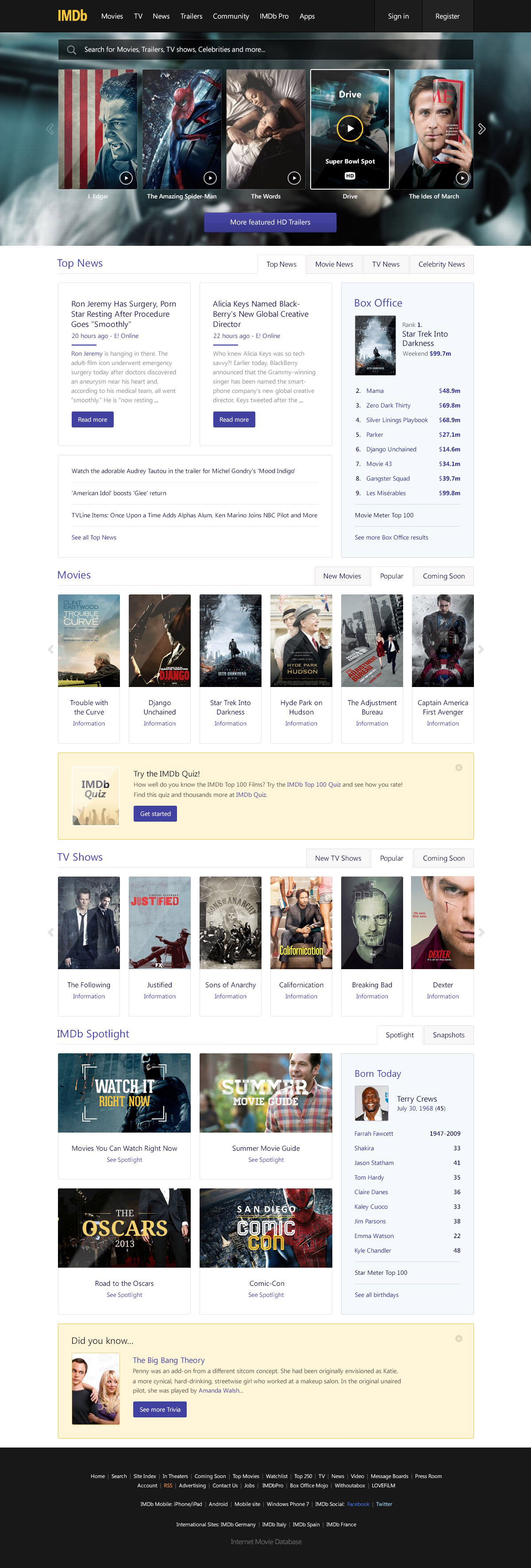
IMDb
A new concept homepage for IMDb that highlights a simpler design with a more cinematic feeling to it. The designer has tried to make it clean and simple but also be capable of showing a lot of information.
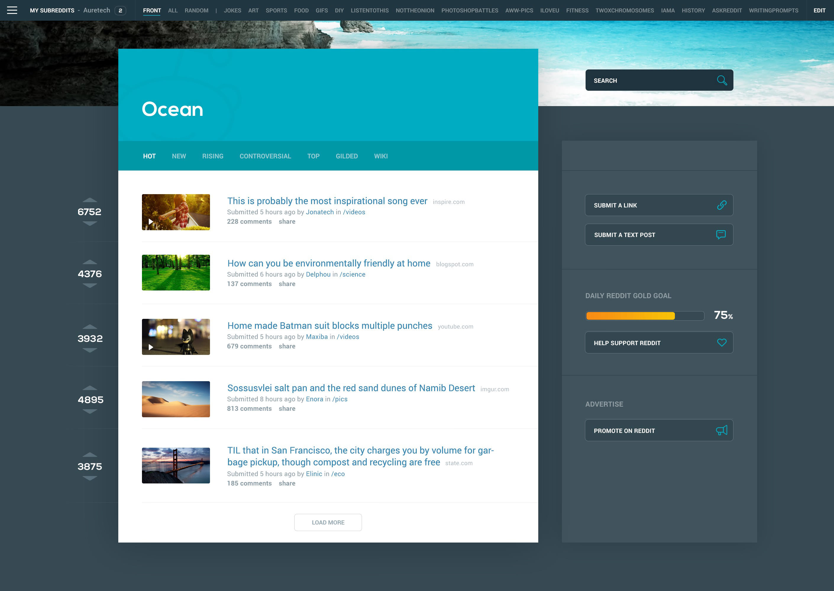
Of all the social media websites, Reddit is in the biggest need of a redesign. Here is a concept design of the website that features cleaner style for better readability and a much better arrangement of subreddits and account management in the same drawer.
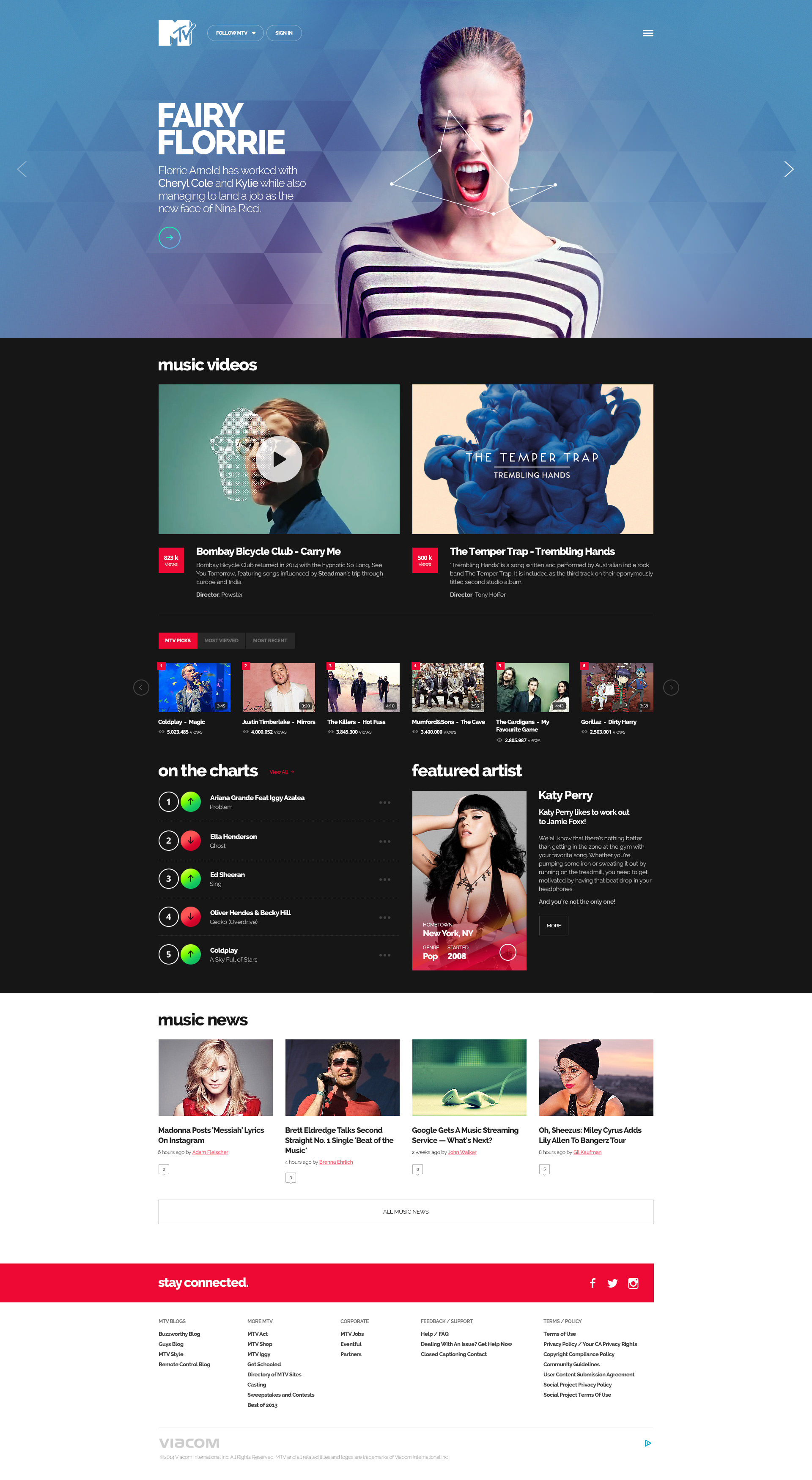
Mtv.com
In this concept design, MTV’s website has been given a fresh look and distinctive visual language without being too trendy. The designer has used abstract and futuristic shapes with filter effect and a new typeface.
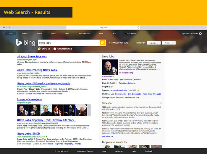
Bing Search Engine
Here is a little rethink effort on the design aspects of the Bing search engine. The designer has made only a few visual adjustments that made the platform look and function better than its current version.
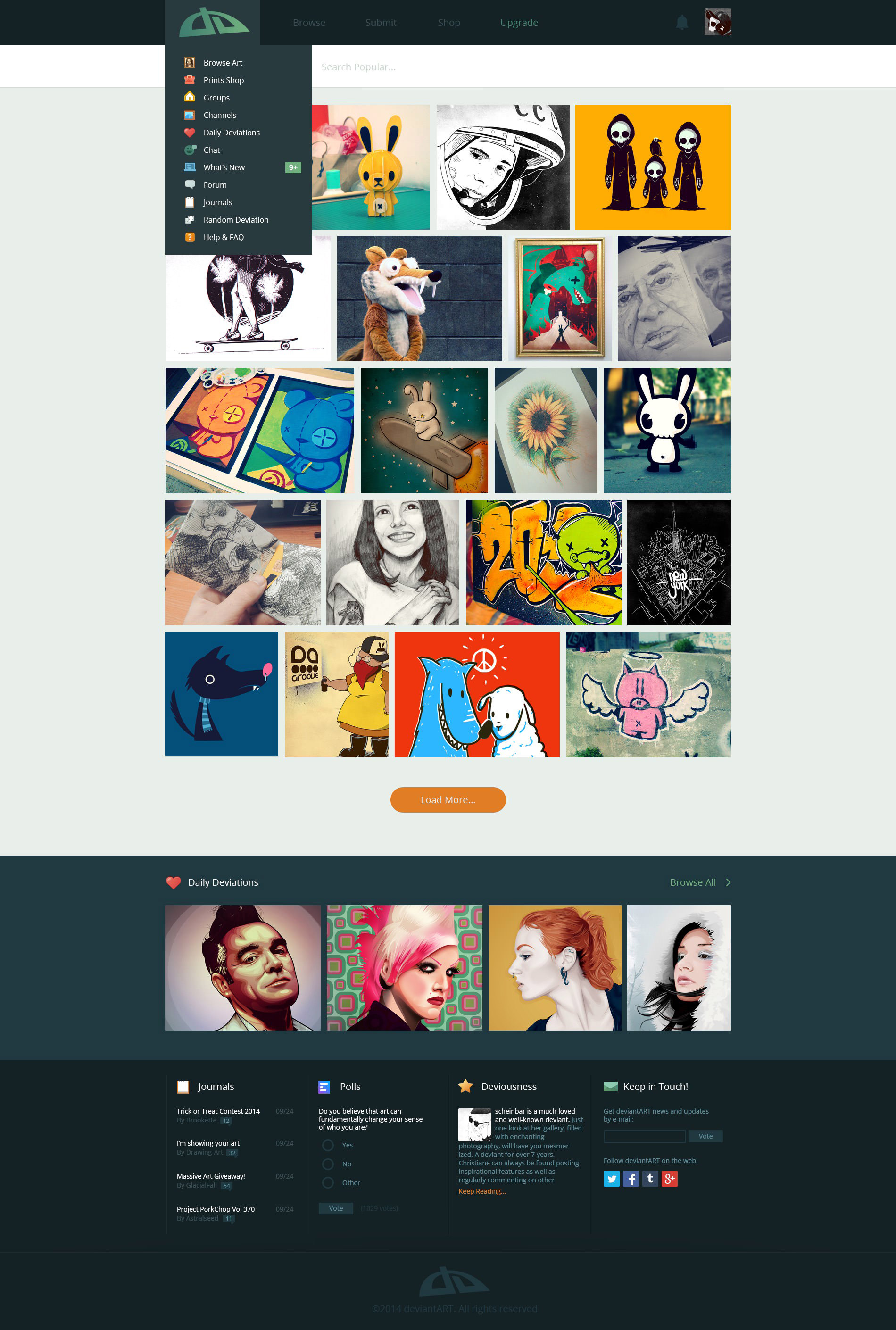
deviantART
Home to wonderful artists, deviantART has received its own redesign that features a modern, clean and minimal interface. Though some functional aspects have been compromised to make the design look better, but then again, it’s just a concept.
The post 33 Redesign of Popular Websites For Your Inspiration appeared first on Hongkiat.