Finally, Something Apple Isn’t Good At
Unless you’ve been living under a Dell for the last 10 years, you’ve undoubtedly heard of a ‘fruit’ company that Forrest Gump indirectly helped launch in the early 1980’s. Instantly recognizable, the Apple brand boasts the 42nd most visited website in the galaxy (23rd most visited in the U.S.) and is an industry leader in state-of-the-art, lifestyle-changing products. Now, Forrest wasn’t a smart man, but he knew what love was. So why does one of the smartest companies in the world have no love for its mobile visitors, and how can they fix their outdated website? The solution is simple: responsive design.
What Is Responsive Design?
Responsive web design incorporates sizing capabilities that adapt to multiple platforms, like smartphones, tablets, or computers. You know, the gadgets Apple is known for. Responsive websites respond to their environment via the client’s browser and adjust the viewing area to fit the device’s screen size. But Apple’s website isn’t responsive, which means you can’t navigate it effectively on your raspberry iPhone 5C.
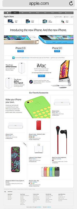
Apple’s Current Site As Seen On Mobile:
[SCROLL inside the iPhone below]

Grab The Icy Hot. Prepare For Hand Cramps:
On your smartphone, navigate to the Apple website. Notice how hard it is to see everything? That’s because you’re viewing a website that was designed for a desktop. Text disappears from sight and it’s almost impossible to use the navigation bar. And where’s the footer? With the amount of manual dexterity it takes to pinch, swipe, and zoom your way to the iPad you’re looking to buy, you may as well be topping Fruit Ninja leaderboards.
Going Mobile Pays
Why shouldn’t we forgive Apple’s retro site when their products are so flashy and progressive? Well, because we’re no longer clamoring over free AOL discs or jamming out to dubstep’s precursor via dial-up modems. While Apple.com is still partying like it’s 1999, Monetate is projecting $38.8 billion in mobile sales for 2013. 56% of individuals own smartphones and a third of those individuals use them exclusively to access the web. In short, the Internet’s gone mobile and 67% of mobile web users make purchases only from mobile-friendly sites.
So is Apple alienating mobile customers and losing out on potential profits by not having an updated website? Yes. No wonder thousands wait in line for weeks to buy their latest products in-store. That’s at least less frustrating than scrolling every which way on a handheld device just to read a headline. The cost of exclusivity may soon be too rich for the tech giant’s blood if Android users eager to purchase iGadgets are hindered by an incompatible Apple Store app or an unfriendly website.
Apple.com’s Redesigned iPhone Page For Mobile:
[SCROLL inside the iPhone below]

Why We Care
As a burgeoning L.A.-based digital agency with a pulse on all things web, we honestly couldn’t believe it when we pulled up Apple’s site on our smartphones. After a quick search on Googs, we saw similar surprise from others around the web. Since we are design ninja’s we quickly put together these mockups to show the world what their site could look like.
No Need For Carpal Tunnel:
To eliminate the effort it takes to currently navigate Apple’s site, we stacked the images and added drop-down menus. We kept their amazing visual content, enlarging images, CTAs, and buttons so they’re more “tap friendly.” Now, site visitors can have a similar experience on their smartphones as they would on their laptops.
The Redesigned iPad Page:
[SCROLL inside the iPhone below]

The Redesigned Responsive Apple Store Page:
[SCROLL inside the iPhone below]

5 Reasons Why Apple Needs Responsive Design
- User Experience: It doesn’t take a Steve Jobs-caliber visionary to see that poor customer experiences will hinder sales. Improving accessibility across devices means greater exposure to millions of mobile device users and greater potential for increased profits.
- Lost Sales: Apple isn’t hurting for cash, but we’re positive their business model doesn’t include missing out on beaucoup bucks, such as the $25 billion in purchases mobile users spent in 2K12.
- Rep Control: Consumers choose Apple because their products are stylish, their technology is cutting edge, and their products are easy to use. Currently, however, their mobile presence doesn’t measure up to its well-established hype.
- Competition: Right now, Android, Samsung, and Microsoft are all bonding over how much better their mobile presence is than Apple’s.
- Peer Pressure: Mashable called 2013 the Year of Responsive Design. Seriously, everyone’s doing it; from the POTUS to McDonald’s. If it’s good enough for the Prez and a scary-ass clown, it’s good enough for Apple.
Wrap-Up and Peace Out
Apple produces superior products but their website? Meh. We’re not trying to pick on Apple… but seriously they should integrate responsive properties into their website so mobile users are able to check out their amazing products and make purchasing much easier. Apple, if you’re looking for a new programming team, feel free to holler at us.
About SPINX
SPINX is a digital marketing agency based in Los Angeles, CA, that specializes in website redesign and development, as well as online strategy and marketing. Digital craftsmen at heart, we create with imagination and technology. And real love.
The post Responsive Web Design Fail: Apple.com Alienates 30% Of Its Visitors first appeared on Web Design & Digital Marketing Tips.


