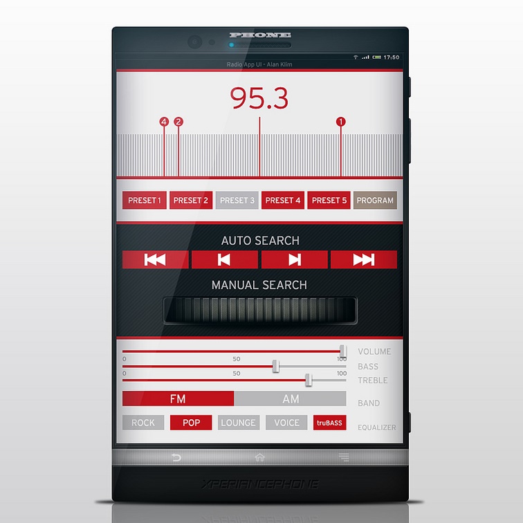
 A mobile app with flat design. Courtesy Alan Klim / Radio App UI
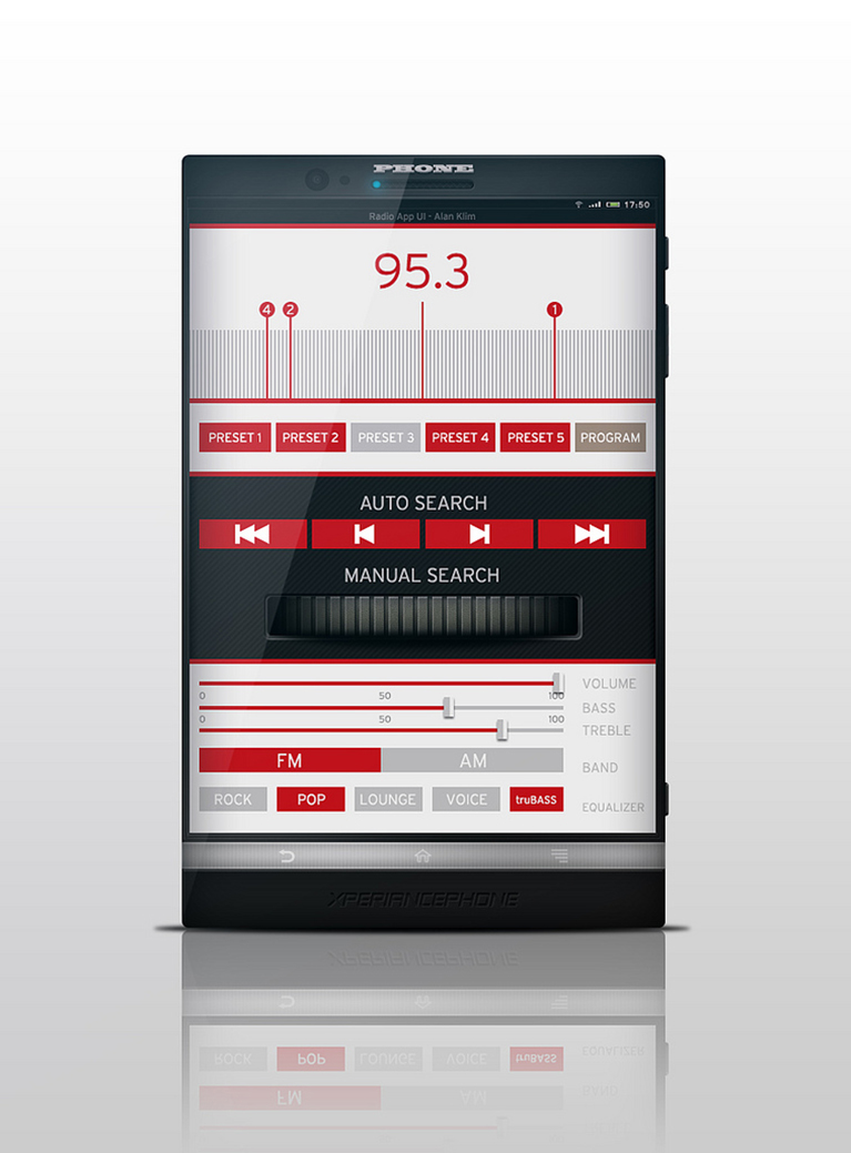
Your website should already be using responsive design for mobile devices. With mobile usage increasing each year, responsive design—or a lack thereof—will make or break a customer’s perception of your site. At this point, your mobile site should be responsive, and your site’s visitors should have no issues switching between mobile and desktop.
However, responsiveness is just the first step to having standout design. There are many emerging mobile design trends that you should incorporate in 2014. Here are the Top 3:
Simpler Design:
Some huge tech design news in 2013 involved a word most people had never thought of: skeuomorphism. Skeuomorphism is the practice of using real-world visual references to represent something strictly online—think of the diskette icon that means “save.” It’s still around long after 3.5” floppies got tossed into the great e-waste bin in the sky. Apple made big news in late 2013 for finally dumping skeuomorphic design in favor of flat design. Apple’s message was clear: simple design is back, in a big way.
From startups to giants like Apple, design-savvy companies are doing more with less. The Next Web says that though content is king, simple content is even better. “Simpler content will dominate 2014 and beyond as we design our websites…[this] means short bursts of content, Twitter style.” Fortunately, simplicity is easier for your mobile site to represent.
This is why so many companies, like Google, have been going flat. Google made its logo and overall design scheme flat because gradients are difficult to represent, and consequently it’s both more mobile-friendly and more aesthetically appealing.
Likewise for the large images at the tops of homepages (also called hero areas) that will grow increasingly trendy throughout 2014. Similarly, article-heavy sites are dropping the sidebar and just focusing on content, another design trend that is very friendly towards mobile.
Resolution independence:
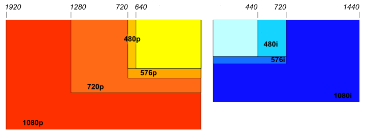 Resolution will increasingly be independent of device constraints. Courtesy Wikimedia Commons Resolutions Chart
The consensus on design is that desktop is increasingly going to resemble mobile, not the other way around. Until then, there are going to be some growing pains in mobile design. One of the latest innovations in smoothing over the differences in user interfaces is resolution independence.
As technology advances, screens can hold more pixels per square inch (PPIs). So far, so good! The amount of PPIs rendered on different screens is “pixel density,” and different devices have differing pixel densities. This is where problems begin. The same object rendered on different screens is going to differ in size based on the respective pixel densities, and this can create blurriness and troubles with clickability. In a multi-screen world, users often use several devices at once, so resolution independence is a must.
The solution is resolution independence for mobile interfaces. It intelligently scales design features to avoid the problems traditionally plaguing mobile. It sounds complicated, but in a multi-screen world, it’s a next-level solution that your website must use for mobile.
Device Agnosticism:
It’s frustrating for a mobile-using customer to have to return to a website from a desktop computer. Too many users have experienced being unable to pull up a form, complete required fields, or enjoy the full functionality of a site on mobile. Not only is this frustration common, but it can be fatal for business. An experiment in lead-generation saw that 17% of respondents filled out a form via mobile when it included two fields, and that number plunged to 3% when a third field was added. Device agnosticism promises to fix problems like these.
Good device-agnostic design means that your site maintains its looks and functionality regardless of whether it’s viewed on desktop, mobile, or tablet. Responsive design is about building a mobile-friendly site, but device agnosticism actually takes a step back. By bringing design back to the foundation of your site, device agnosticism makes the technology with which it’s accessed less important.
Nowhere is the adage “content is king” more true than with device agnosticism. With your website design (or redesign), abandon rigid ideas about dimensions. Device agnosticism focuses on templates, “blueprints and guidelines— not firm, concrete measurements of design,” according to one user experience expert. Visitors to your site will see your content similarly spaced regardless of their tech, because device-agnostic design focuses on loose, flexible placement over strict dimensions.
To keep up with both device usage trends and developments in design, your company has a lot of new ideas to incorporate. These are just a few of the steps beyond responsive design that you can take to ride the wave of the mobile revolution—and look great doing it. Has your company already incorporated any of these elements into your site’s design? Please let us know in comments. If you’d like to hear what an LA mobile design agency can do with these trends for your website, please feel free to contact us for more information.
The post Beyond Responsive Design: 3 Trends in Mobile You Should Be Using first appeared on Web Design & Digital Marketing Tips.